PANGEAM. SEE LIFE OF YOUR SPACE
Pangeam is an industrial AI platform that anonymously monitors workspaces to help organizations understand if their space is working for or against their people.
ROLE
Product Designer
PERIOD
2022–2024
DELIVERABLES
UX/UI Design
Design System
Pitch Deck Design
Website Design & Development
Illustration
Graphic Design

Context
Context
Context
Context
Context
Context
Context
Context
Context
Context
Context
Context
Context
Context
Context
Context
Context
Context
Context
Context
Context
Context
Context
Context
Context
Context
Context
The Challenge: Lack of Actionable Workplace Insights
Companies spend millions on office spaces—but are they actually working? Traditional methods like badge swipes and surveys only scratch the surface. At Pangeam, we set out to build a smarter platform that showed how workspaces were really being used, helping companies make better decisions about collaboration, space planning, and employee experience.
As the Product Designer, I led the UX strategy from the ground up—researching users, mapping flows, and building prototypes. I worked closely with engineers, stakeholders, and researchers to turn abstract ideas into a real product. Along the way, I helped shape the brand, pitch materials, and a scalable UI system. The result: a data-driven, market-ready platform that gave organizations real insight into how their spaces support their people.


Discovery
Discovery
Discovery
Discovery
Discovery
Discovery
Discovery
Discovery
Discovery
Discovery
Discovery
Discovery
Discovery
Discovery
Ideation
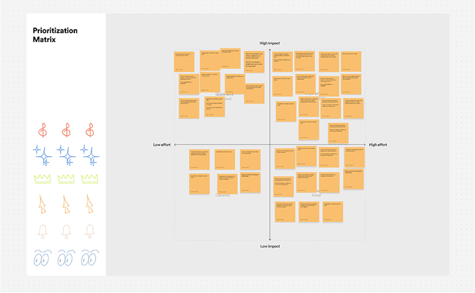
Brainstorm & Features Planning: After discovery, I led brainstorming sessions with stakeholders to turn insights into features. We generated exciting ideas but needed focus.
Prioritization Matrix: To keep things strategic, we worked closely with the CTO and engineers to map out a prioritization matrix, weighing user impact, feasibility, and business value. At the end of the day, we had to make smart trade-offs to deliver on time and stay within budget—without cutting corners on what mattered most.
Requirements & Prototypes: Once we pinpointed the highest-priority features, we outlined clear requirements and began building interactive prototypes.

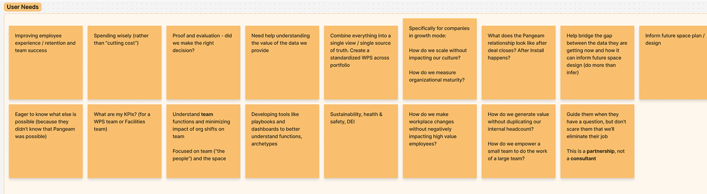

User Research: Key Problems
Offices Designed for Outdated Work Models
Issue: Fixed desks, assigned seating, large conference rooms—these designs cater to a pre-hybrid era and no longer match evolving work patterns.
Solution: Live Tracking Dashboards give real-time data on how employees move and interact, guiding flexible office designs that match actual usage.
Underutilized Spaces Increase Costs
Issue: Facility managers can’t pinpoint which rooms or areas are thriving vs. wasted. This leads to high overhead and unneeded expansions.
Solution: Occupancy Heatmaps & Behavioral Analytics surface granular data on foot traffic and activity types, enabling targeted resource allocation.
Workplace Changes Driven by Guesswork
Issue: Renovations or design tweaks are often implemented without measuring actual impact or ROI.
Solution: Intervention Planner allows teams to model hypothetical changes (like reconfiguring desks or adding collaboration pods) and preview likely outcomes before spending on renovations.
No Data on Event-Driven Engagement
Issue: Companies invest heavily in events (from casual networking to formal workshops) but rarely track post-event outcomes.
Solution: Event Analytics Dashboard measures engagement before, during, and after events, helping HR teams fine-tune event planning to boost in-office culture.
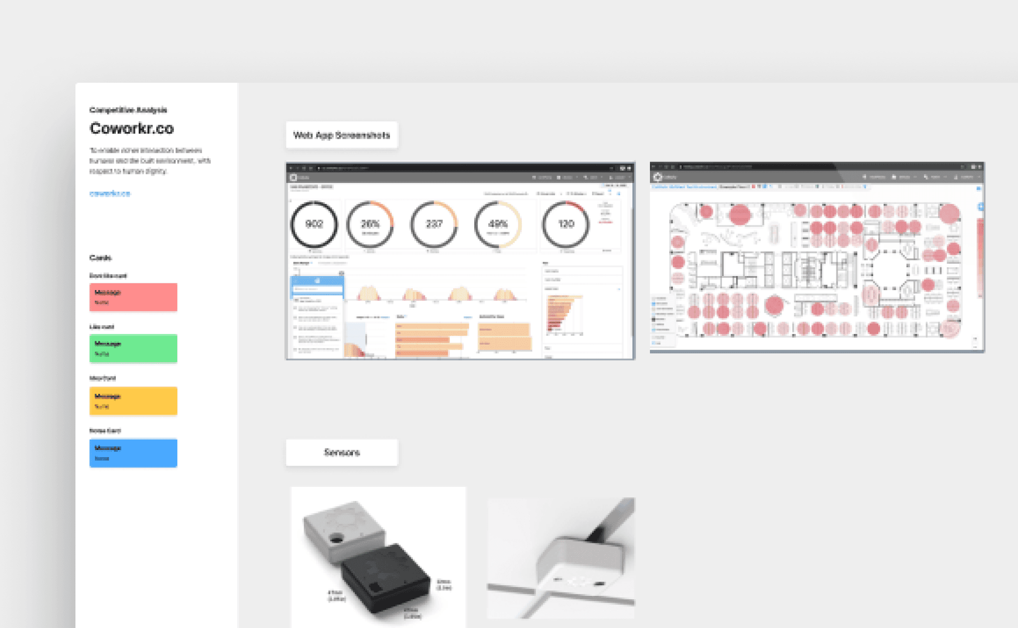
Competitor Analysis
To position Pangeam as a category leader, I analyzed competitors in workplace analytics, identifying pain points in existing solutions:
Static, outdated data (e.g., traditional occupancy tracking)
Poor Web App features (data-heavy dashboards with complex navigation)
Lack of actionable insights (raw data with no clear recommendations)


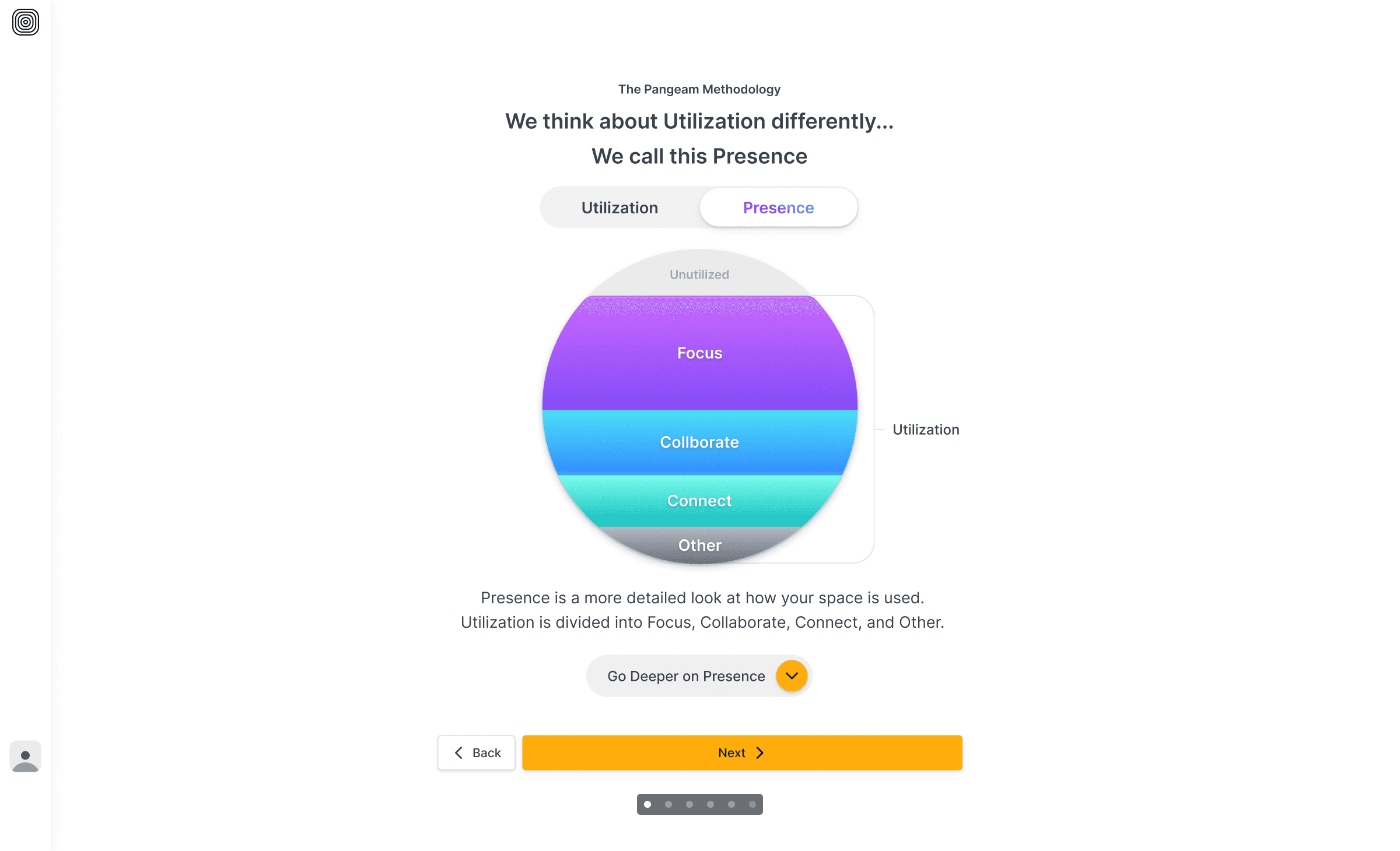
Technology
Sensors detect people coming and going to calculate occupancy.
AI differentiates among focusing, collaborating, and connecting.
Aggregate behaviors are categorized, and physical presence is scored.

DESIGN
DESIGN
DESIGN
DESIGN
DESIGN
DESIGN
DESIGN
DESIGN
DESIGN
DESIGN
DESIGN
DESIGN
DESIGN
DESIGN
DESIGN
DESIGN
DESIGN
DESIGN
DESIGN
Design Process Alignment
Early on, we defined a clear, structured design process—from discovery to delivery—and aligned on who was responsible for each stage. By mapping everything out visually and assigning ownership across design, product, and engineering, we ensured smooth collaboration, faster decisions, and consistent progress.

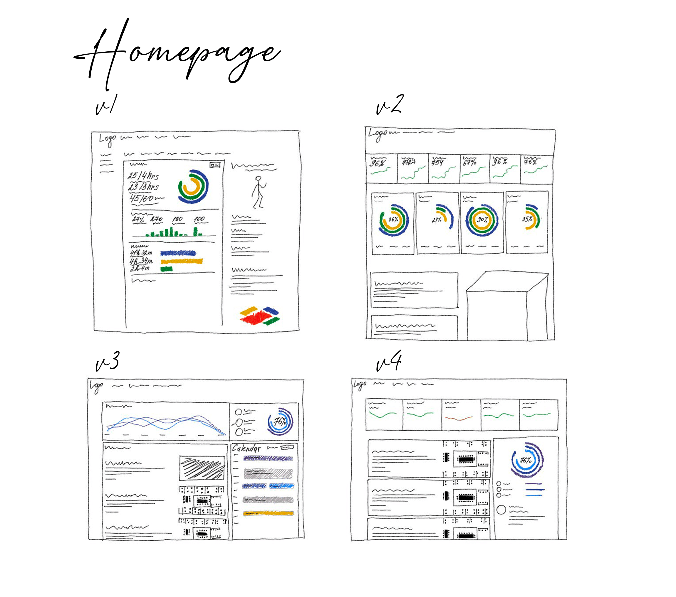
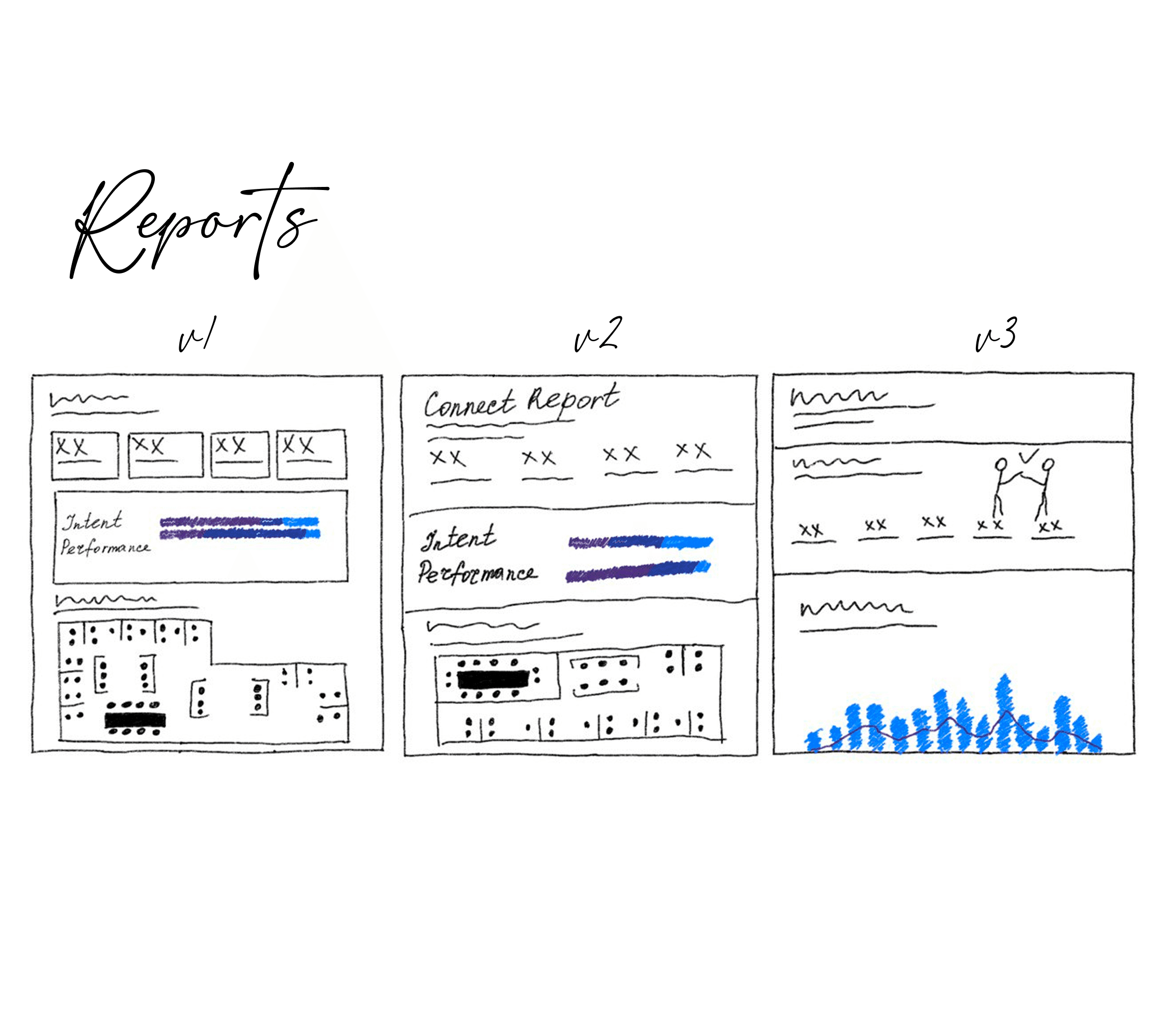
Wireframing
Based on insights from earlier phases, I developed initial concepts for the main pages. After a collaborative team review, we aligned on a clear direction and transitioned into preparing high-fidelity prototypes.


Branding
We collaborated with Berger & Föhr, a renowned design studio, to develop Pangeam’s logotype, branding strategy, and visual identity. Together, we developed comprehensive branding guidelines, ensuring consistency across the product, marketing, and user touchpoints.

Design System
To make the design process seamless and scalable, we began developing a flexible UI design system right after the low-fidelity wireframes. Drawing from my experience integrating design systems, we optimized it to accelerate implementation, streamline development, and enhance usability while maintaining visual consistency. We started small, refining and testing continuously, with accessibility as a key priority.
Prototyping
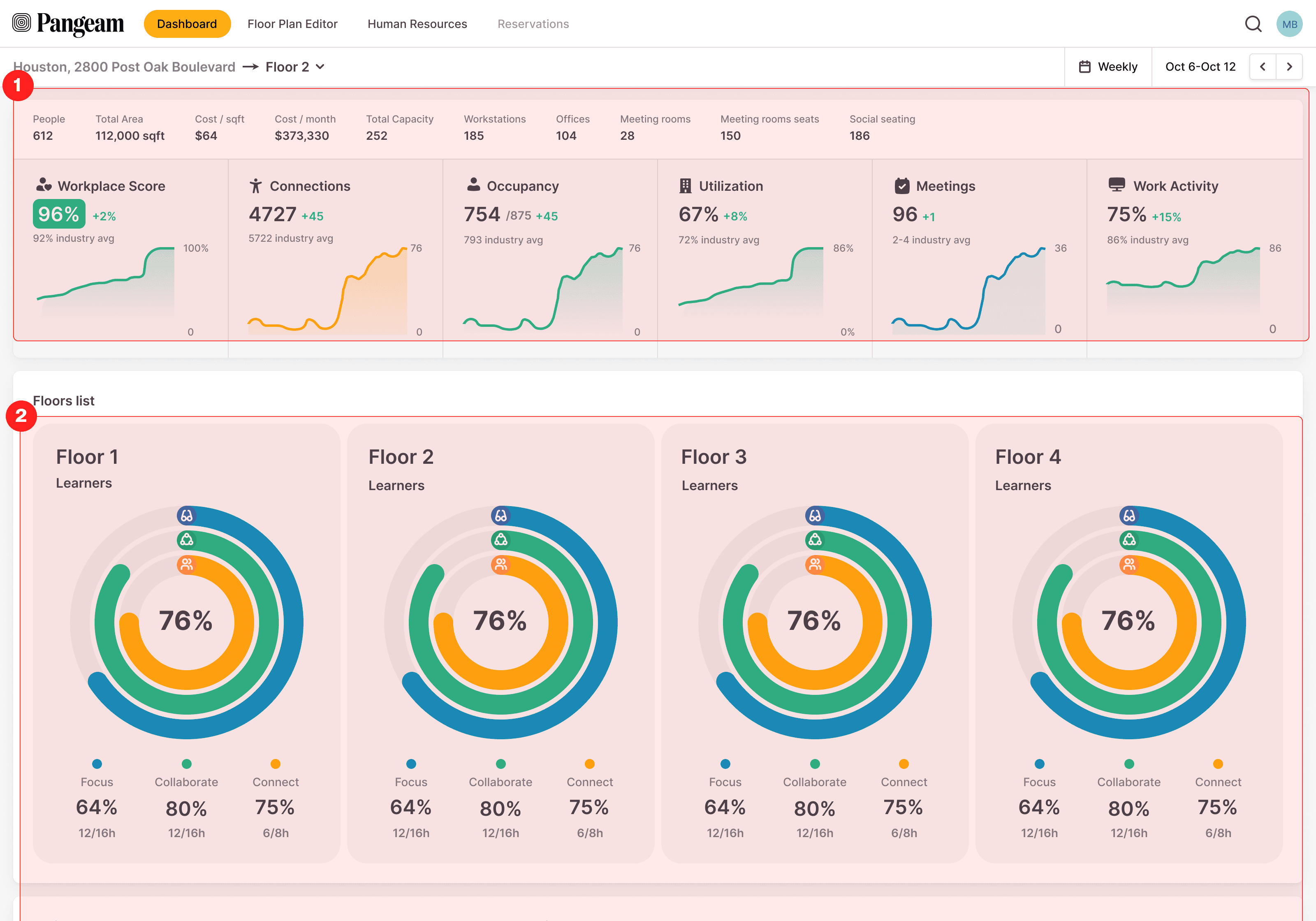
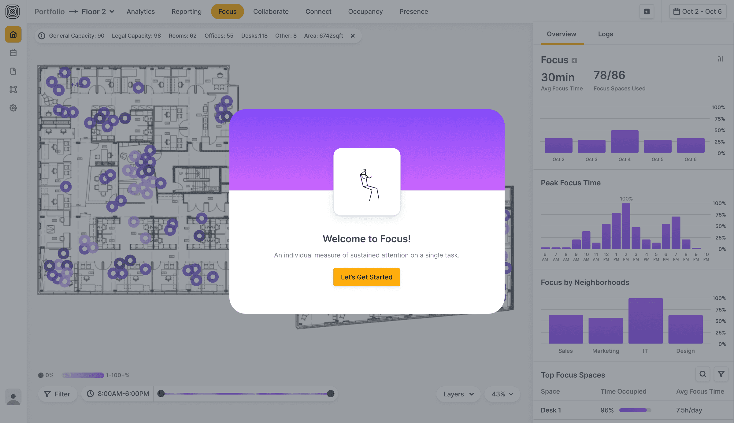
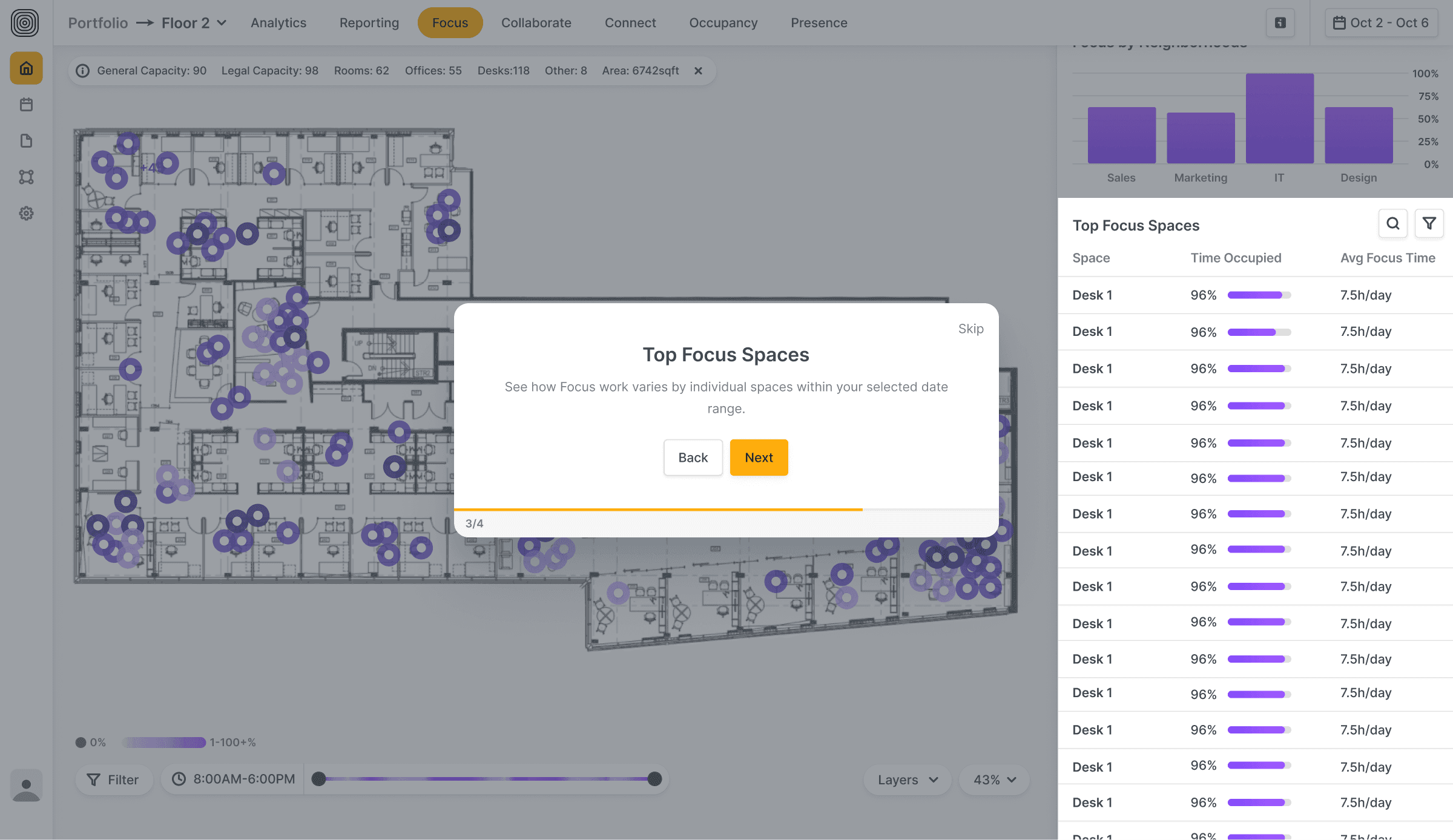
After user interviews and surveys, it was clear the experience needed to center around the floor plan view and its metrics. For the first version, I focused on showcasing key metrics, guiding users on how to combine them for deeper insights. We tested user archetypes, refined reporting flows, and explored early methods to generate data-driven insights.

Prototyping: Key Metrics
Task Completion Rate
34%
90% in final version
What it measures: Percentage of users who successfully complete a task.
UX Question it answers: Can users successfully complete what they came to do?
Key findings:
The floor page was overloaded with tabs, making it hard to distinguish relevant data. Many users missed key interactions.
Users struggled to locate relevant analytics data; switching between the floor page and analytics view created friction.
After simplifying navigation and unifying the analytics view, users completed tasks more confidently and with fewer errors.
Funnel Conversion Rate
50%
80% in final version
What it measures: Percentage of users who complete all steps in a defined flow.
UX Question it answers: How well does our flow perform from start to finish?
Key findings:
Users dropped off during the floorplan upload stage due to unclear instructions and lack of feedback.
Breaking down the flow into smaller, guided steps with clear CTAs improved comprehension and reduced friction.
Introducing a step-based walkthrough significantly increased conversion rates across flows like Building-Floor navigation, Find Data, Calendar, and Floor Plan management.
Task Completion Rate
42%
improvement
What it measures: How long it takes users to complete a key workflow.
UX Question it answers: Is this experience intuitive and efficient for our users?
Key findings:
Hesitation clicks dropped by 50% after improving screen layout and reducing decision fatigue.
Refining onboarding steps and adding contextual tooltips shortened task time significantly.
Clearer microcopy and progressive disclosure helped users focus on just one decision at a time, improving flow speed and accuracy.
Product Validation
To validate our design and business decisions, we conducted multiple rounds of user testing:
Participants: Workplace strategists, Facility managers, HR leaders
Methods: Remote interviews with interested clients.

Product Validation: Key Results
What went well 👍
People love our product!
Validating early prevents costly missteps. Testing concepts before full development helped us avoid building unnecessary features and focus on what mattered most.
User feedback is invaluable. Even when a problem is known, user insights highlight nuances and help align the team.
Simple solutions can unlock big wins. What initially seemed like minor tweaks revealed major usability improvements, leading to higher engagement.
What didn’t go so well 👎
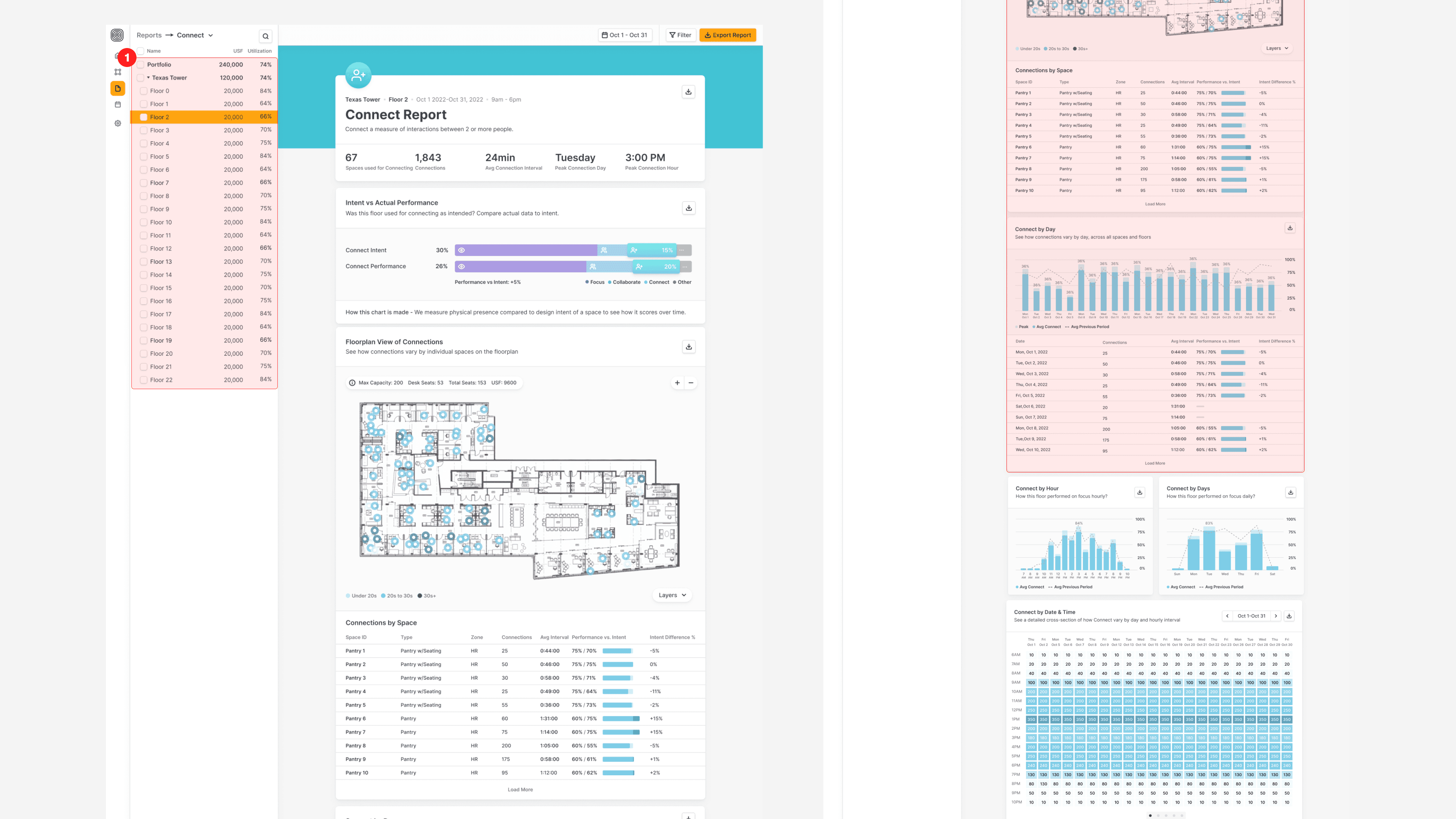
Raw data. Users wanted more than just data – they needed context, guidance, and clear takeaways to make informed decisions.
Poor navigation in Reports. Navigating through the Reports section was unintuitive, leading to user frustration and increased time spent finding key information.
Visual hierarchy. The interface felt cluttered, making it difficult for users to prioritize and process information efficiently.
Hidden analytics section. Users had difficulty locating the analytics section, limiting their ability to gain valuable insights from the platform.
Ways to Improve: Floor Page
BEFORE
1
Overloaded with Tabs: Increased cognitive load and cluttered the interface.
2
Poor UX Constraints: Limited users’ focus on key areas of interest.
3
Disruptive Sidebar: Took up space and broke visual flow.
AFTER
1
Optimized Sidebar Navigation: Reduced cognitive load and saved screen space.
2
Data Visualization: Replaced tabs with interactive data directly on the floor plan.
3
Connect: Simplified patterns for a smoother user experience.

BEFORE
1
Inconsistent UI Pattern: Metrics placement varied across pages, disrupting visual hierarchy and user flow.
2
Low Information Density: Floor list lacked key data points, reducing scannability and efficiency.
AFTER
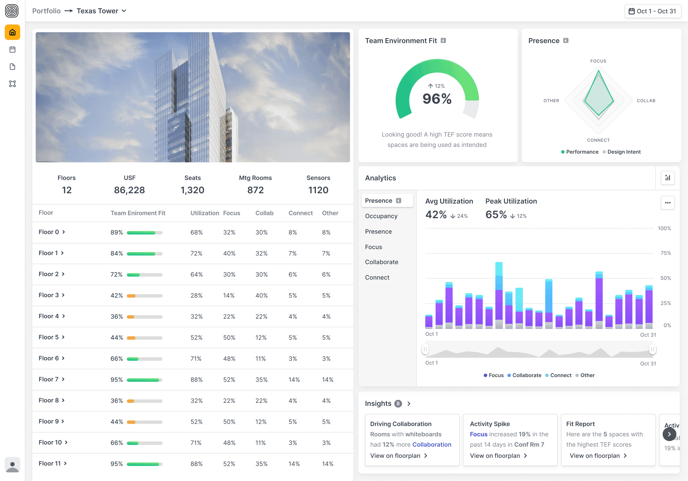
1
Consistent Layout: Aligned metrics on the right to establish a uniform visual pattern and improve cognitive flow across Portfolio, Building, and Floor pages.
2
Improved Data Visibility: Enhanced floor list with richer, more scannable data, boosting usability and quick comparisons.

BEFORE
1
Inefficient Navigation: While the left-hand navigation was intuitive, it struggled to handle large data sets, leading to slow load times and a clunky user experience.
2
Surface-Level Insights: Reports presented raw data effectively, but lacked deeper insights and actionable takeaways, forcing users to manually interpret trends.
AFTER
1
Inefficient Navigation: While the left-hand navigation was intuitive, it struggled to handle large data sets, leading to slow load times and a clunky user experience.
2
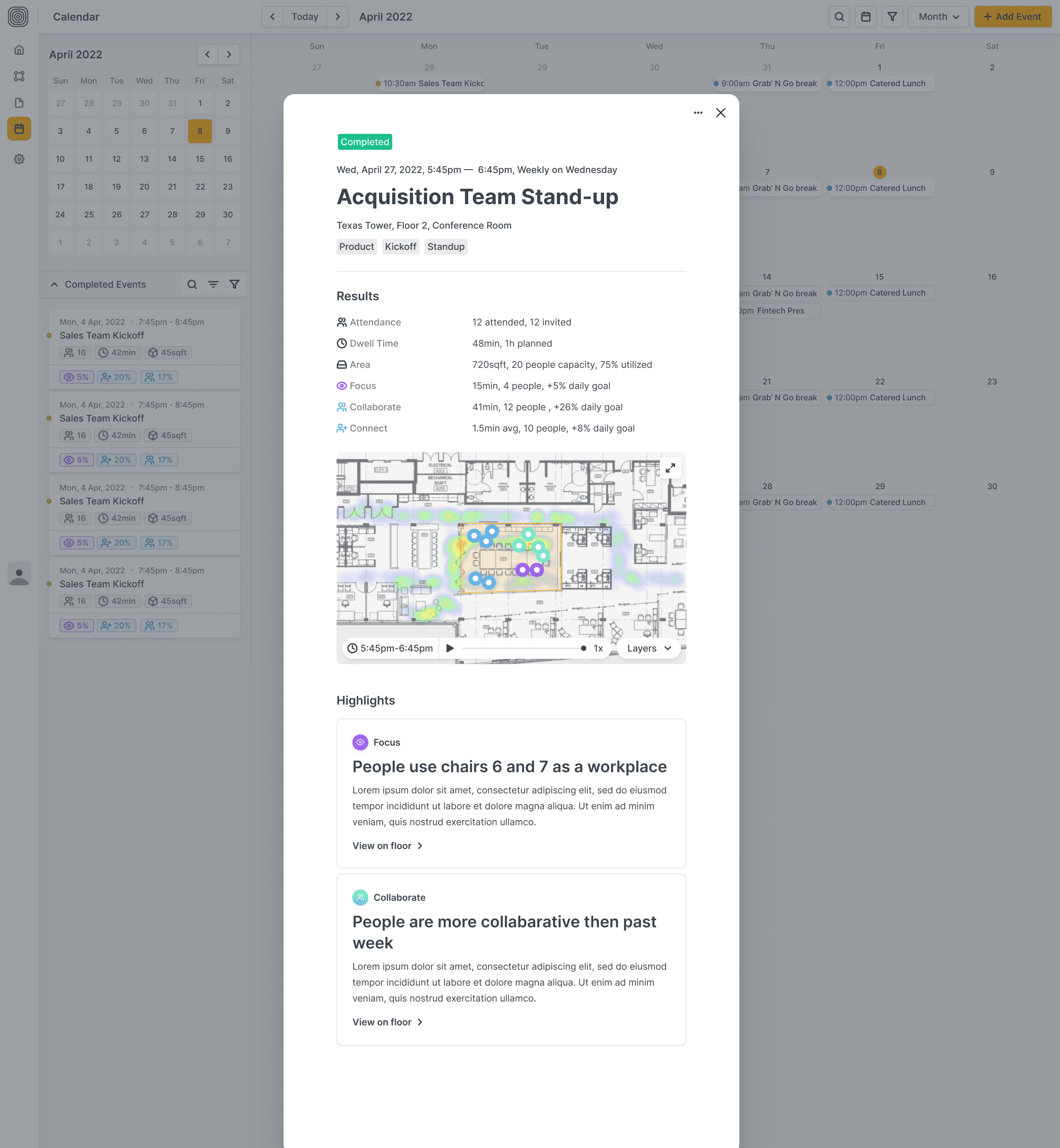
Interventions: Introduced a game-changing tool that tracks how specific changes (like adding a coffee machine) influence floor dynamics, providing clear cause-and-effect insights.

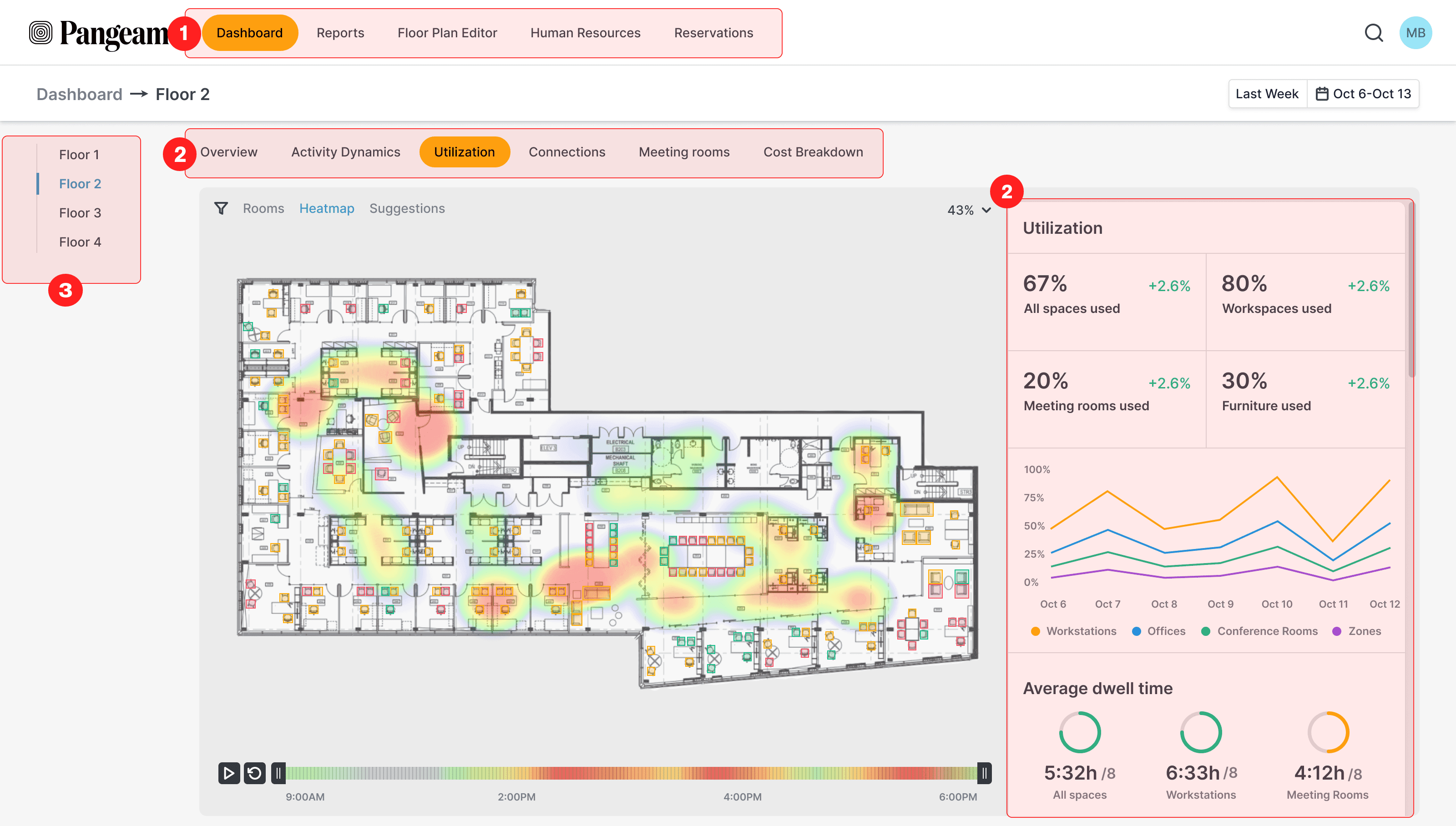
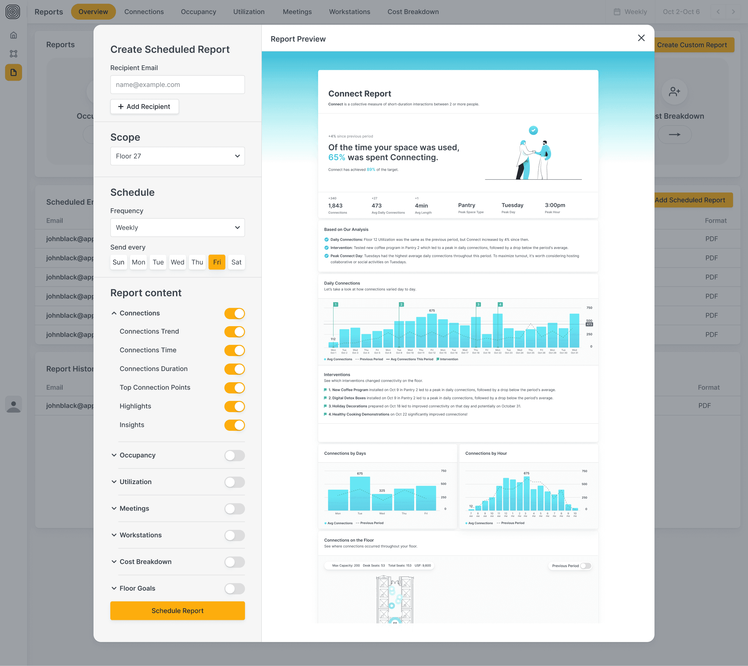
Final Solution
Final Solution
Final Solution
Final Solution
Final Solution
Final Solution
Final Solution
Final Solution
Final Solution
Final Solution
Final Solution
Final Solution
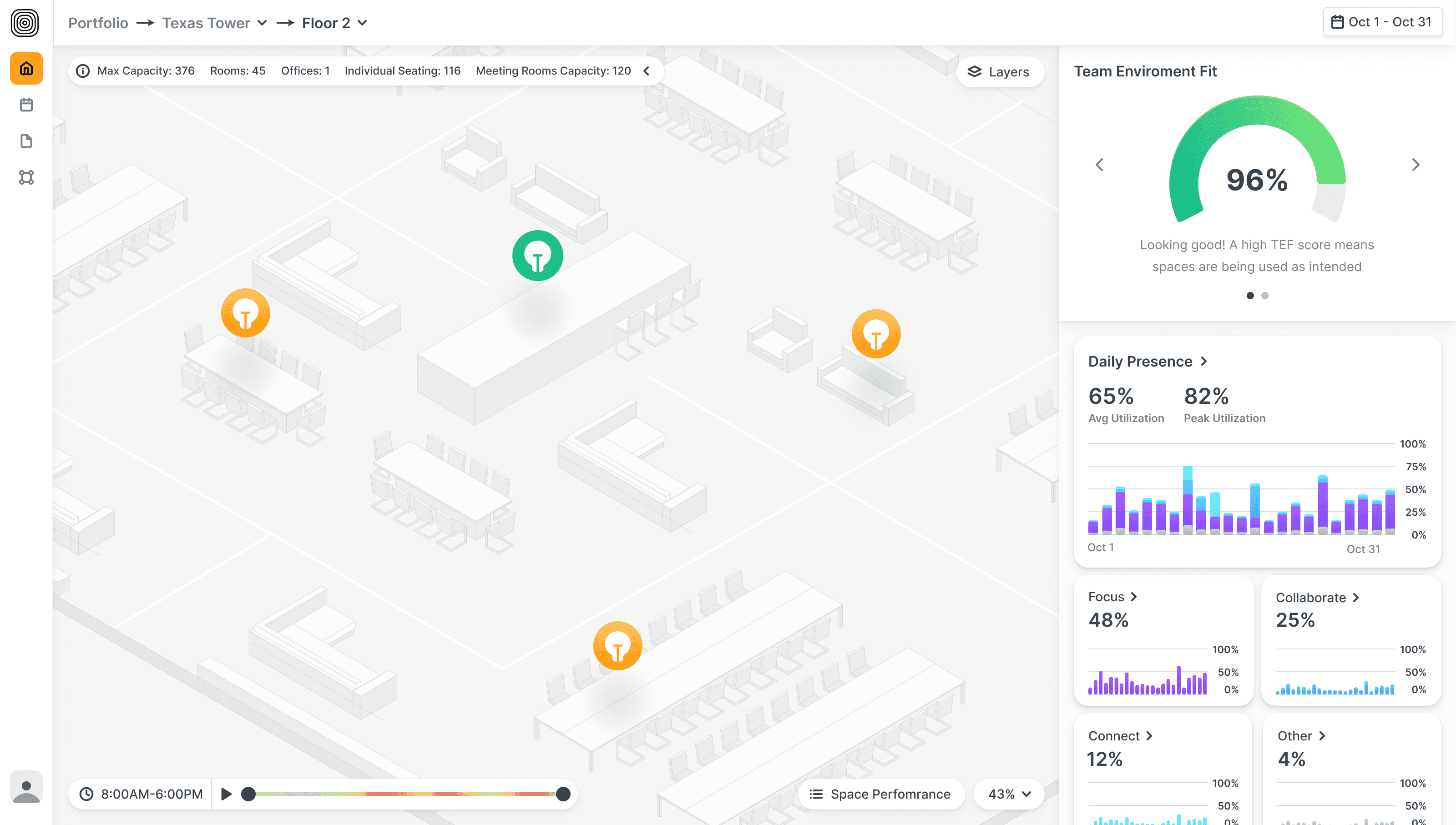
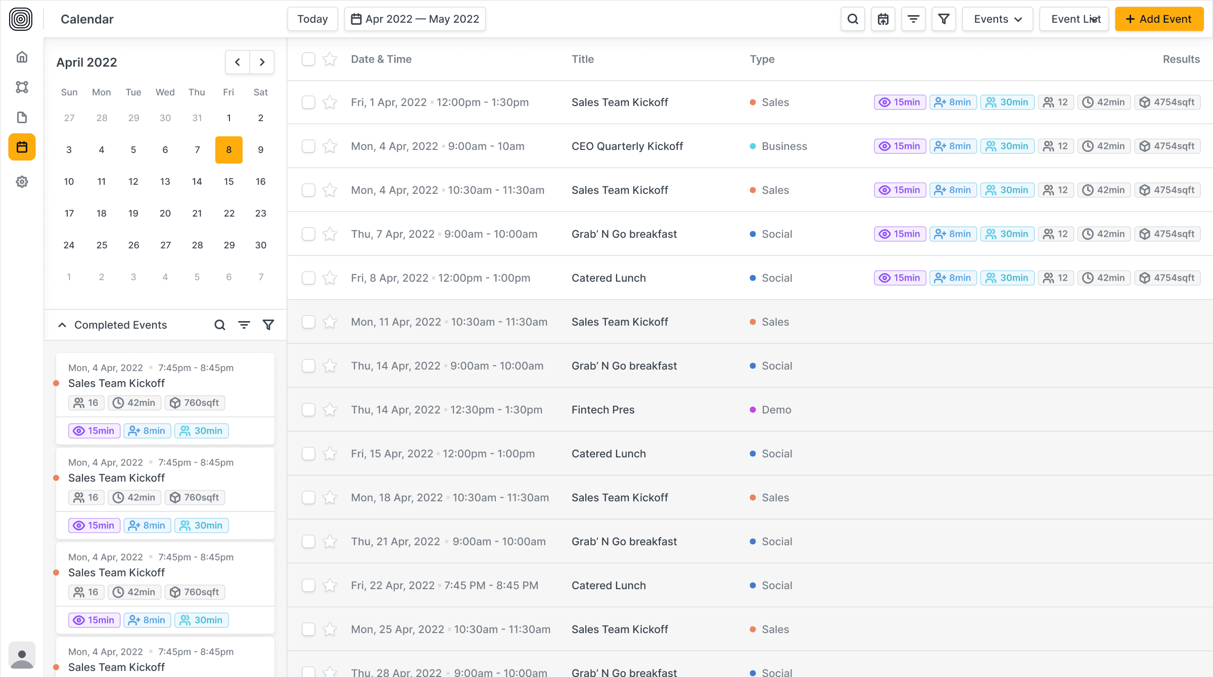
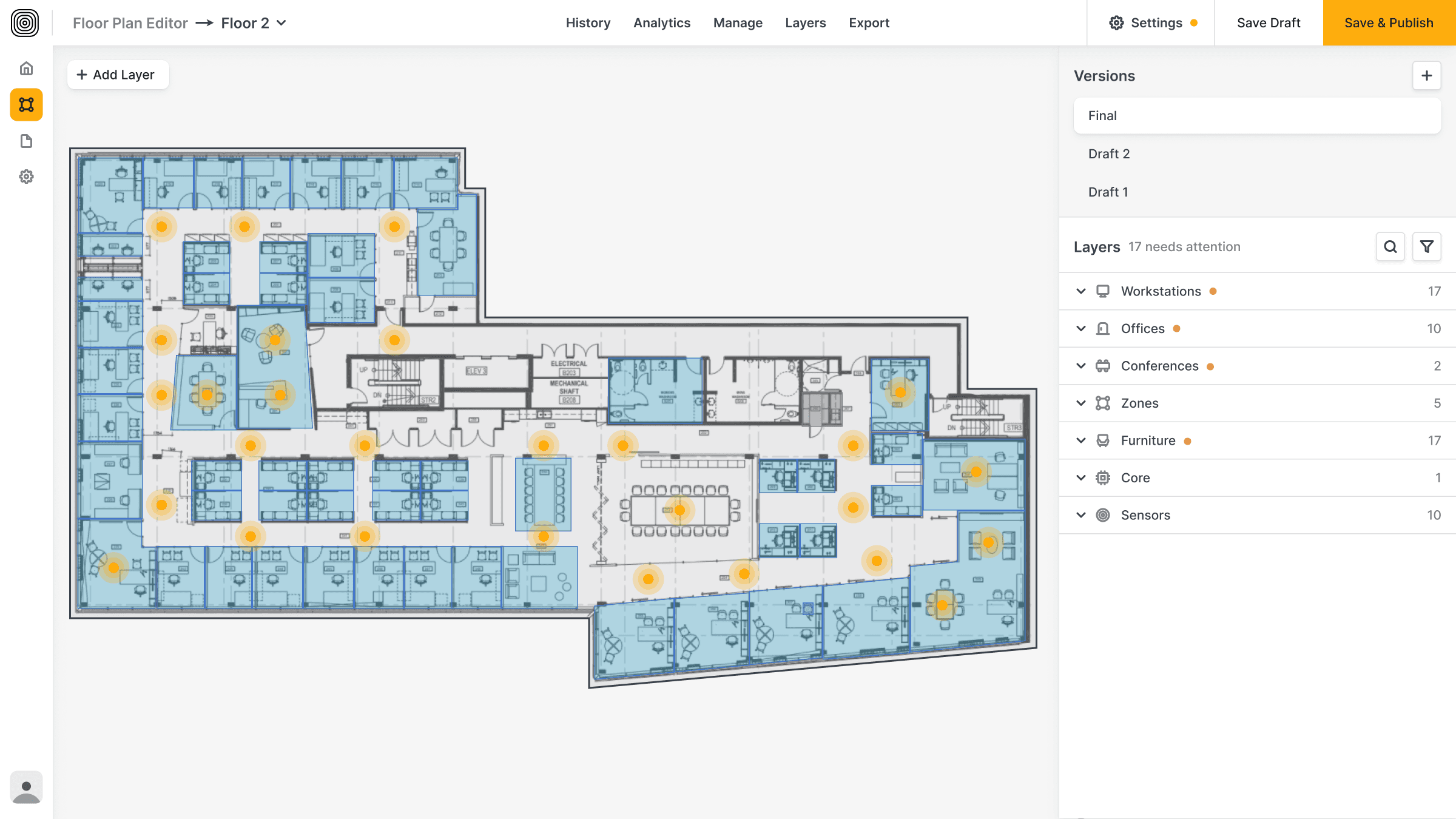
From Portfolio to Floor Dashboard

Calendar


Onboarding flow


Walkthrough


Other Screens


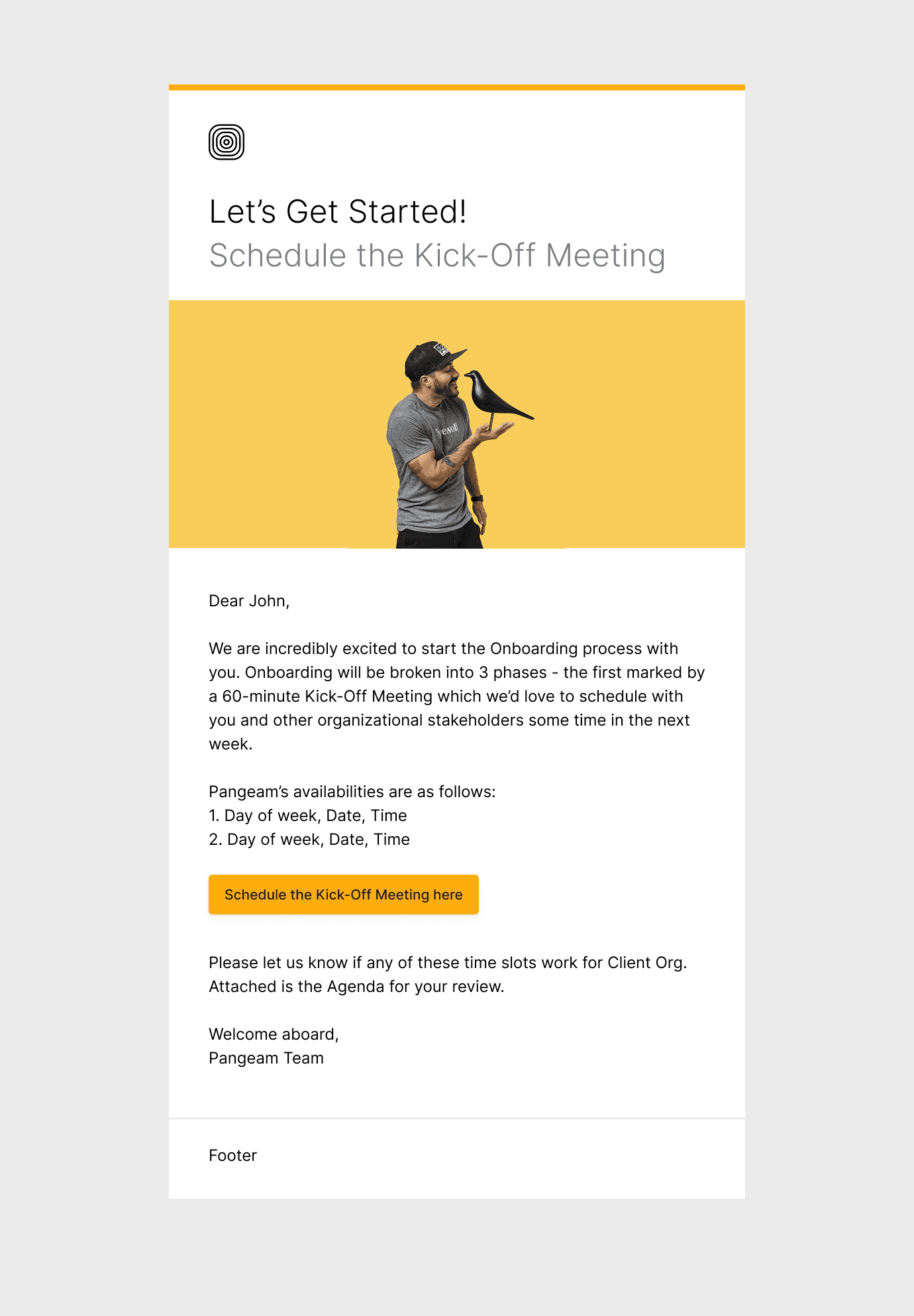
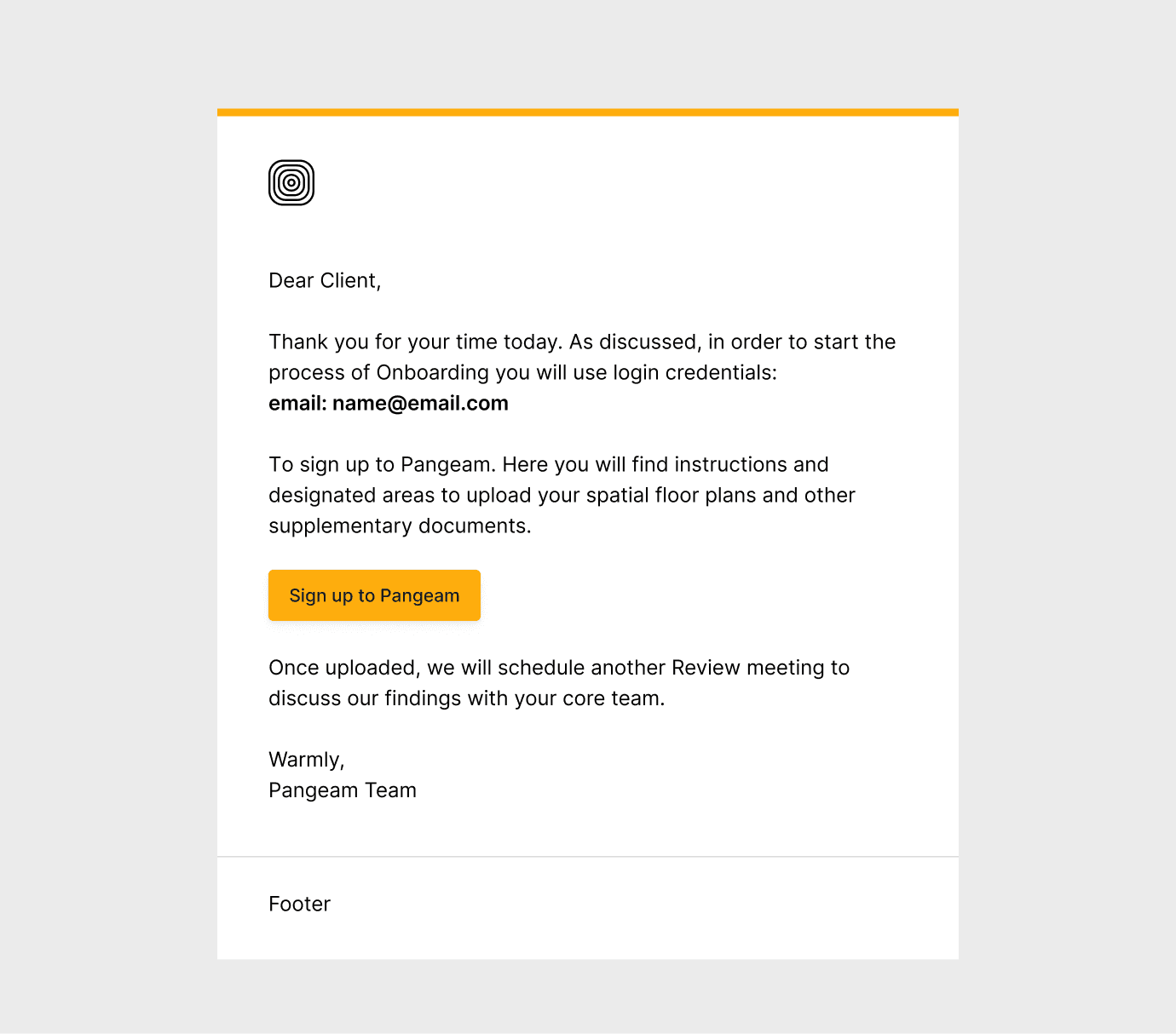
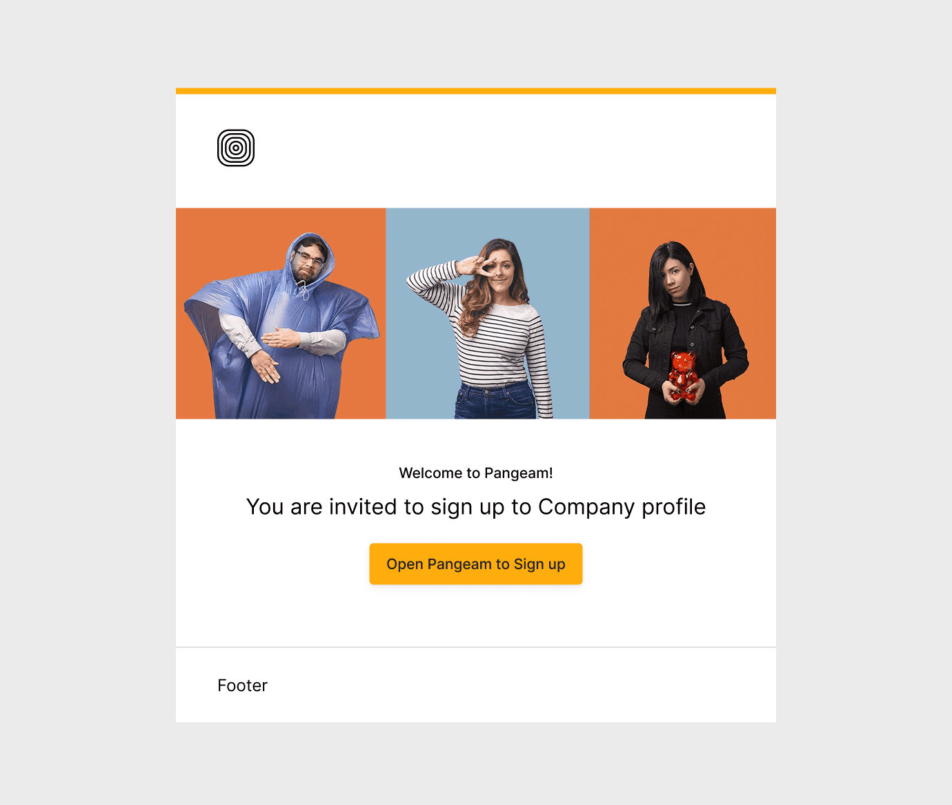
Emails
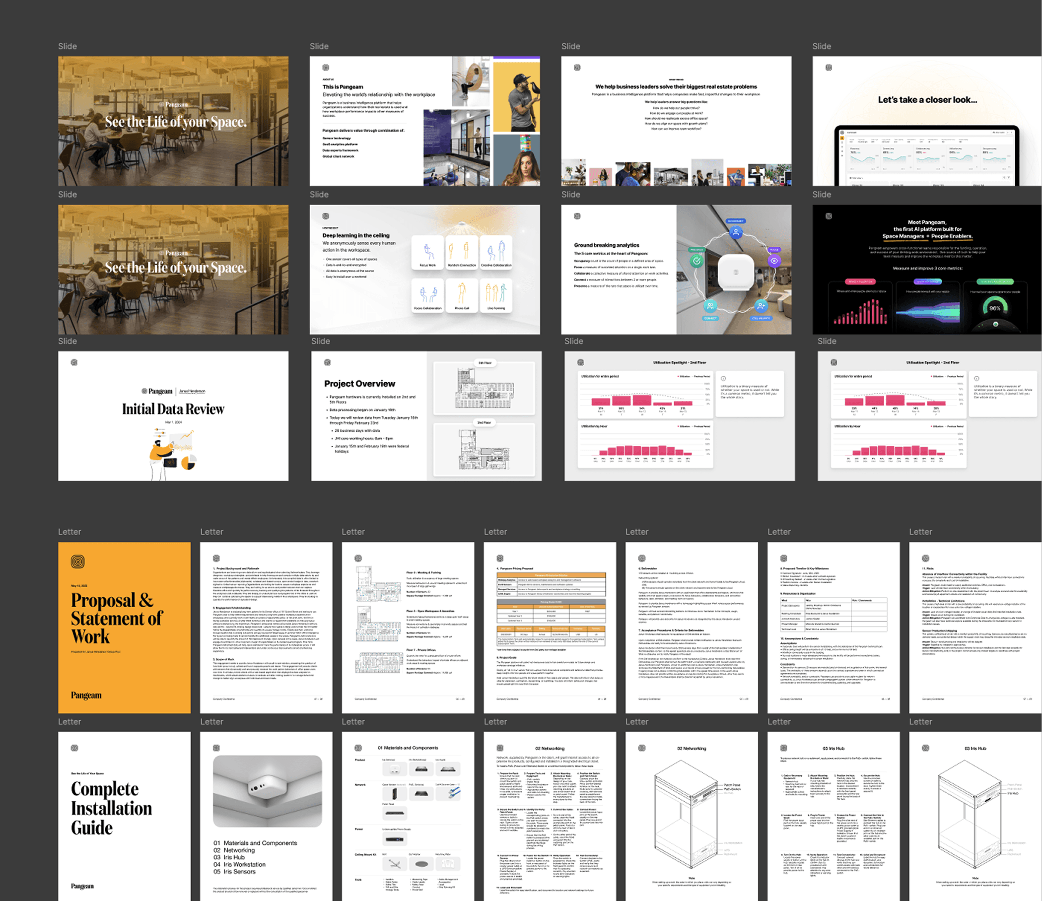
Presentation Decks
To support sales, onboarding, and fundraising, we partnered with stakeholders across teams to create a full suite of presentation materials. We built a dedicated design system in Figma and Google Slides, making it easy for anyone to create polished, on-brand decks without starting from scratch.
Deliverables included:
Sales decks
Live demo slides
Onboarding and install guides
White papers
Proposal and RFP templates
Investor pitch decks
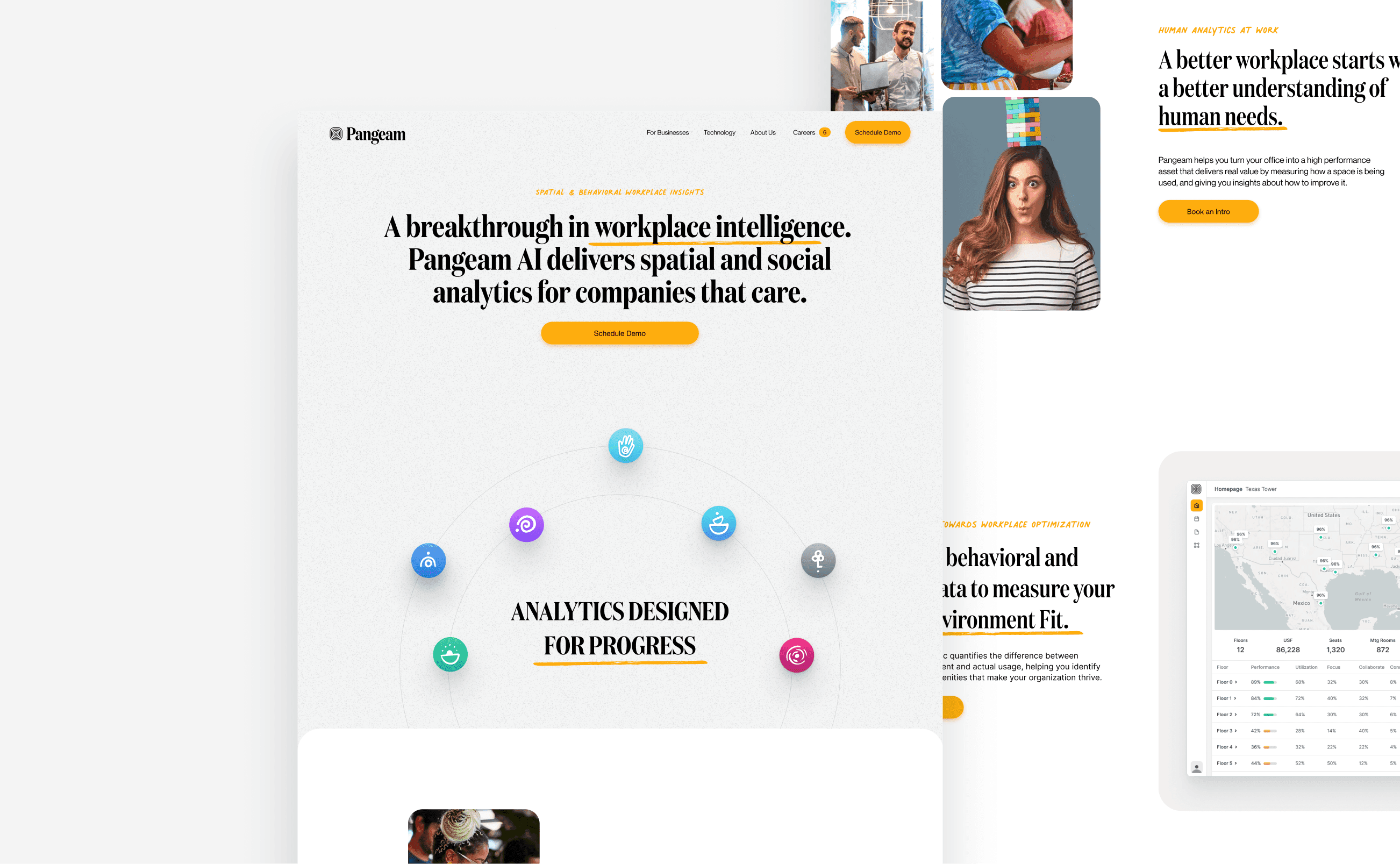
Website
As the Lead Designer, I initiated the website redesign by gathering input from cross-functional stakeholders and reviewing existing research on our target audience. I worked closely with leadership to define clear goals to increase conversion rates, clarify the product’s value, and support sales efforts. We also established success metrics to track post-launch performance.
I designed, built, and launched the site using Framer, selecting it for its flexibility and speed. I incorporated subtle interactive elements to enhance engagement while keeping the experience focused and accessible. I also explored integrating 3D visuals with Spline, but after multiple optimization attempts, I made the call to deprioritize them in favor of faster load times and a smoother user experience. This set the foundation for a high-performing, conversion-driven site.
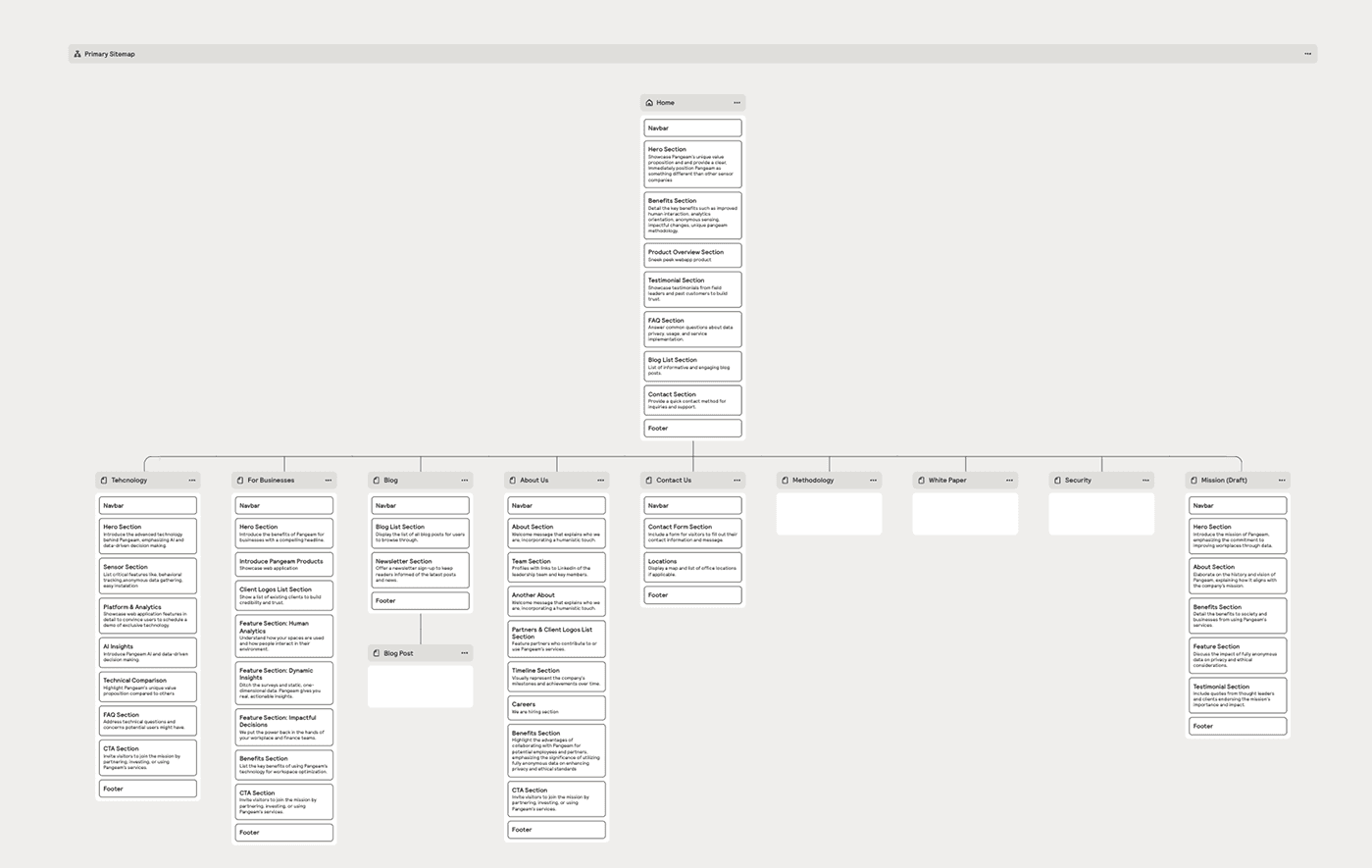
Website: Process
We collaborated closely with stakeholders to bring Pangeam’s website to life. We kicked things off with a brainstorming session in Figma, where we shared ideas, explored insights from previous research, and aligned on goals. I created an initial sitemap to define structure, followed by wireframes to map out key flows and content priorities.
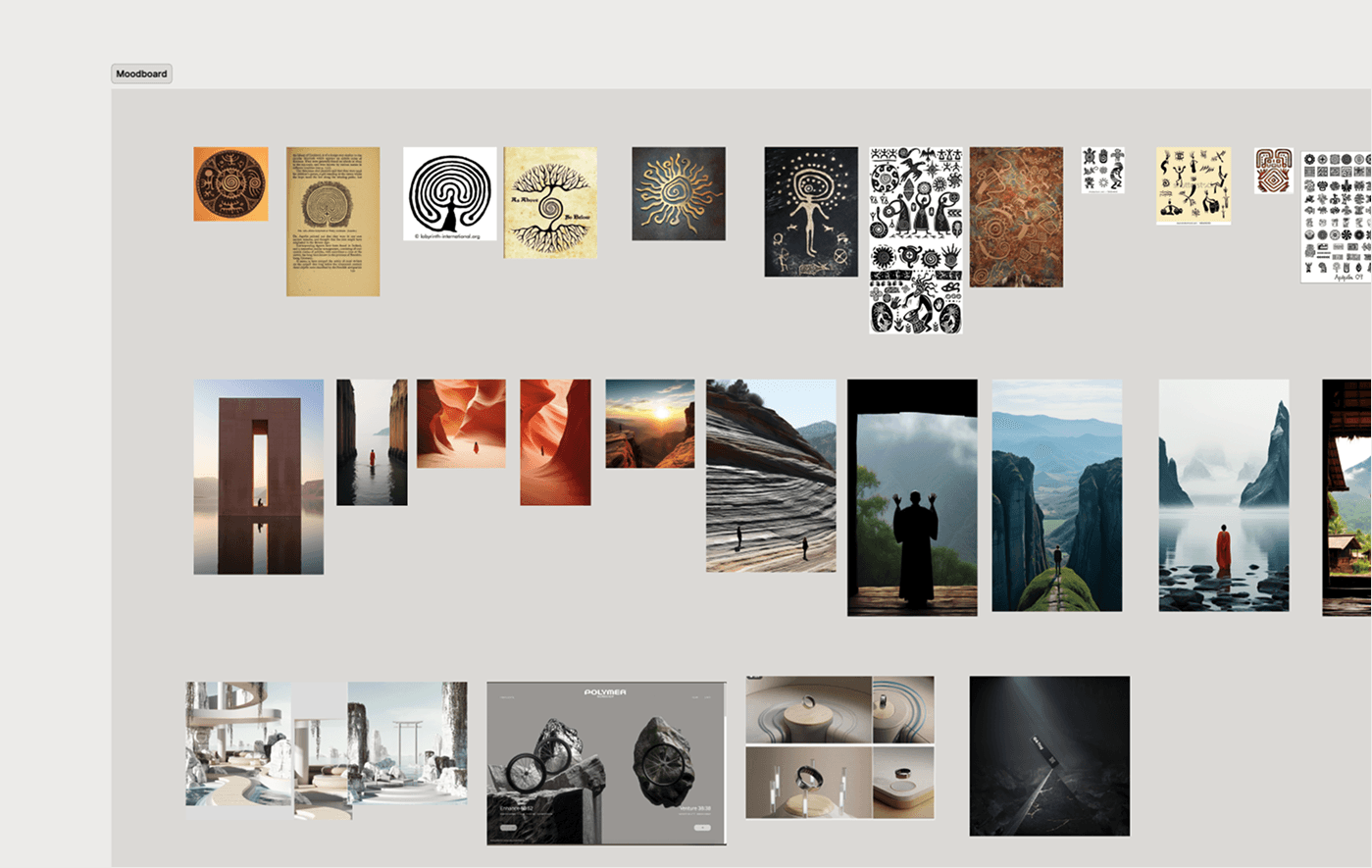
In parallel, we refined the messaging and worked on copy together. To shape the visual direction, I put together a moodboard that captured the tone and feel we wanted—clean, intelligent, and forward-thinking—fully aligned with the brand identity. From there, I explored a few visual concepts before landing on the final design, which balanced clarity, credibility, and a modern, tech-forward aesthetic.


Website: Home Page
Website: For Businesses
Website: Technology

Ideation: Key Results
What went well 👍
User interviews uncovered lots of user behavior that steered the project in a meaningful direction.
Inviting more team members to collaborate broadened our perspective, leading to the discovery of new feature opportunities.
What didn’t go so well 👎
We tend to have too many features for MVP, which was a development challenge until we focused on the most important features.
Some key requirements shifted midway through prototyping, forcing last-minute redesigns and increasing development complexity.