
iamvisp@gmail.com Click to copy email Copied to clipboard!

Pangeam

Pangeam reveals how office spaces are used, tracks behavioral change, and identifies ways to optimize them, without tracking individuals.

I led the full 0→1 design journey: from vision and research to MVP validation and scalable design systems. The platform launched with clients like Adobe, Centene, AT&T, and Hines, and helped secure a $4.2M seed raise to scale the next phase.

My role
Senior Product Designer
Timeline
2022 Q4 – 2025 Q2 (2.5 years)
Team
CEO, PM, R&D, 2 FE, 2 Engineers
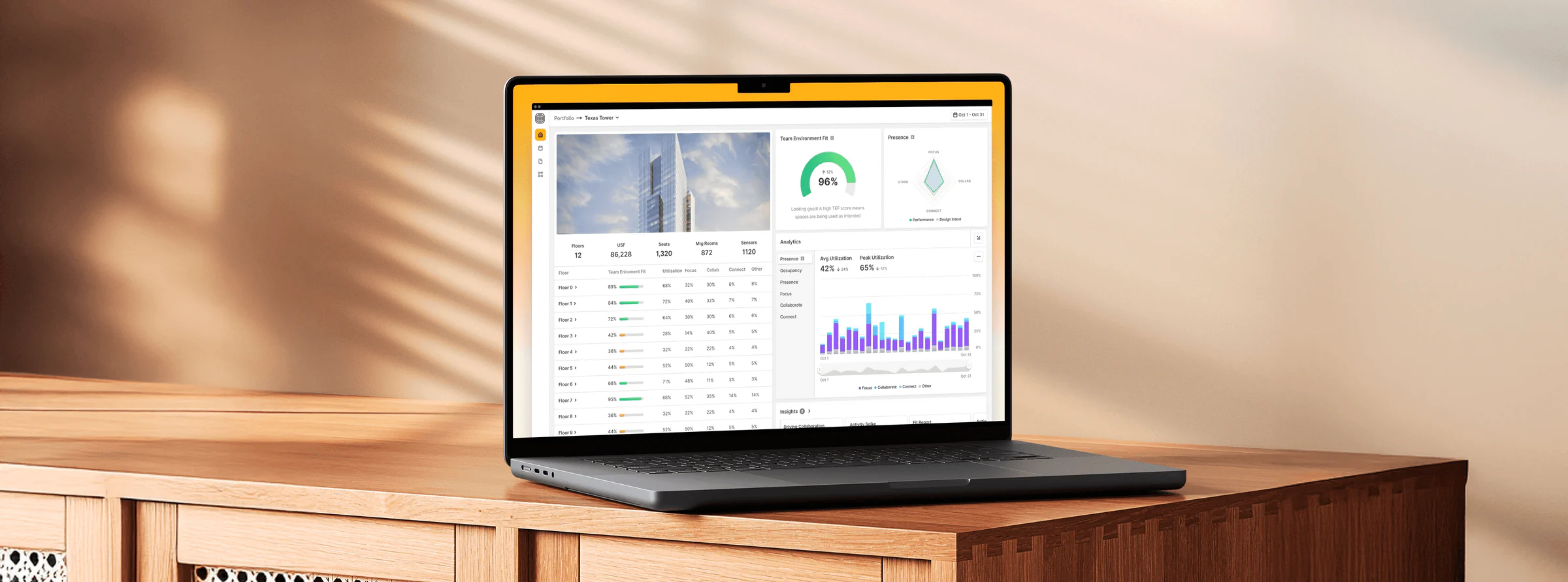
Pangeam — product imagery

Key contributions

  • Led end-to-end product design from research through implementation.
  • Developed the core behavioral framework that became the product's foundation.
  • Created a scalable design system supporting rapid feature development.
  • Facilitated cross-functional collaboration between business, engineering, and research teams.
  • Translated complex spatial data into intuitive visualizations for non-technical users.

Impact

  • Platform launched with enterprise clients including Adobe, Centene, AT&T, and Hines.
  • Helped secure $4.2M seed funding to scale the product.
  • Reduced workspace optimization decision time by 65%.
  • Increased space utilization efficiency by 32% across client implementations.

The challenge

Modern workspaces are dynamic ecosystems that require continuous, thoughtful observation to optimize. Before Pangeam, workplace teams faced three critical challenges:

  • Workplace Changes Driven by Guesswork: Facilities managers made critical space allocation decisions based on subjective observations and anecdotal feedback rather than objective data.
  • Underutilized Spaces Increasing Costs: Companies were spending millions on office space without understanding actual usage patterns, leading to significant waste.
  • No Data on Event-Driven Engagement: Organizations lacked visibility into how specific events, layouts, or amenities affected employee behavior and engagement.
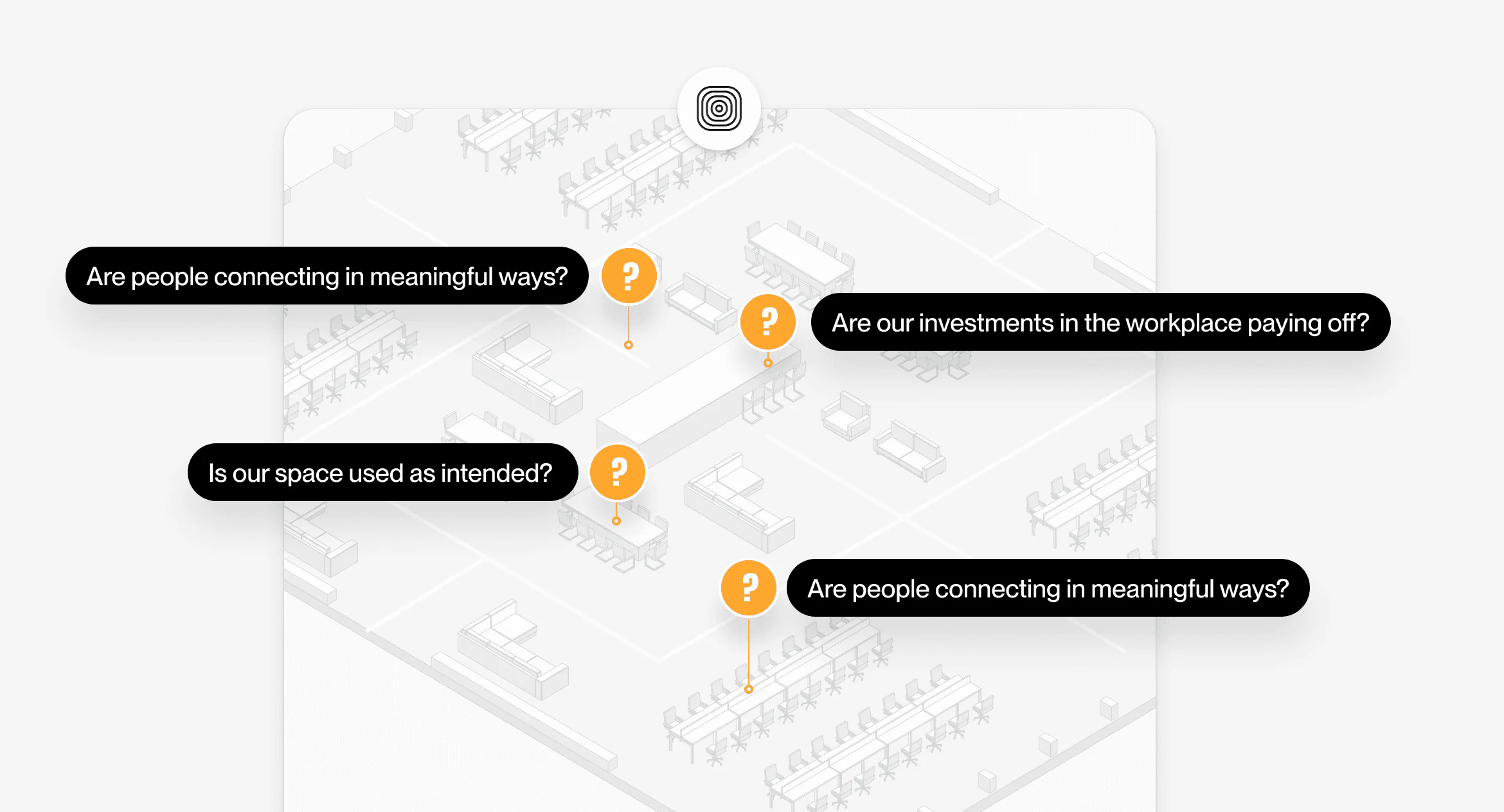
Isometric floor plan annotated with the questions workplace teams could not answer

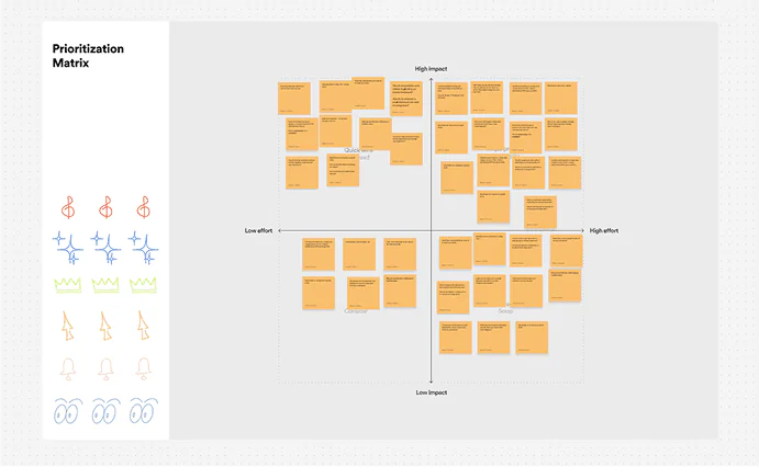
Research & discovery

To deeply understand the problem space, we conducted:

  • Stakeholder Interviews: 15 interviews with facilities managers, workplace strategists, and real estate decision-makers across industries.
  • Competitive Analysis: Evaluated existing solutions including occupancy sensors, badge data systems, and manual tracking methods.
  • Contextual Inquiry: On-site observations at 5 different enterprise workplace environments.

Key insights:

  • Insight Translation Gap: Existing solutions provided raw occupancy data but failed to translate it into actionable insights for non-technical stakeholders.
  • Behavioral Context Missing: Simple presence/absence data wasn't enough; understanding the types of activities happening in spaces was crucial for optimization.
  • ROI Demonstration Challenge: Workplace teams struggled to justify investments without clear metrics showing the impact of space changes.
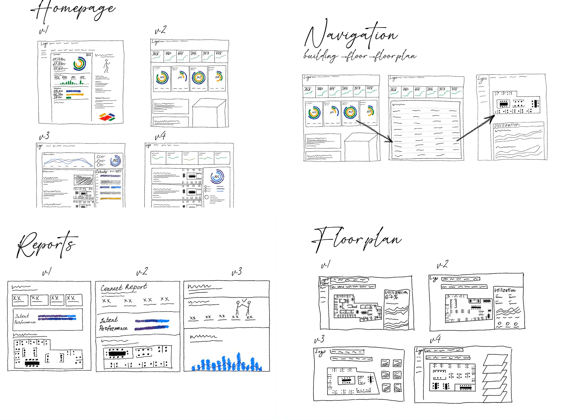
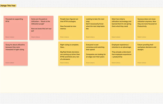
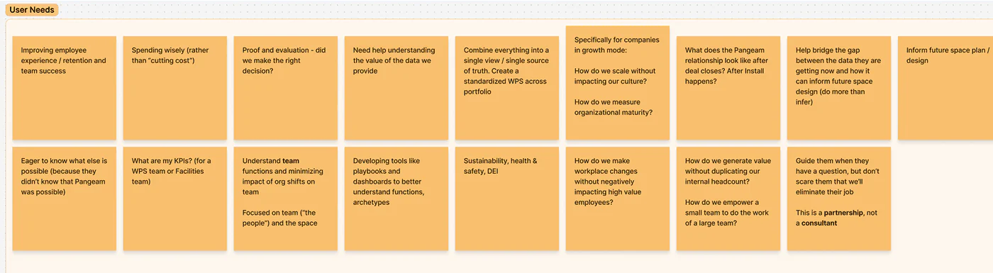
Research artefacts — 1 of 5
Research artefacts — 2 of 5
Research artefacts — 3 of 5
Research artefacts — 4 of 5
Research artefacts — 5 of 5

Hardware solution

AI-driven depth sensor, anonymously detects human activities and interactions.

  • Privacy-First Design: Sensors capture depth data only, with no personally identifiable information
  • Behavioral Classification: AI differentiates among focusing, collaborating, and connecting activities
  • Scalable Deployment: Modular system that can be installed in various workspace configurations

Software solution

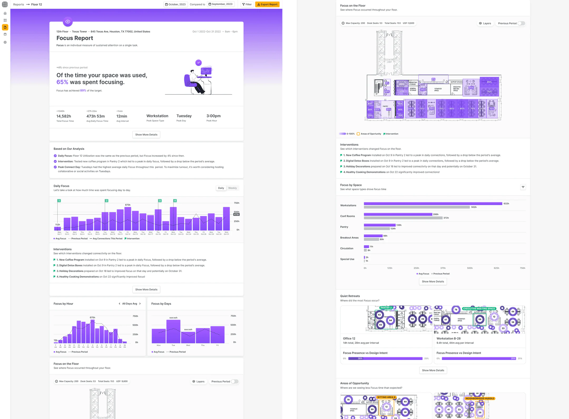
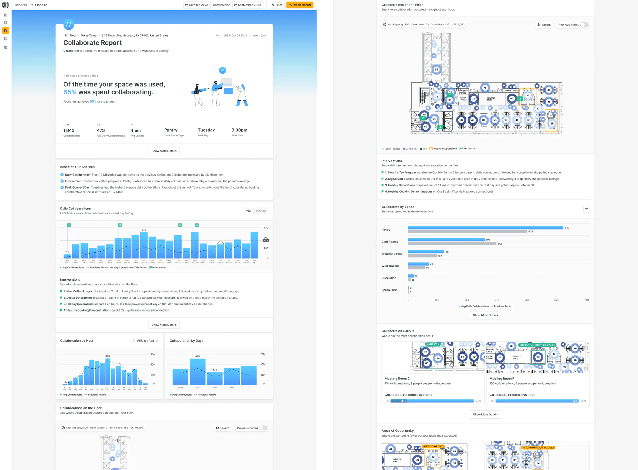
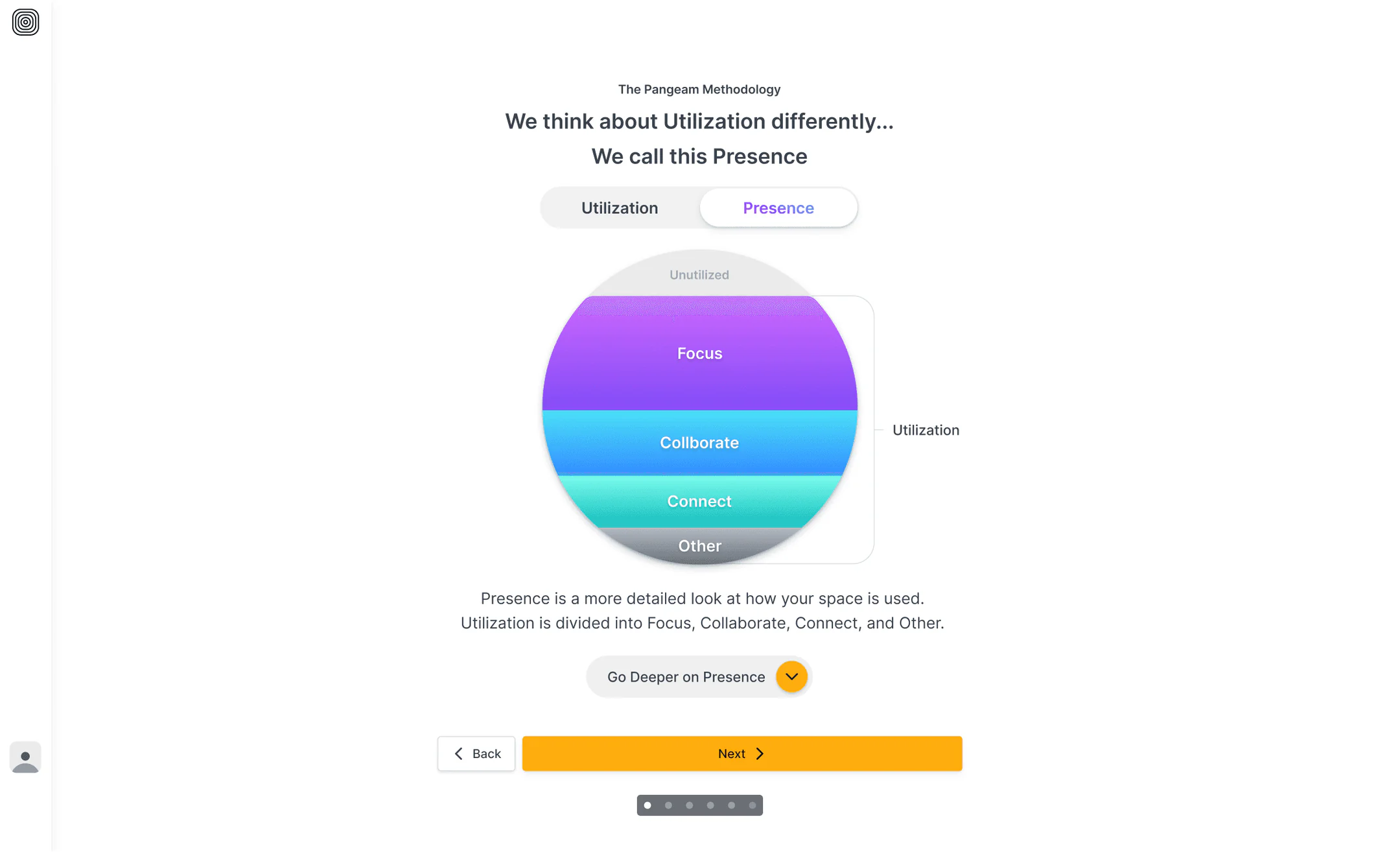
AI-powered software transformed sensor data into human-readable insights. Working with our co-founder and workplace strategist, Pete Bacevice, I helped develop the Focus / Collaborate / Connect / Other model — our core behavioral framework for understanding how space is used:

  • Focus: Individual work that requires concentration
  • Collaborate: Team-based work and structured meetings
  • Connect: Informal interactions and relationship-building
  • Other: Transitions, movement, and miscellaneous activities

This framework translated complex behavioral data into intuitive categories that resonated with both workplace teams and executive stakeholders.

First prototypes

Before moving into implementation, we began by validating our concepts with potential customers — leaders in workplace strategy.

We ran user interviews with potential customers — testing early flows and exploring their goals. By asking the right questions, we uncovered friction points, revealed new feature opportunities, and heard exactly what we hoped for: “This is what we’ve been looking for.”

Early prototype screens used in customer interviews

First prototypes: key metrics

Task Completion Rate

34% 90% in final version

What it measures: Percentage of users who successfully complete a task.

UX Question it answers: Can users successfully complete what they came to do?

Key findings:

  • The floor page was overloaded with tabs, making it hard to distinguish relevant data. Many users missed key interactions.
  • Users struggled to locate relevant analytics data; switching between the floor page and analytics view created friction.
  • After simplifying navigation and unifying the analytics view, users completed tasks more confidently and with fewer errors.
Funnel Conversion Rate

50% 80% in final version

What it measures: Percentage of users who complete all steps in a defined flow.

UX Question it answers: How well does our flow perform from start to finish?

Key findings:

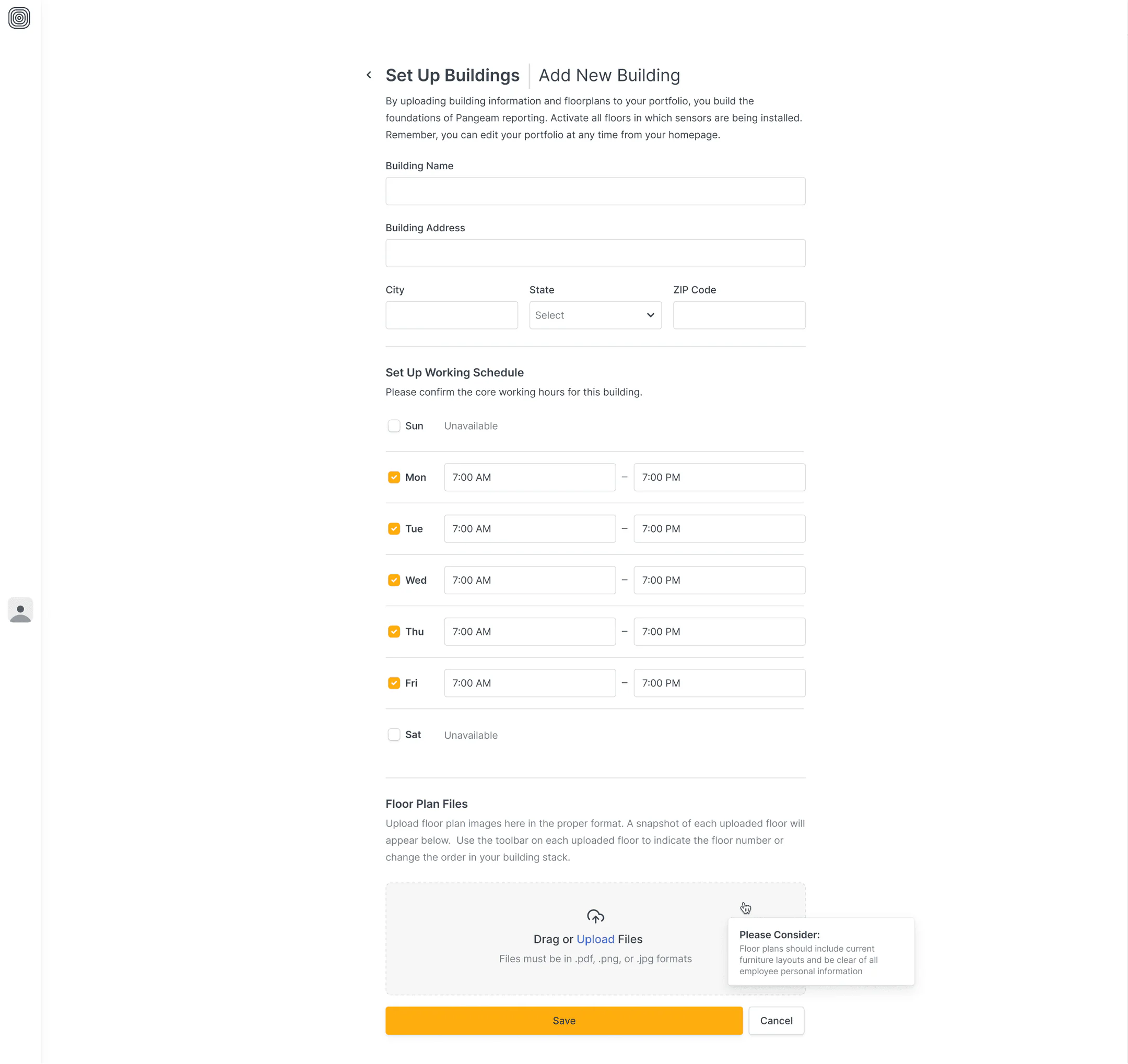
  • Users dropped off during the floorplan upload stage due to unclear instructions and lack of feedback.
  • Breaking down the flow into smaller, guided steps with clear CTAs improved comprehension and reduced friction.
  • Introducing a step-based walkthrough significantly increased conversion rates across flows like Building-Floor navigation, Find Data, Calendar, and Floor Plan.

Task Completion Rate

42% improvement

What it measures: How long it takes users to complete a key workflow.

UX Question it answers: Is this experience intuitive and efficient for our users?

Key findings:

  • Hesitation clicks dropped by 50% after improving screen layout and reducing decision fatigue.
  • Refining onboarding steps and adding contextual tooltips shortened task time significantly.
  • Clearer microcopy and progressive disclosure helped users focus on just one decision at a time, improving flow speed and accuracy.

Key Takeaways: What didn’t go so well 👎

  • Raw data. Users wanted more than just data – they needed context, guidance, and clear takeaways to make informed decisions.
  • Poor navigation in Reports. Navigating through the Reports section was unintuitive, leading to user frustration and increased time spent finding key information.
  • Visual hierarchy. The interface felt cluttered, making it difficult for users to prioritize and process information efficiently.
  • Hidden analytics section. Users had difficulty locating the analytics section, limiting their ability to gain valuable insights from the platform.

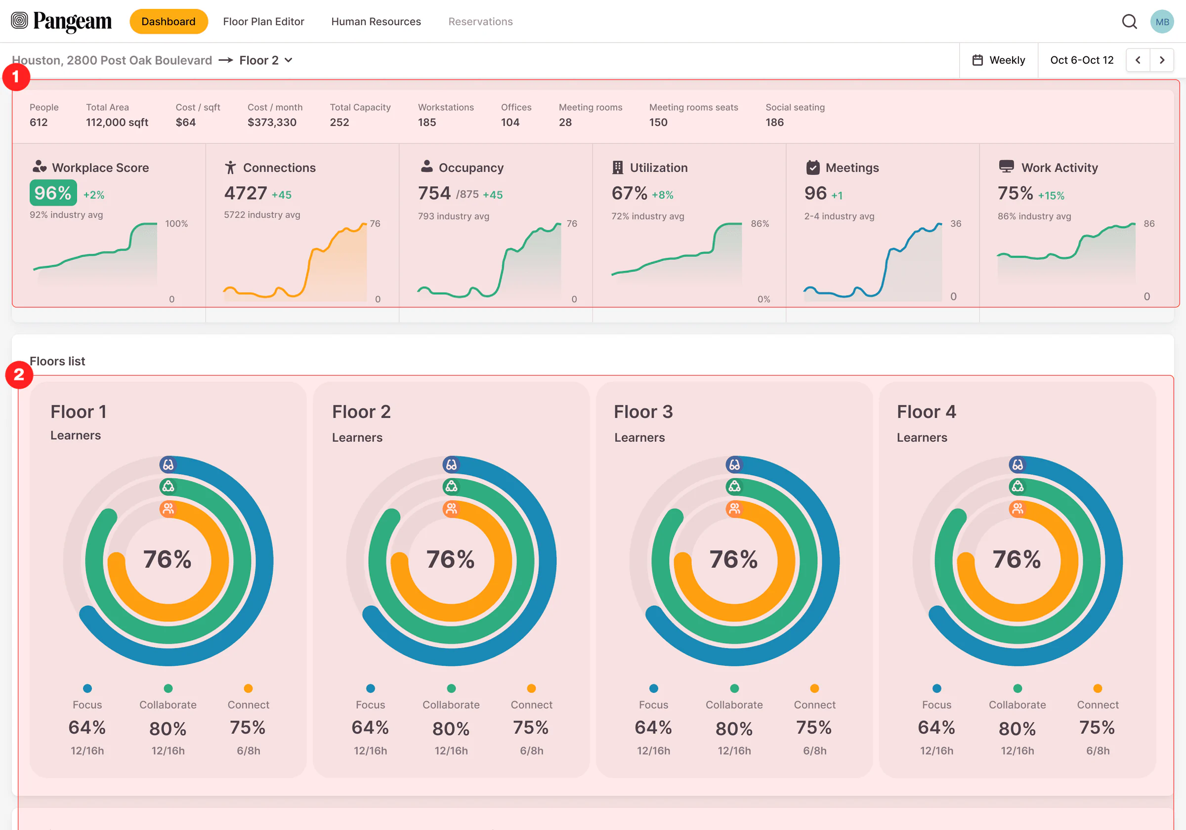
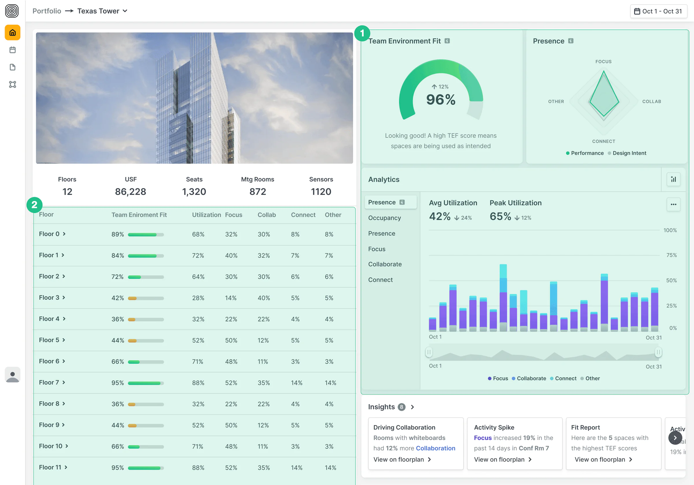
Homepage

A central hub for workplace strategy teams, HR leaders, and executives.

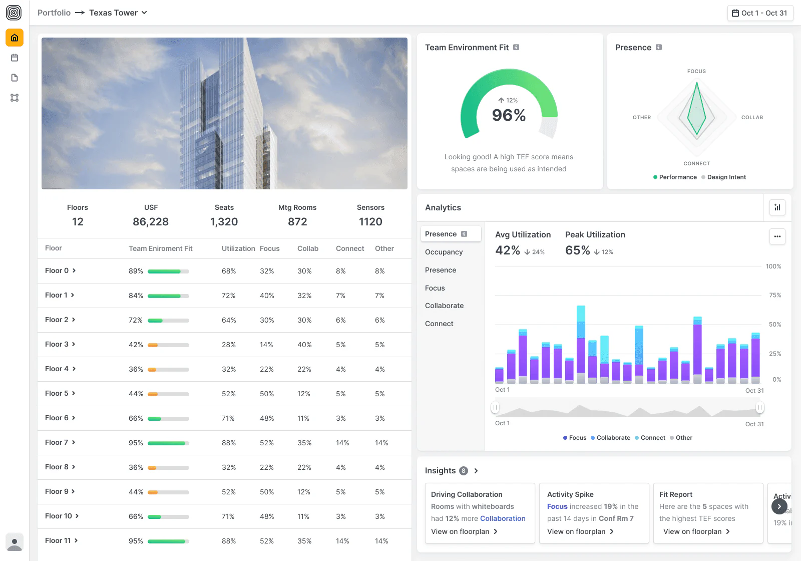
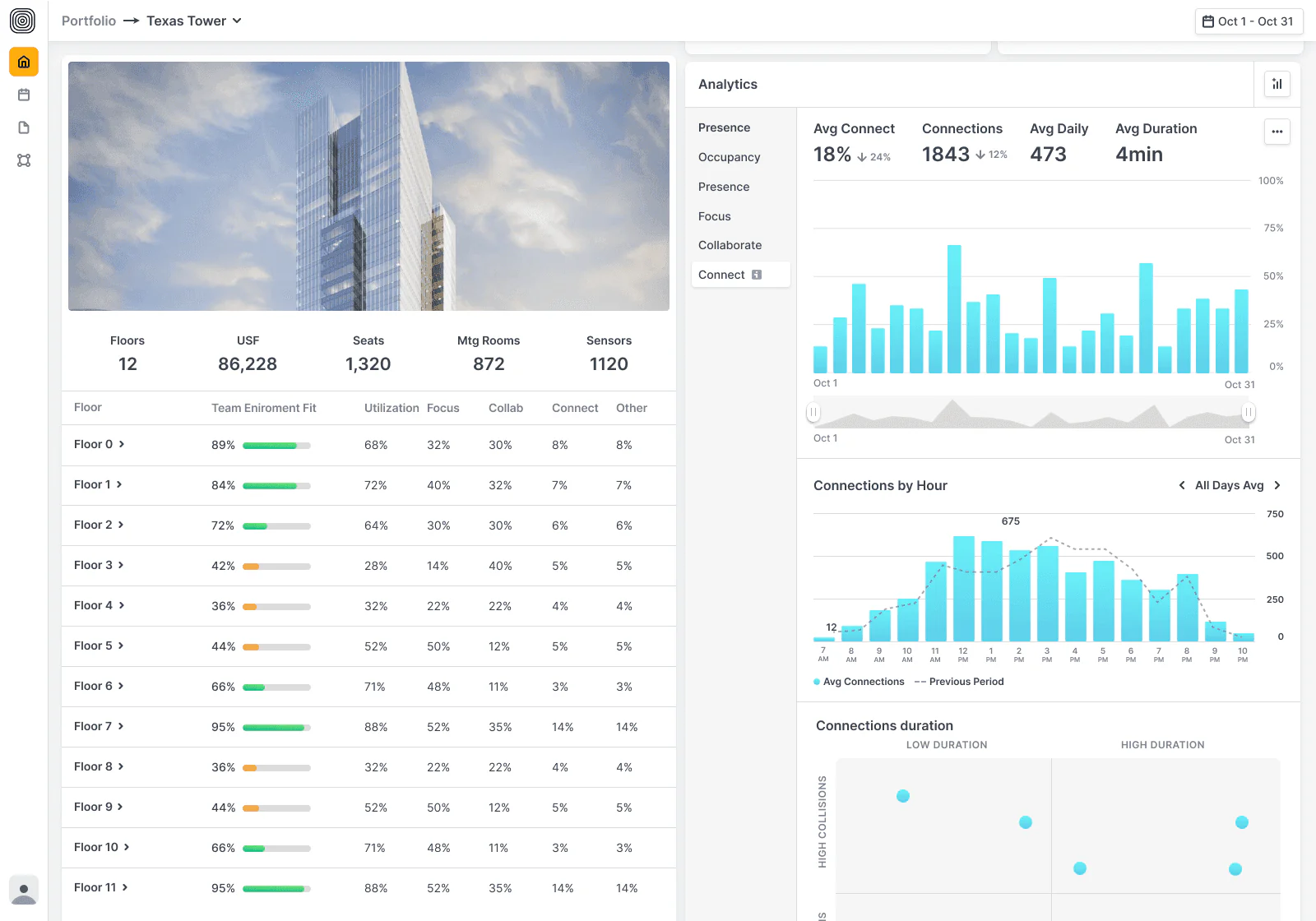
We reimagined this page to stop the guesswork—bringing clarity to how buildings are performing across a portfolio. With quick access to team fit scores, presence insights, and analytics, leaders can spot underperforming spaces and take action faster.

The MVP homepage, dense with metrics

MVP. Areas for improvements

  • Too Basic Metrics: User testing revealed a need for deeper insights—existing metrics didn’t show whether space was used as intended.
  • Confusing Navigation: The layout didn’t match user mental models. Floor pages felt disconnected.

Final solution

  • Improved Metrics: We realigned visuals and content to quickly answer: “Is this space working?”
  • Improved Navigation: Floor-level navigation now follows consistent patterns across the product.
Homepage — final solution — 1 of 3
Homepage — final solution — 2 of 3
Homepage — final solution — 3 of 3

Floor Page

For teams managing day-to-day environments.

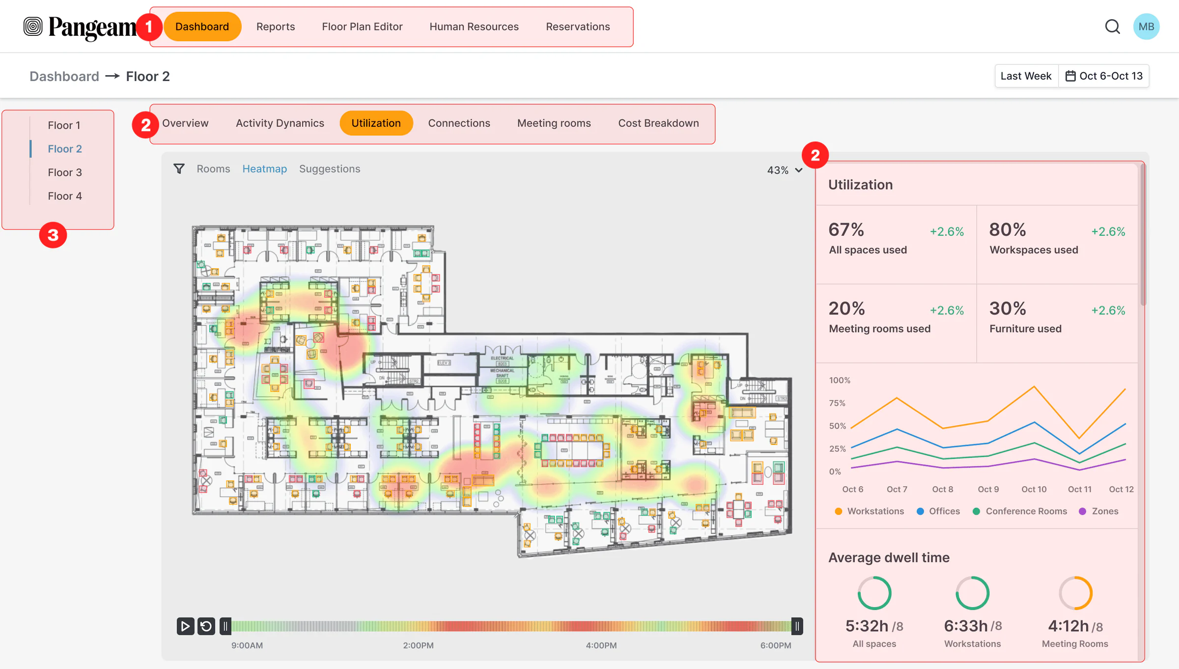
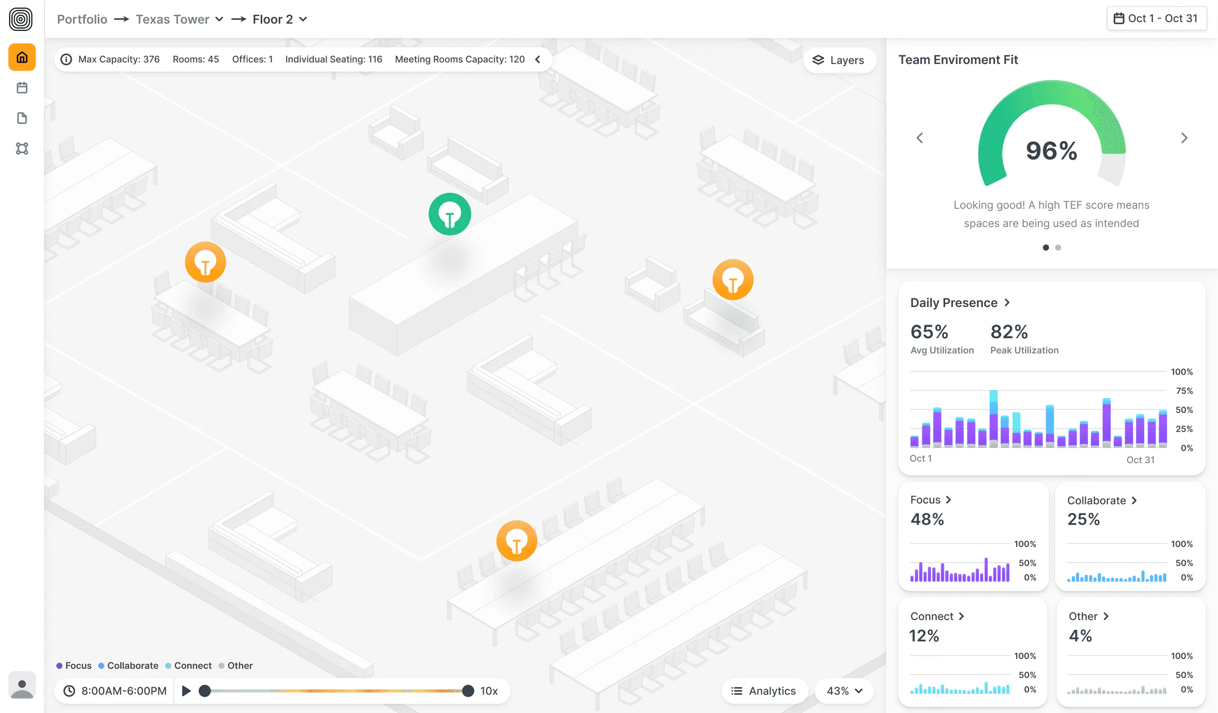
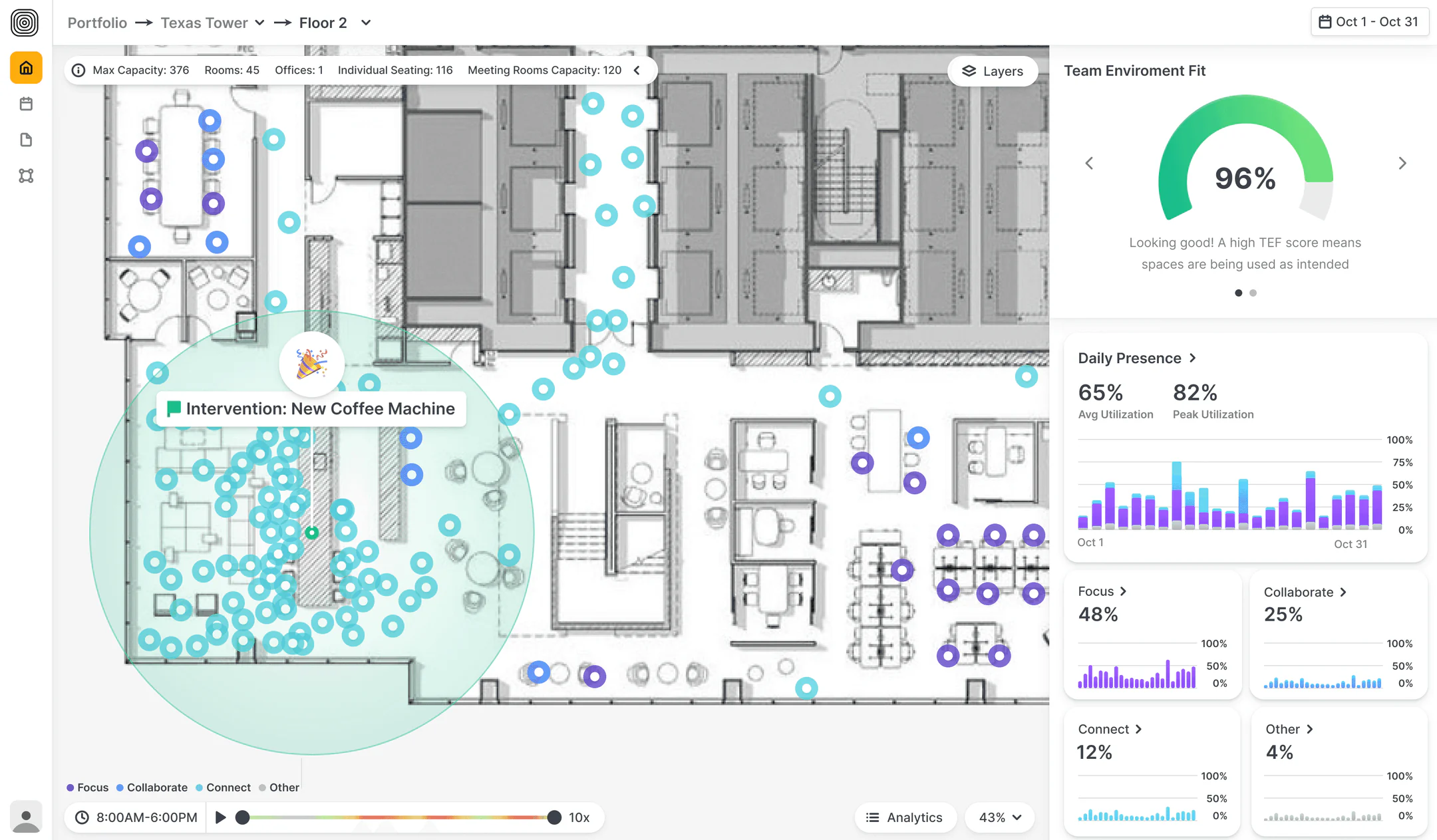
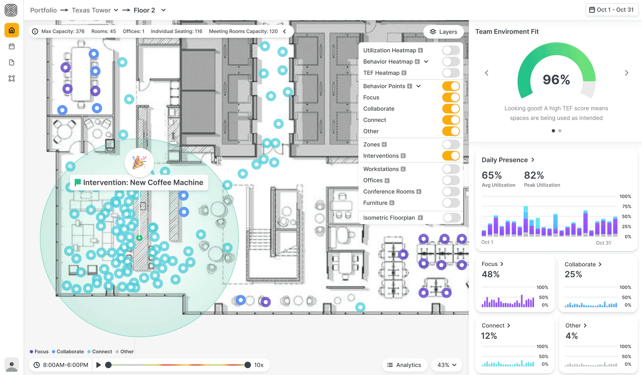
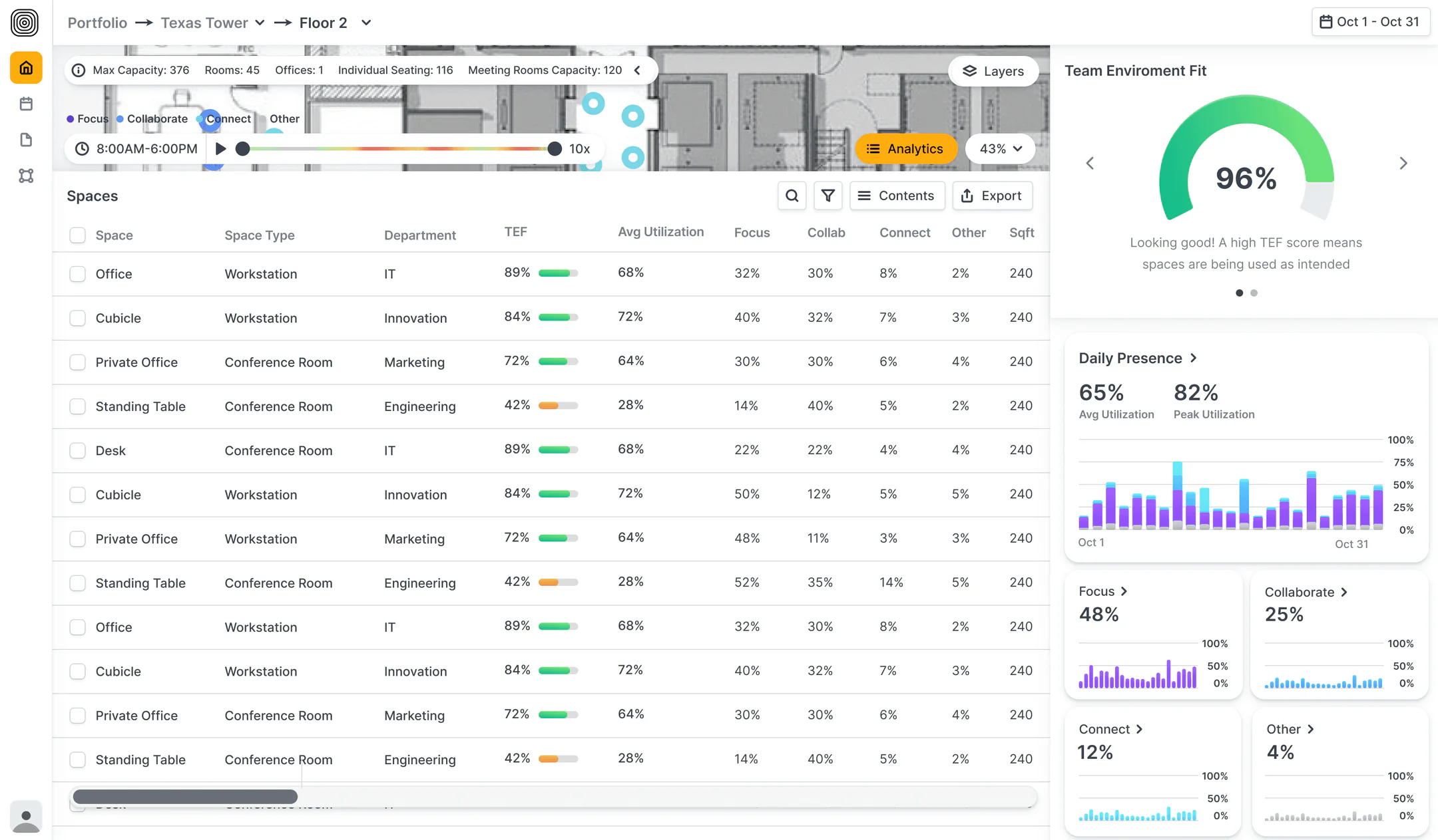
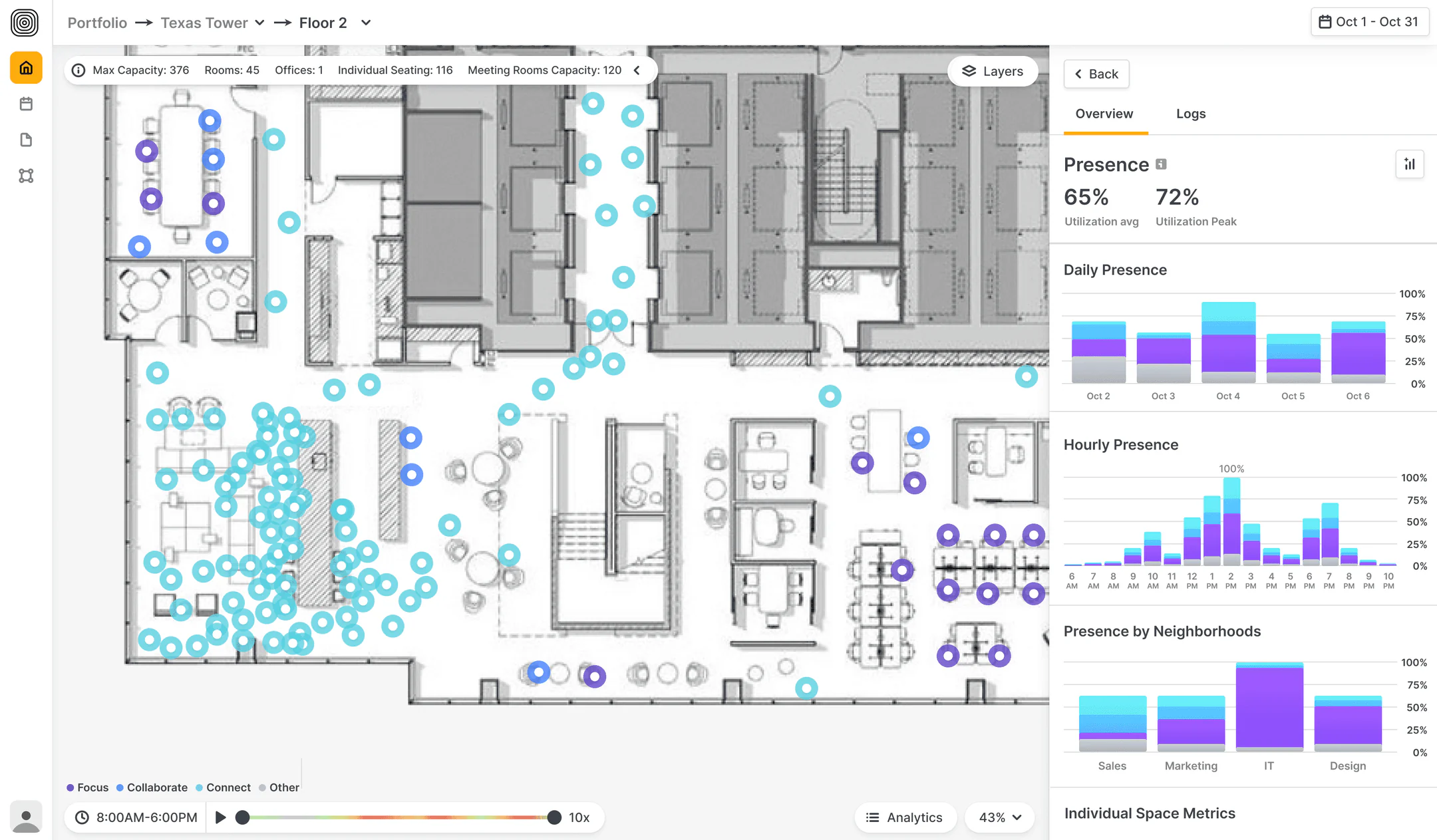
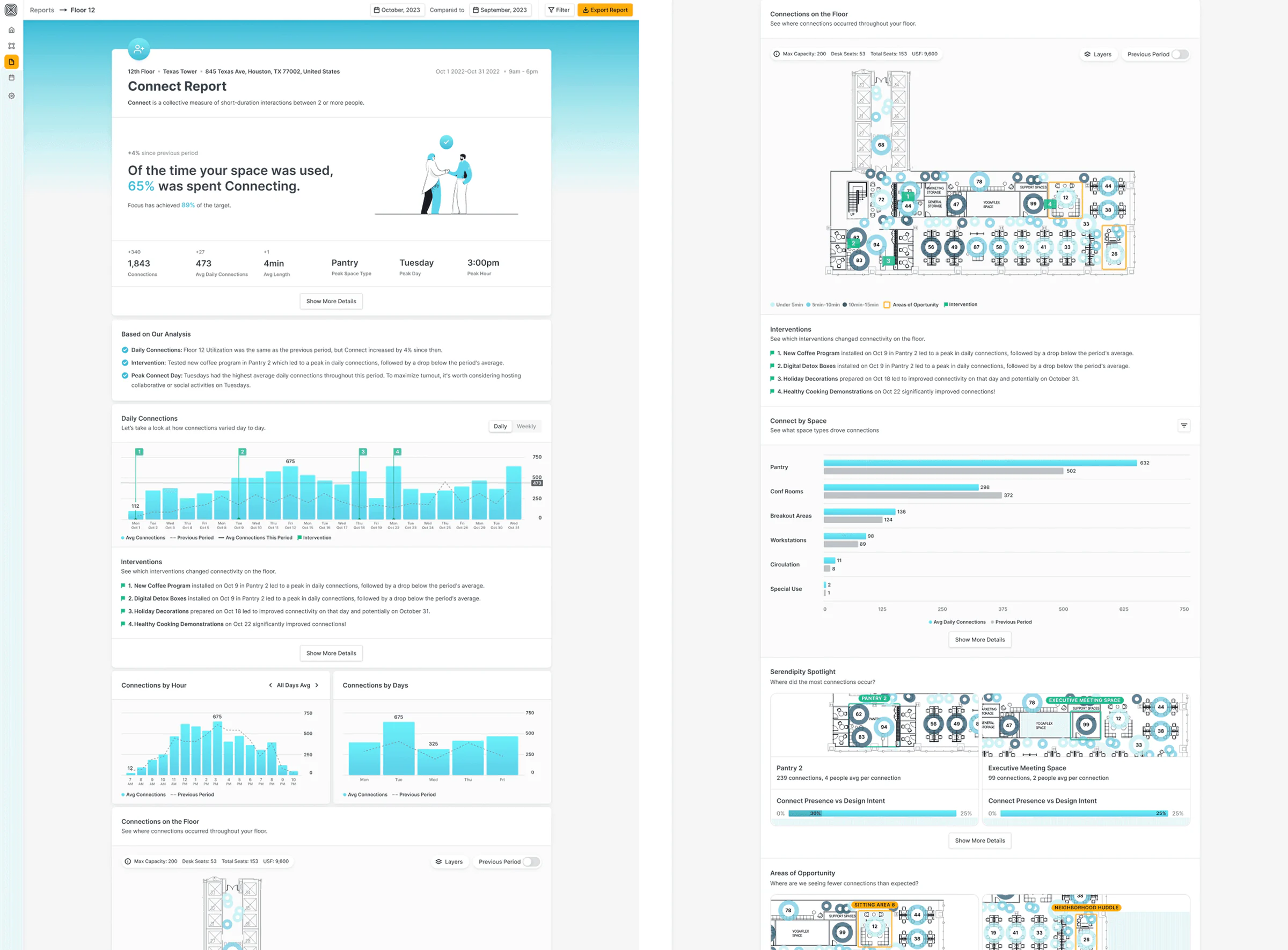
This view helps operations and strategy leads see how each floor is actually being used. We simplified the layout, improved key metrics, and introduced the “intervention” feature to help teams track the impact of small changes with clarity.

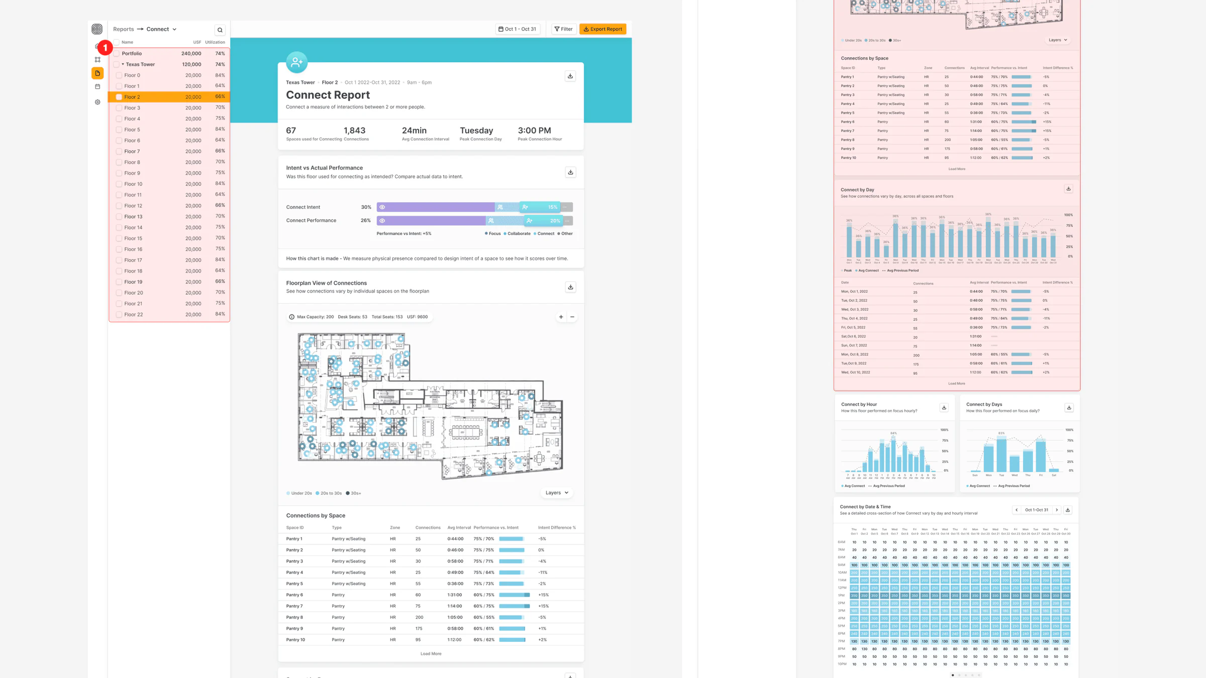
The MVP floor page, overloaded with tabs

MVP. Areas for improvements

  • Overloaded with Tabs: Too many options led to cognitive overload and poor usability.
  • Poor UX Constraints: Limited users’ focus on key areas of interest.
  • Disruptive Sidebar: Took up space and broke visual flow.

Final solution

  • Improved UI: Unified layout and design patterns across screens, making the experience smoother and more predictable.
  • Interventions: After testing, we added a feature to highlight actions teams can take to improve space usage, based on live data.
Floor Page — final solution — 1 of 5
Floor Page — final solution — 2 of 5
Floor Page — final solution — 3 of 5
Floor Page — final solution — 4 of 5
Floor Page — final solution — 5 of 5

Reports

Designed for stakeholders who need answers, not just numbers.

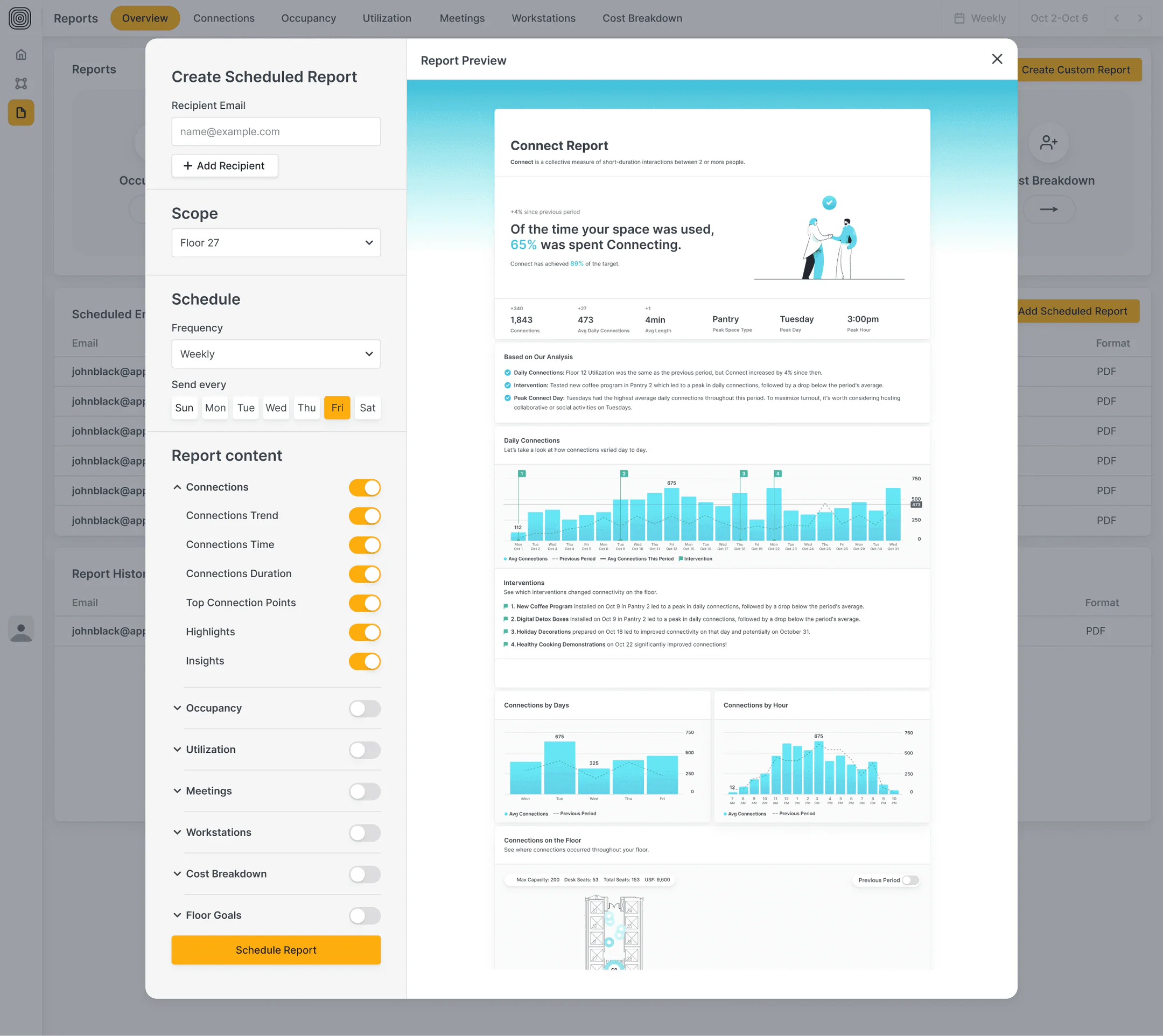
We moved from raw data dumps to smarter storytelling—highlighting what happened, why it matters, and where to look next. AI-generated insights now guide the user through key takeaways, making decisions faster and easier.

The MVP reports view

MVP. Areas for improvements

  • Navigation Issue: Long data load times on front-end made side navigation unusable—had to remove it entirely.
  • Raw Data: Users needed more than numbers—they wanted context, guidance, and clear takeaways.

Final solution

  • Informative Metrics: We clarified the story behind the data and added more actionable insights.
  • AI Insights: AI now helps summarize key patterns, making reports easier to understand and share.
Reports — final solution — 1 of 4
Reports — final solution — 2 of 4
Reports — final solution — 3 of 4
Reports — final solution — 4 of 4

Calendar

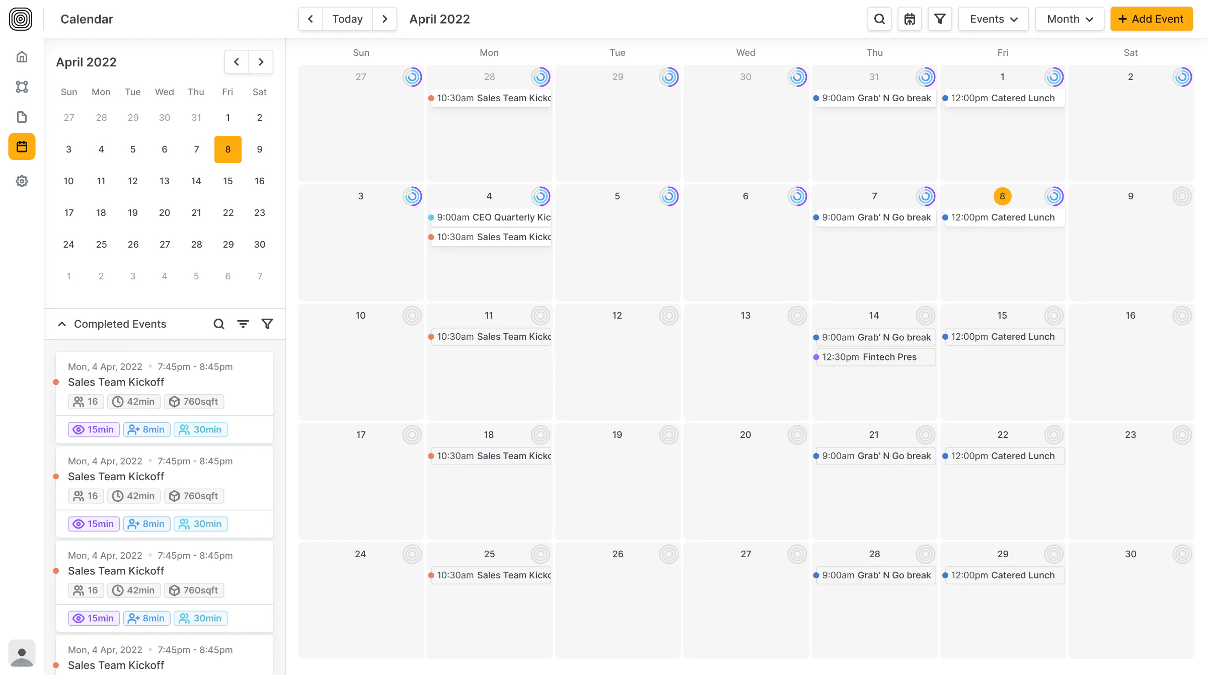
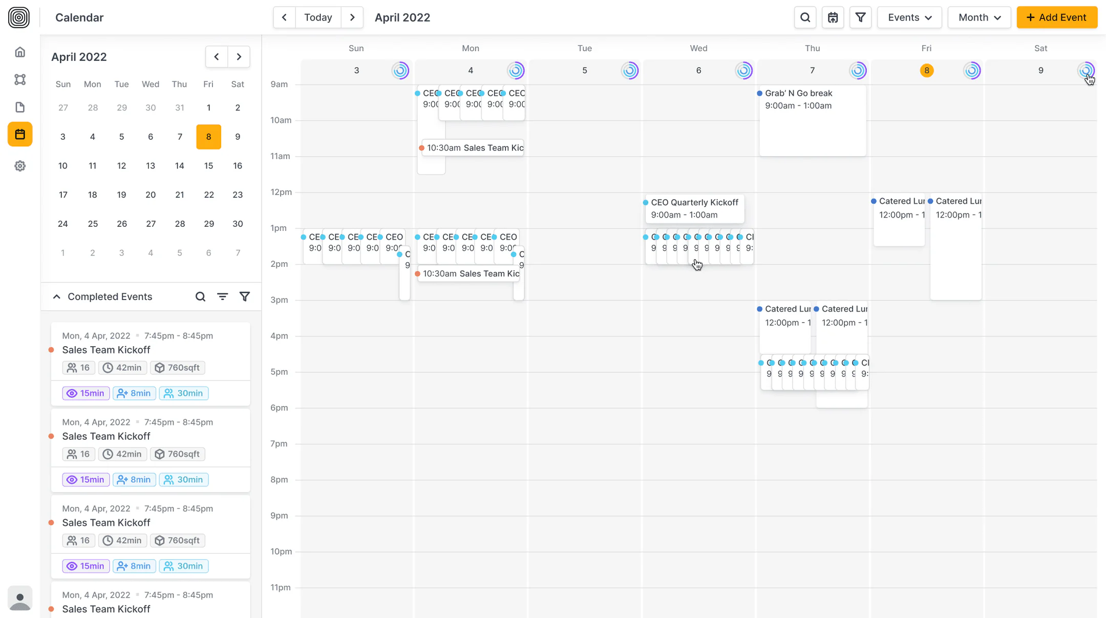
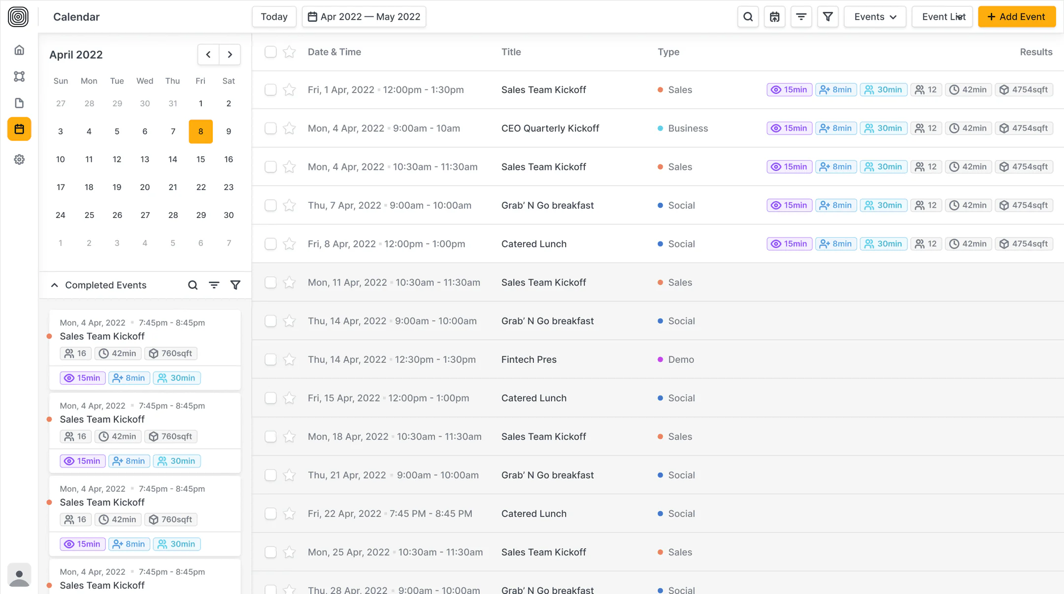
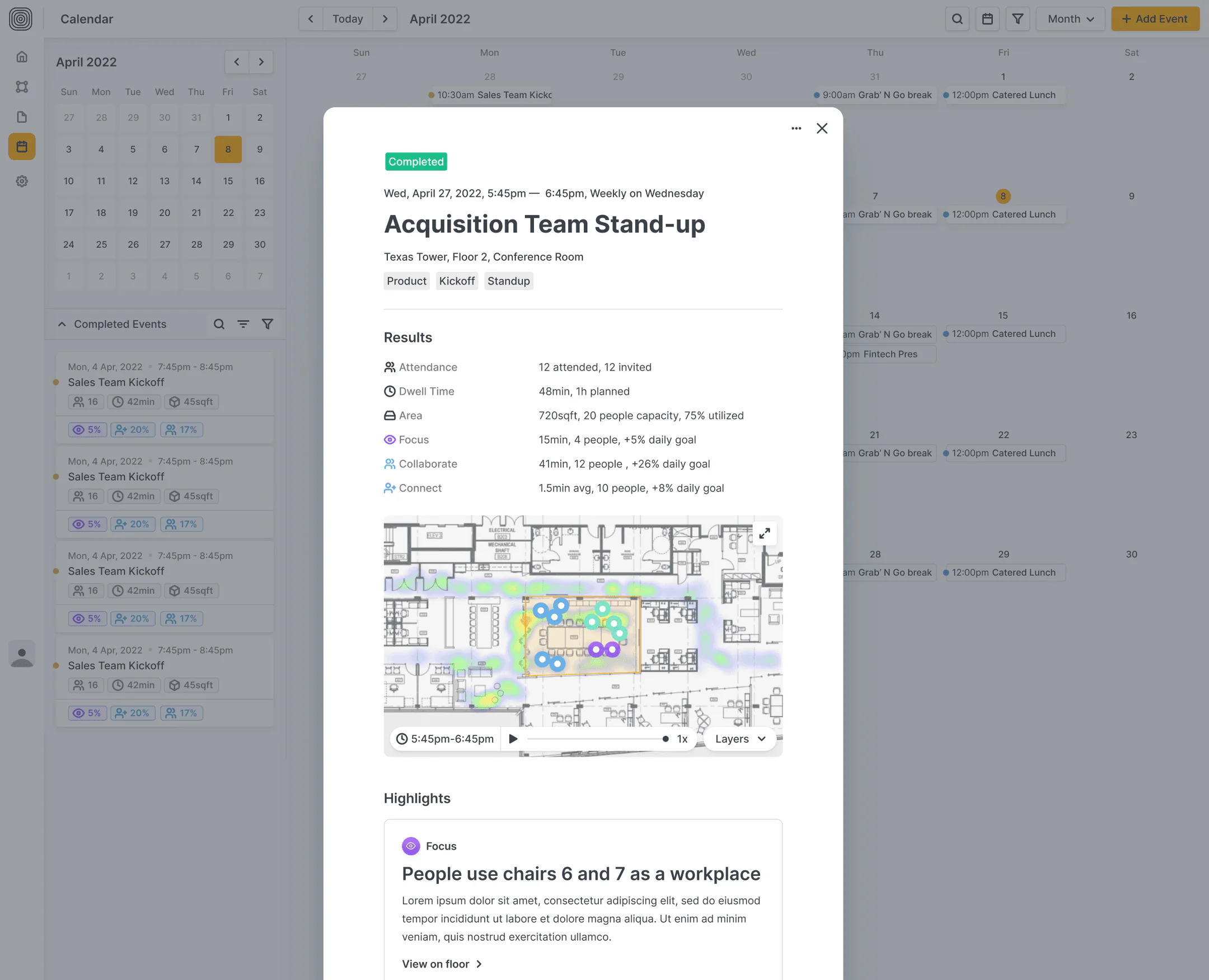
A quick overview for workplace teams to compare building performance, spot trends, and focus where it matters.

Calendar — final solution — 1 of 4
Calendar — final solution — 2 of 4
Calendar — final solution — 3 of 4
Calendar — final solution — 4 of 4

Onboarding Flow

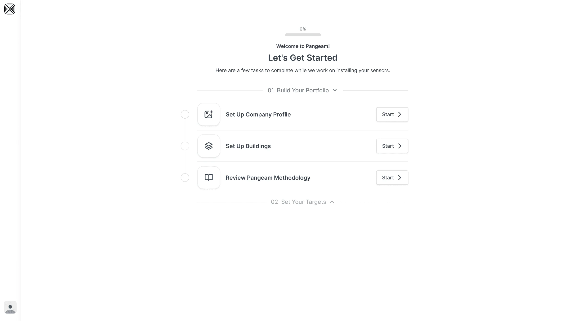
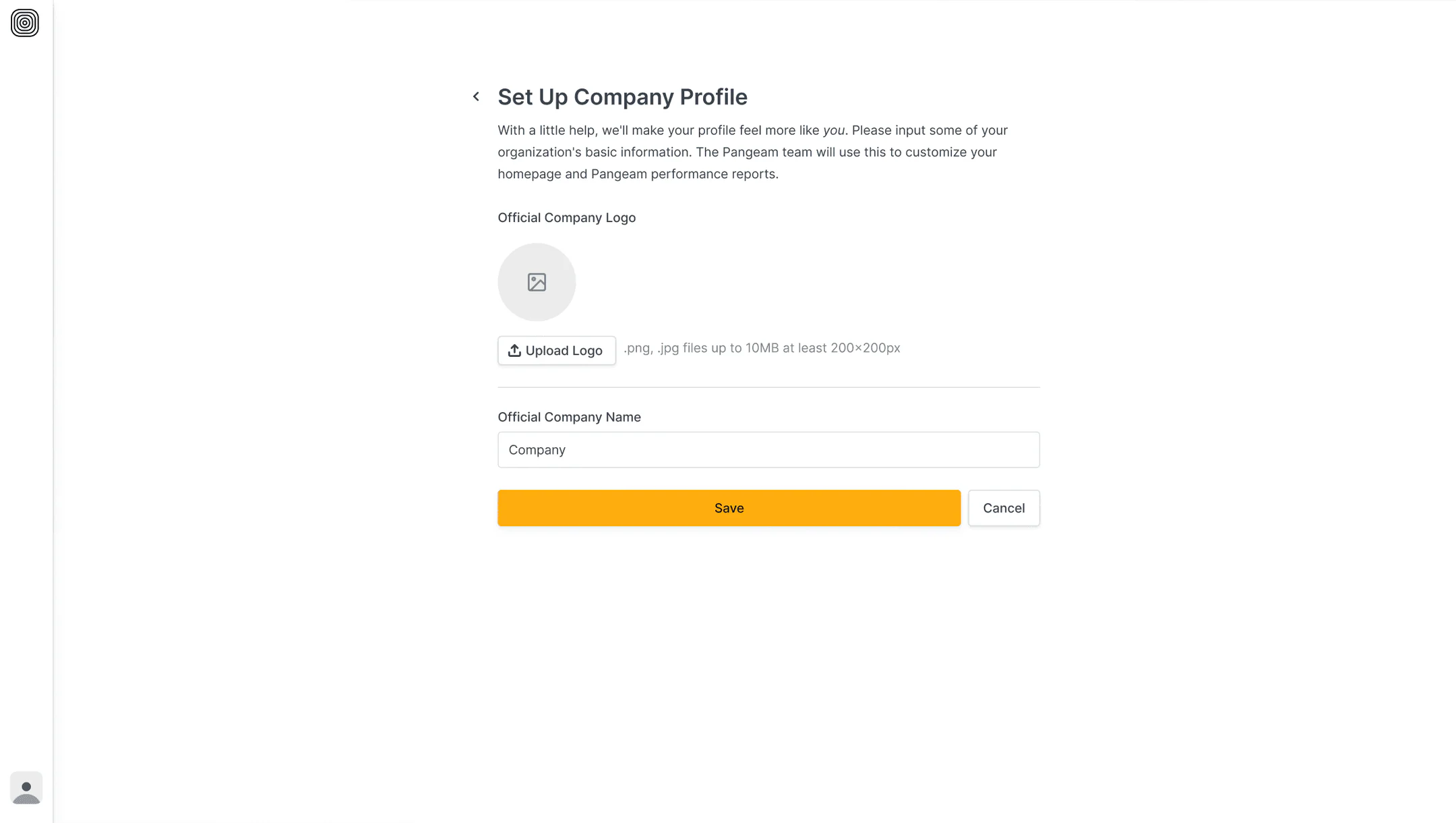
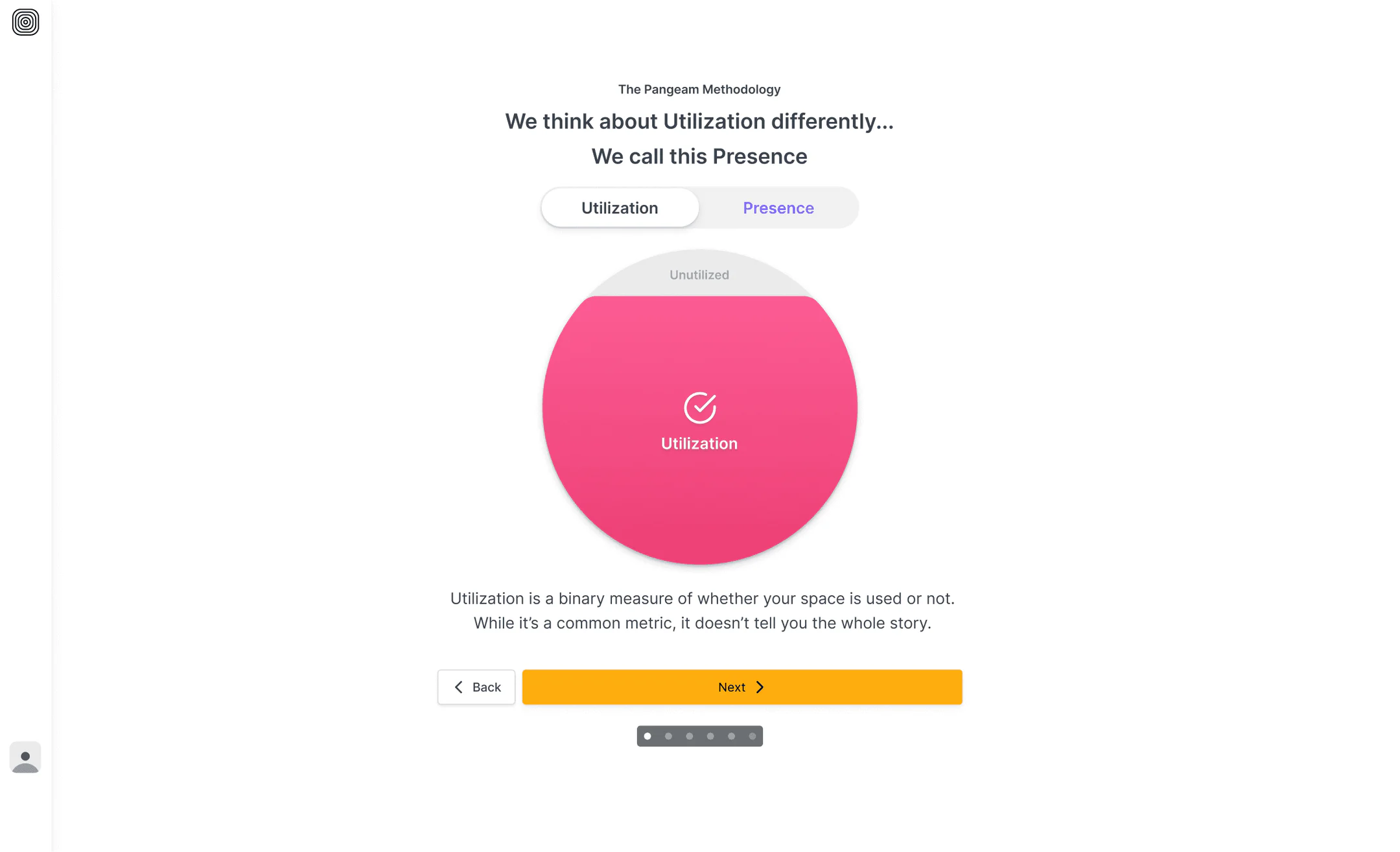
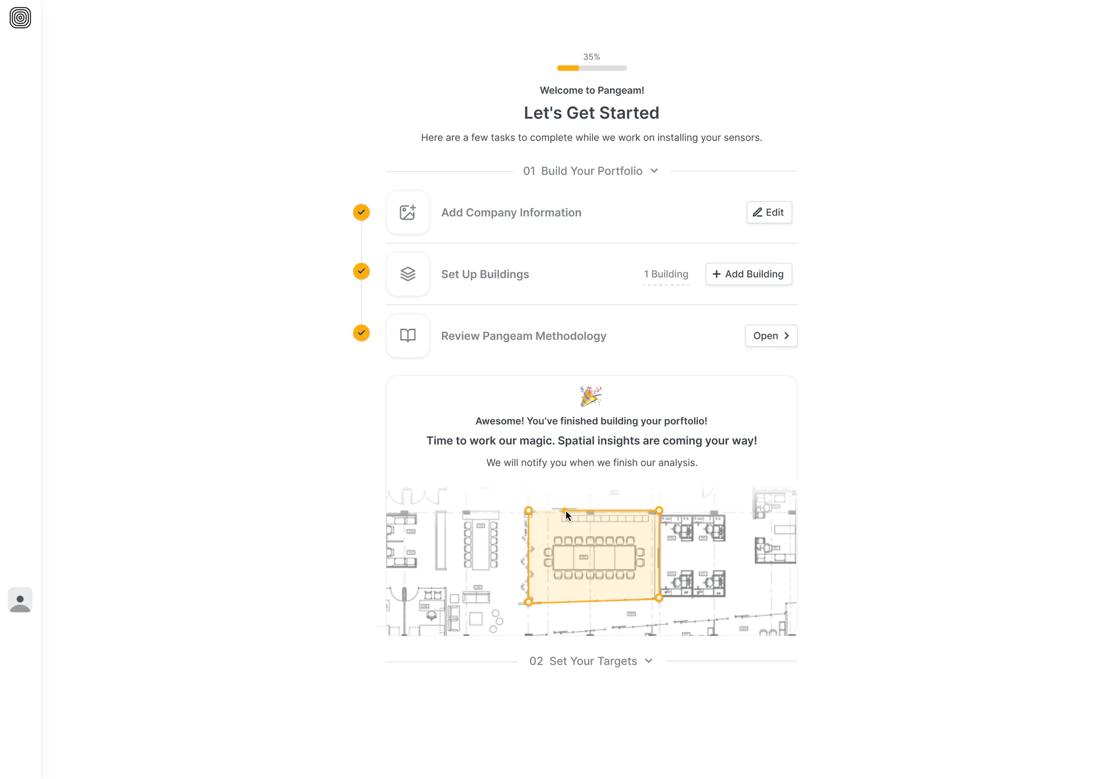
We streamlined setup into a guided path—upload your floor plan, set targets, and you’re ready. Simple steps, no confusion, full clarity.

After usability testing, we refined key moments in the flow where users got stuck or misunderstood instructions—turning friction into fluidity.

Onboarding Flow — final solution — 1 of 6
Onboarding Flow — final solution — 2 of 6
Onboarding Flow — final solution — 3 of 6
Onboarding Flow — final solution — 4 of 6
Onboarding Flow — final solution — 5 of 6
Onboarding Flow — final solution — 6 of 6

Walkthroughs

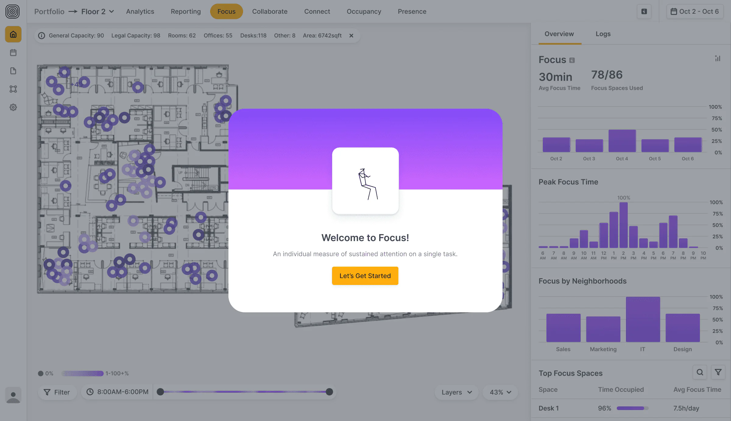
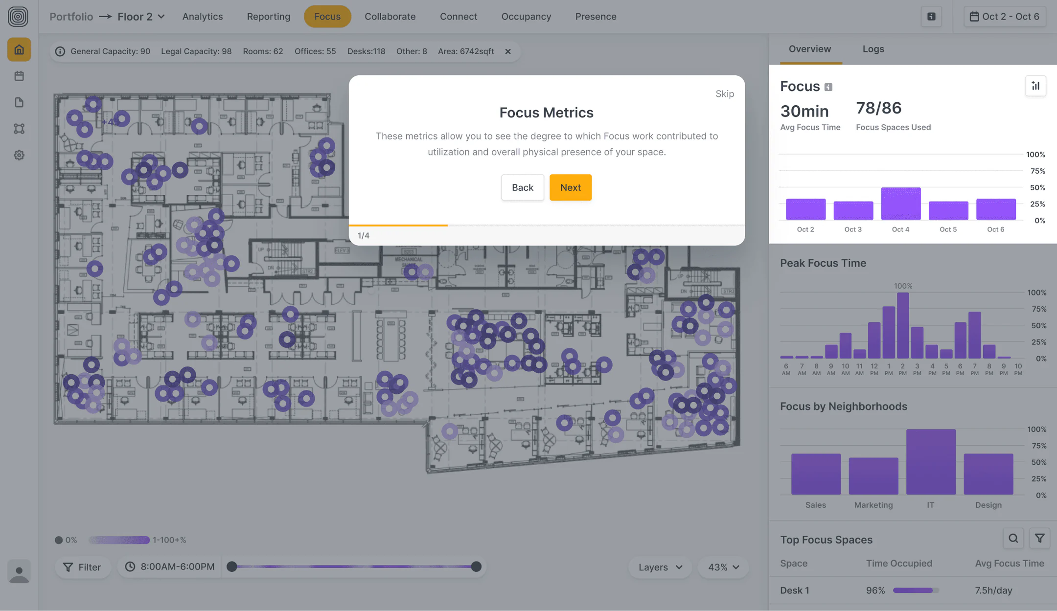
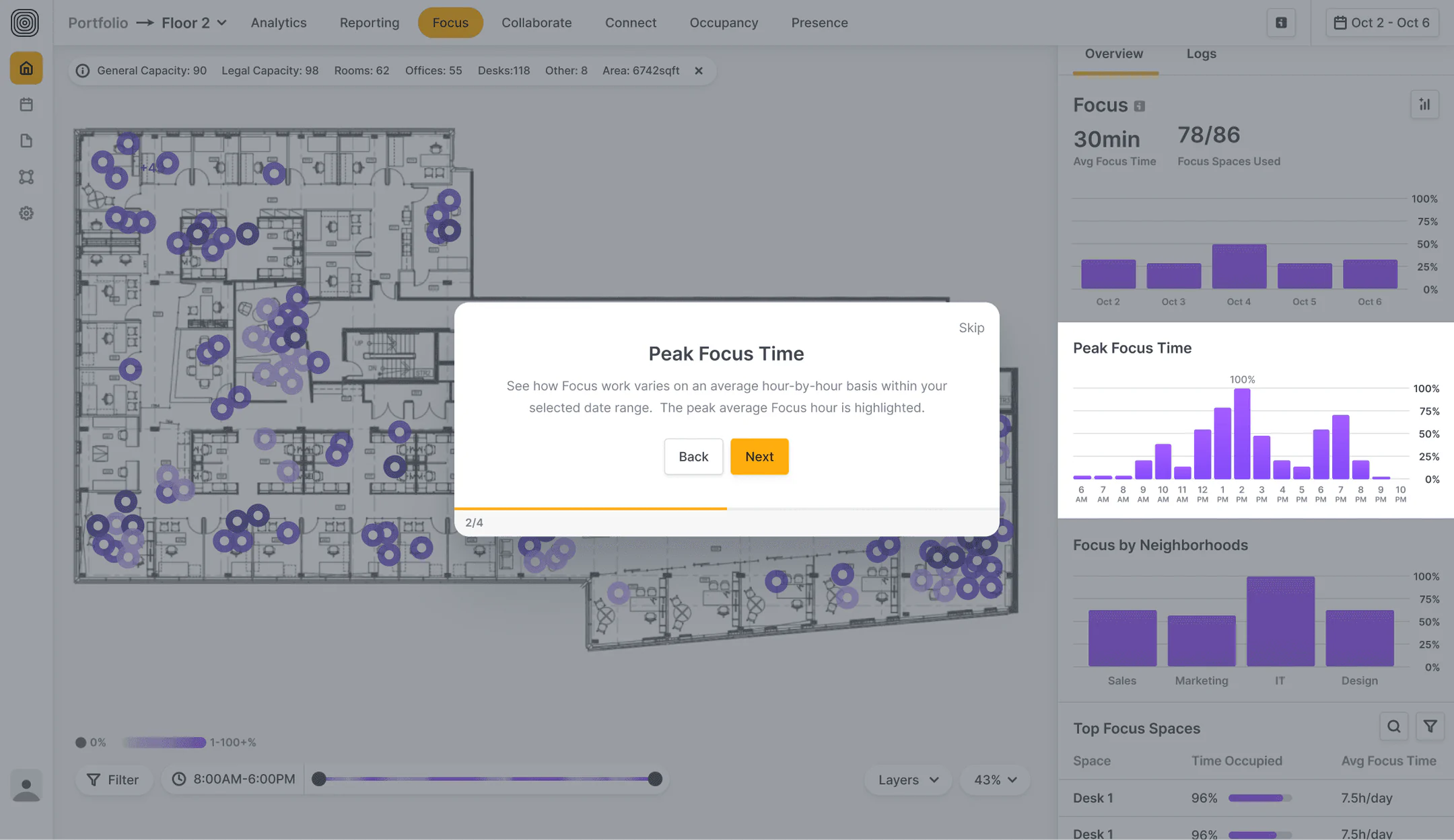
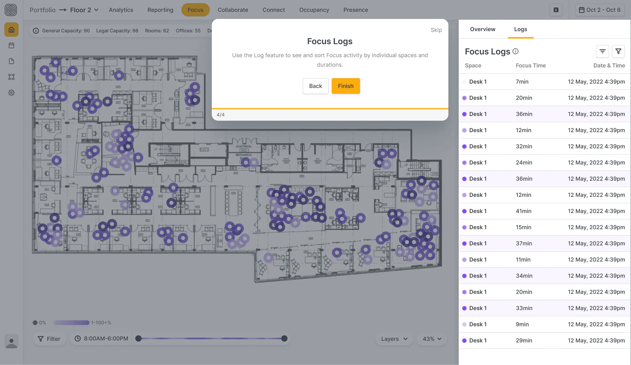
We built replayable walkthroughs for every flow, so users feel confident navigating complex insights.

Walkthroughs — final solution — 1 of 4
Walkthroughs — final solution — 2 of 4
Walkthroughs — final solution — 3 of 4
Walkthroughs — final solution — 4 of 4

Website

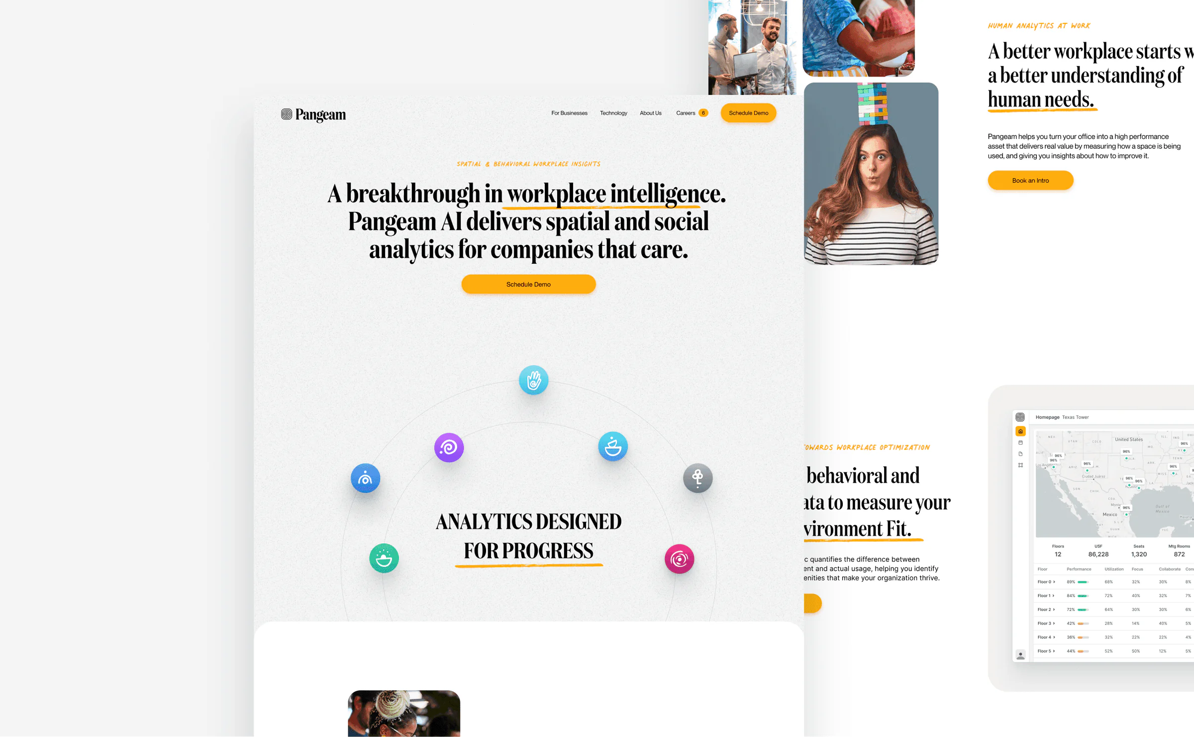
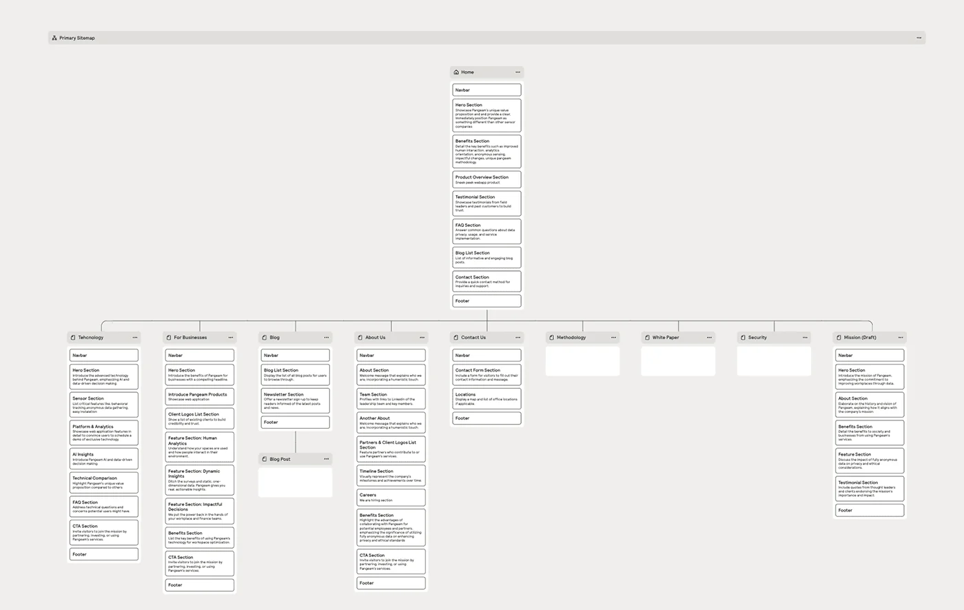
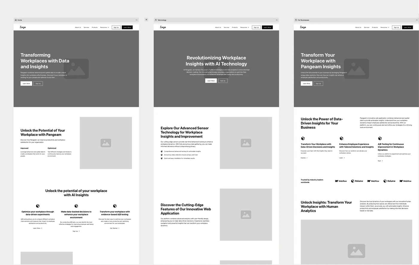
As Lead Designer, I kicked off the website redesign by aligning with stakeholders and reviewing audience research. Together with leadership, we set clear goals: improve conversion, clarify product value, and support sales—with metrics in place to track success.

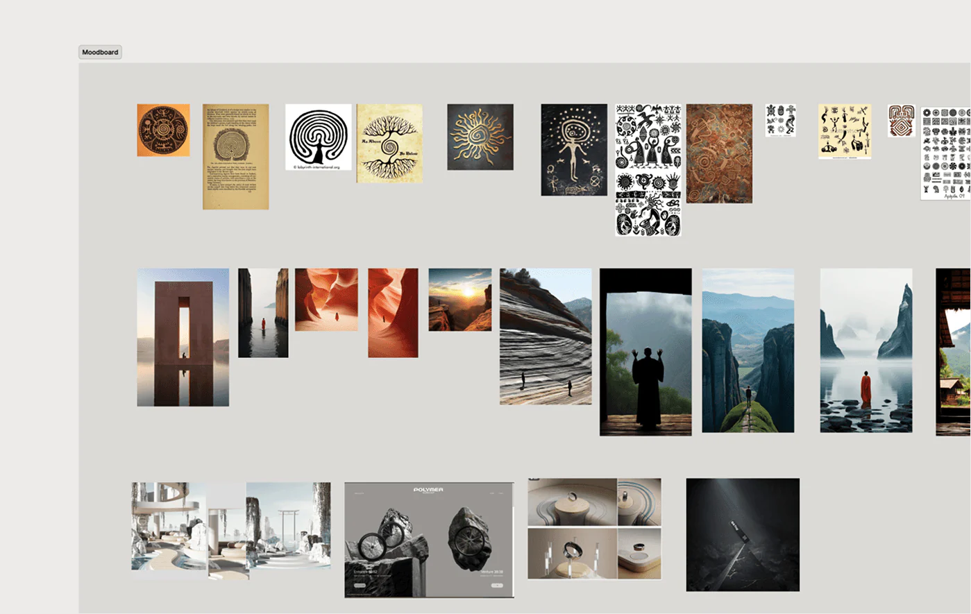
I designed, built, and launched the site in Framer, chosen for its speed and flexibility. Subtle interactions enhanced engagement without compromising clarity or accessibility. I explored 3D visuals using Spline but ultimately prioritized performance and load speed to deliver a faster, more focused experience.

View Website

Website screens — 1 of 4
Website screens — 2 of 4
Website screens — 3 of 4
Website screens — 4 of 4

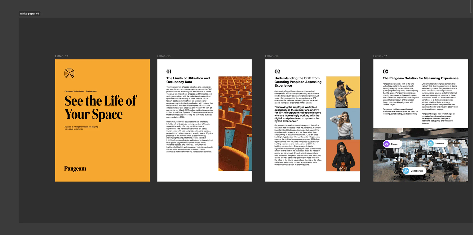
Presentation decks

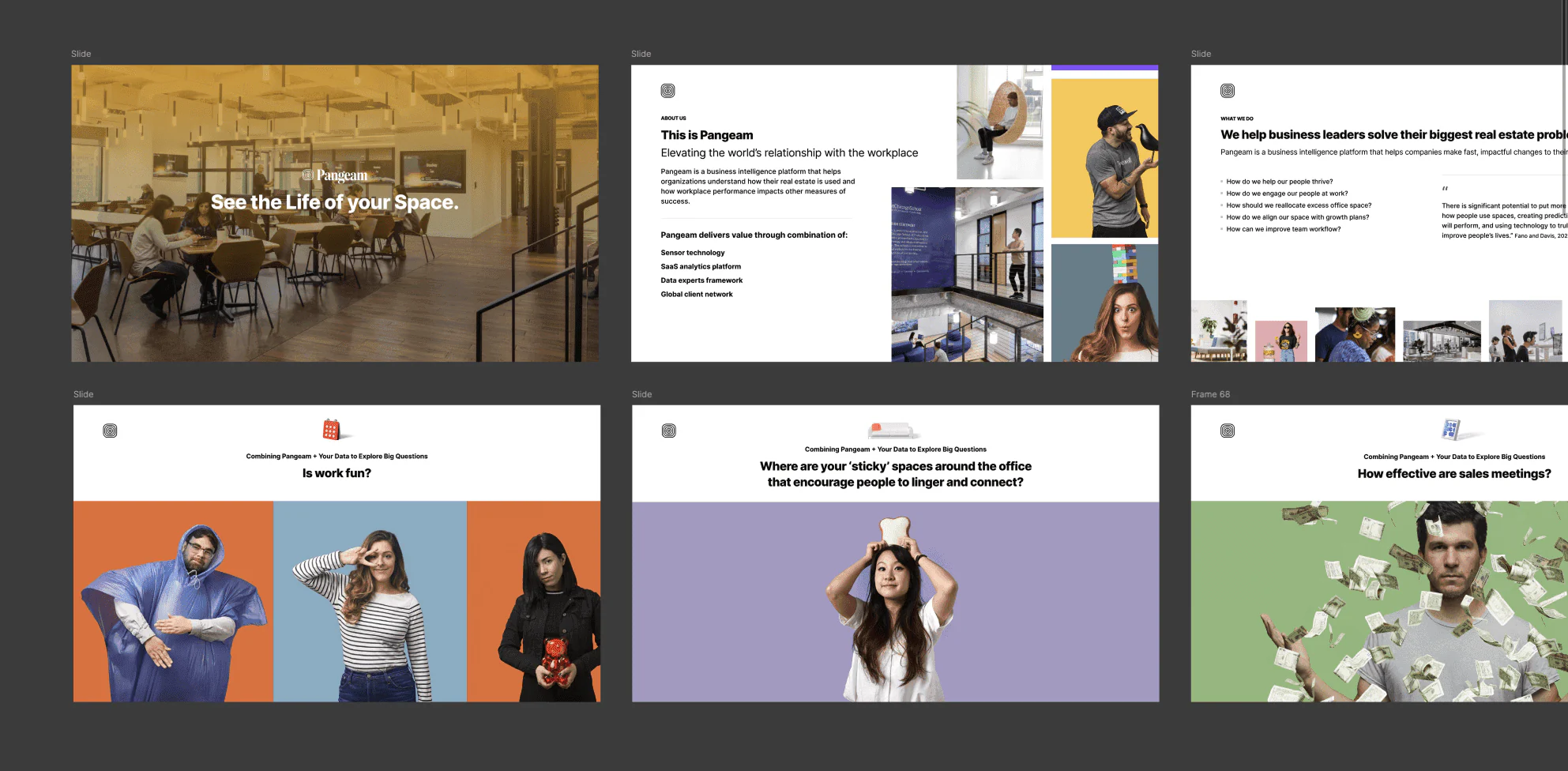
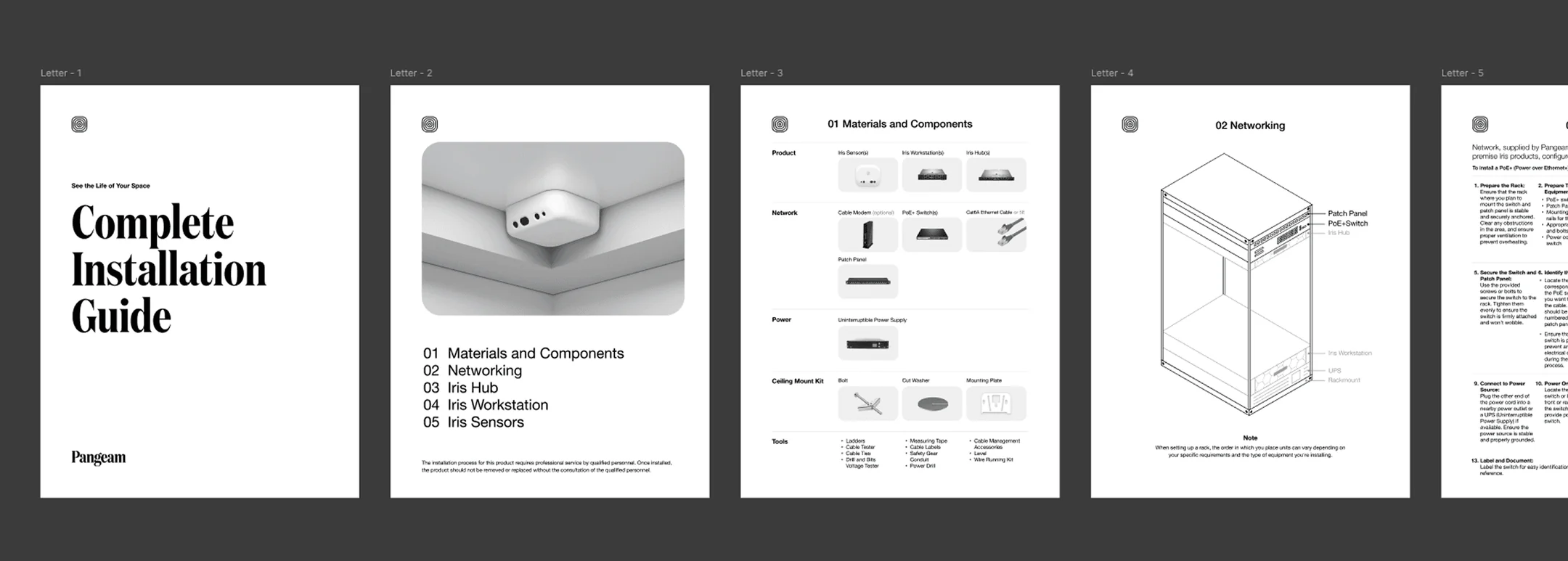
To support sales, onboarding, and fundraising, we partnered with stakeholders across teams to create a full suite of presentation materials. We built a dedicated design system in Figma and Google Slides, making it easy for anyone to create polished, on-brand decks without starting from scratch.

Deliverables

  • Sales Decks
  • Pitch Decks
  • Onboarding and Installation Guides
  • White Papers
  • Proposal and RFP templates
Presentation decks — 1 of 3
Presentation decks — 2 of 3
Presentation decks — 3 of 3

Takeaways

  • Minor UX tweaks → major winsSmall changes led to clearer flows and higher engagement.
  • Validated early, built smarterTesting concepts early helped avoid wasted effort and focus on real needs.
  • Early design system saved dev timePrevented UI rework and enabled faster, more consistent delivery.
  • Key features trimmed pre-MVPCollaboration with engineering avoided costly overbuild.
  • $4.2M seed funding securedValidated product vision attracted early investors and market confidence.
  • 6 enterprise clients onboardedAdopted by major real estate and workplace teams during MVP phase.