
Keyword.com
Keyword.com is a leading SEO rank tracking platform designed for agencies, in-house teams, and enterprises aiming for precision and scalability in their search strategies. It offers accurate, real-time keyword tracking across multiple locations and devices, including mobile and desktop, with a verified accuracy rate of 96.86%.
- My role
- Product Designer
- Timeline
- Jul 2019 – Nov 2019 (5 months)
- Team
- Product Owner, Front-end Engineer, Software Engineer

Challenge
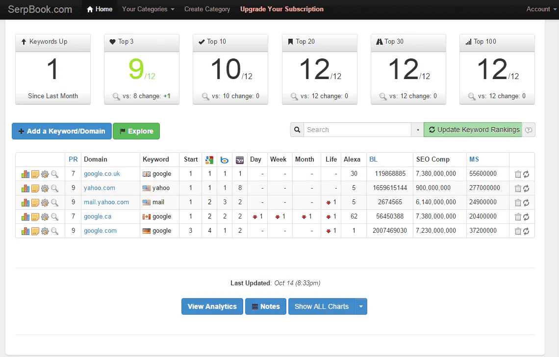
Keyword.com had a strong product and loyal user base, but its interface hadn’t kept pace with its growth. Key workflows felt dated, and new users often struggled to understand the product’s value quickly. Internally, the design lacked consistency, making it harder to scale or evolve the experience.
The goal was ambitious: redesign the entire product to feel faster, clearer, and more modern — without alienating long-time users. And to create a scalable design foundation that could unify a growing family of SEO tools.
Design process
Research
I partnered with the Product Owner to translate business requirements into user-centered design solutions:
- Stakeholder Interviews: Held in-depth sessions with the CEO, Product Manager, and Engineering Lead to align on business goals, user expectations, and technical constraints.
- User Feedback Analysis: Reviewed customer support tickets, NPS responses, and cancellation data to uncover pain points and areas for improvement.
- Usage Data Analysis: Analyzed feature usage, drop-off points, typical user flows, and time spent across key sections.
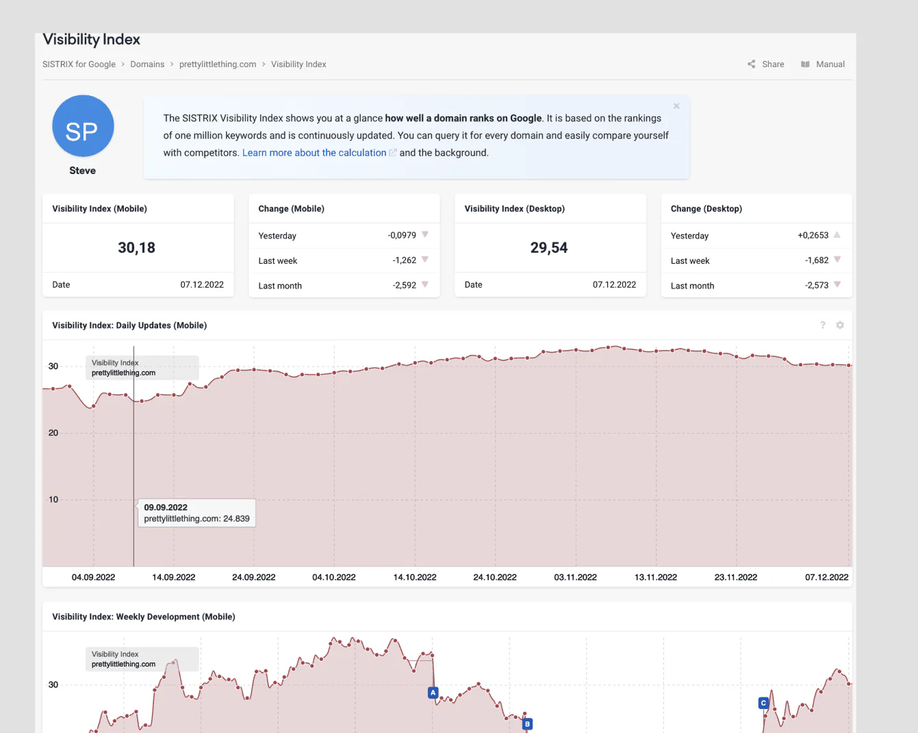
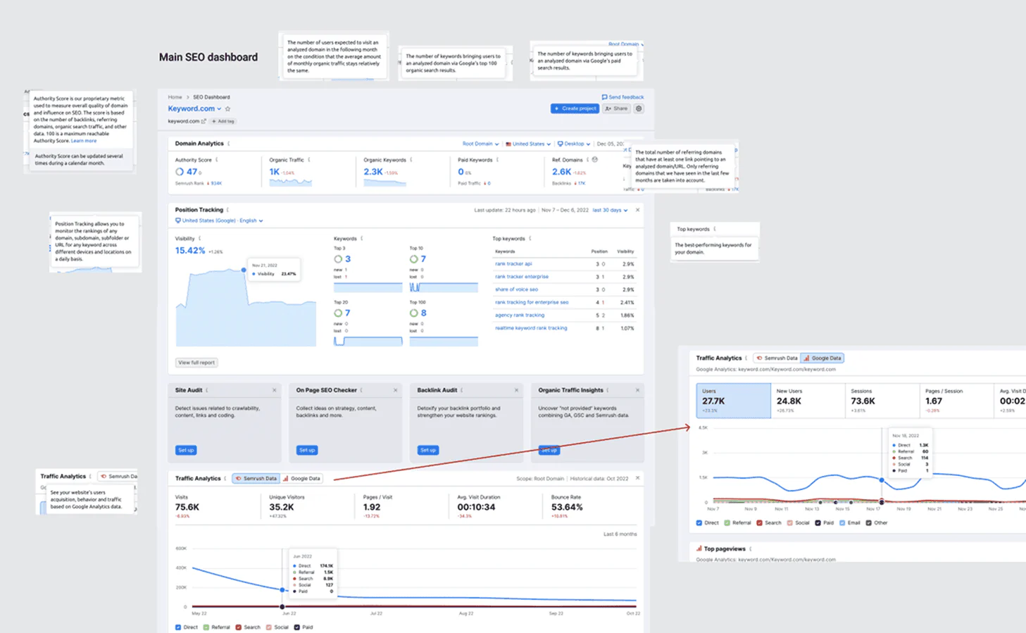
- Competitive Analysis: Benchmarked leading SEO tools to identify industry standards, market gaps, and opportunities for differentiation.
- UI Audit: Performed a comprehensive audit to document inconsistencies in visual design, interaction patterns, and terminology.
Key insights
The research revealed several critical insights that shaped the redesign:
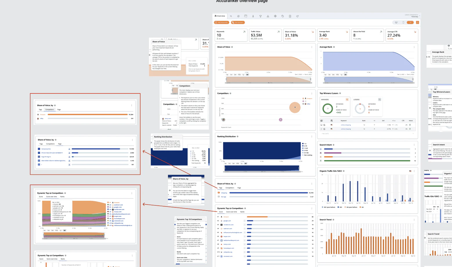
- Density over clarity: Users were overwhelmed by the amount of data presented on key screens, making it difficult to extract actionable insights.
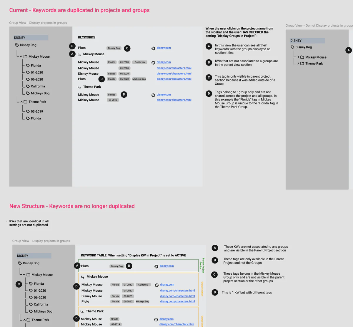
- Organic architecture: The information architecture had evolved organically, resulting in unintuitive navigation and buried features.
- Inconsistent patterns: Different sections of the product used varying interaction patterns for similar actions, increasing the learning curve.
- No responsive support: The existing design was not responsive, creating frustration for users who needed to check rankings on the go.
Solution
I led the end-to-end UX and UI redesign — from rethinking core flows to reworking the visual language. We focused on simplifying the experience, surfacing insights faster, and making the product more approachable for new users while staying powerful for pros.
We also introduced a modular design system built specifically for SEO tools. It brought consistency across the platform and became the visual foundation for four other products in the SEO toolset.
The new experience helped drive growth, improve onboarding, and ultimately contributed to Keyword.com’s acquisition by saas.group.
Keywords home
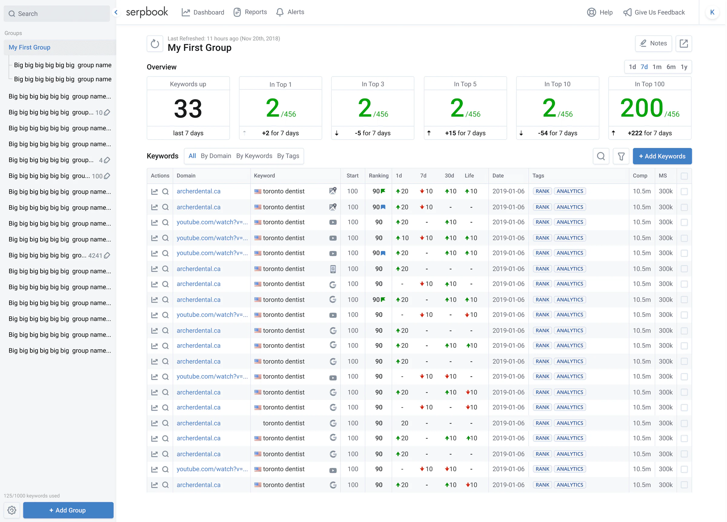
Keep a pulse on your website’s search rankings with a spot-on keyword ranking dashboard — straightforward, reliable, and just what you need to pinpoint exactly what’s working and what’s not.
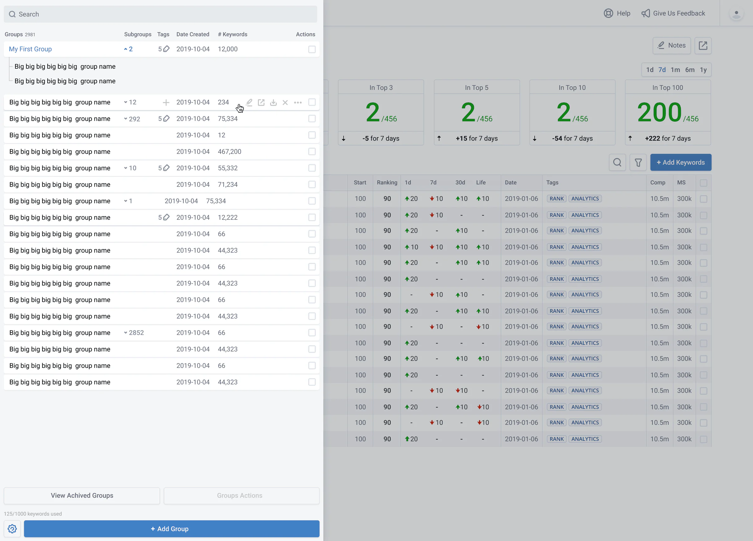
Keywords home — menu
Navigation was restructured to group related features, use clear labels, ensure consistent access to actions, and allow collapsible sections to reduce visual noise.
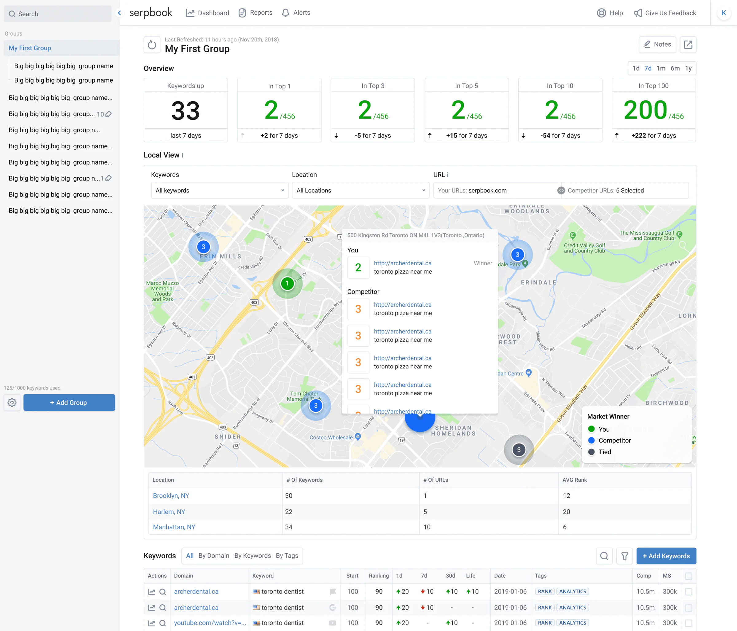
Keywords home — local view
Look beyond global visibility and start winning SERPs in local regions. Track any device or market, and optimize per geographical location. Google Snack Pack tracking included.
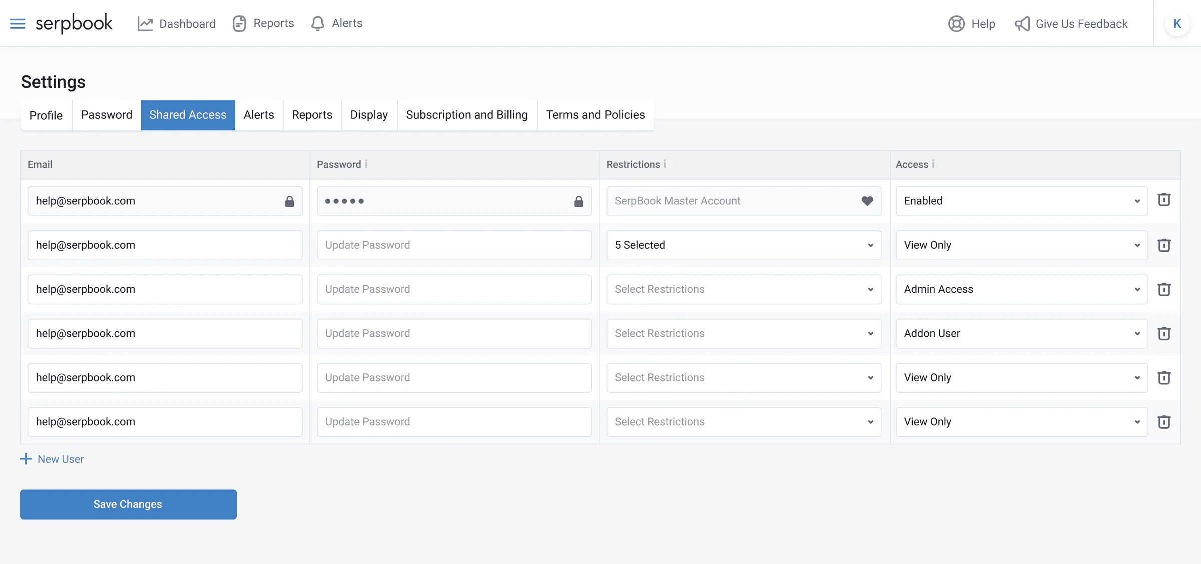
Settings — user management
The admin interface was simplified with clearer permission controls, streamlined settings, improved organization, and a smoother user invite flow.
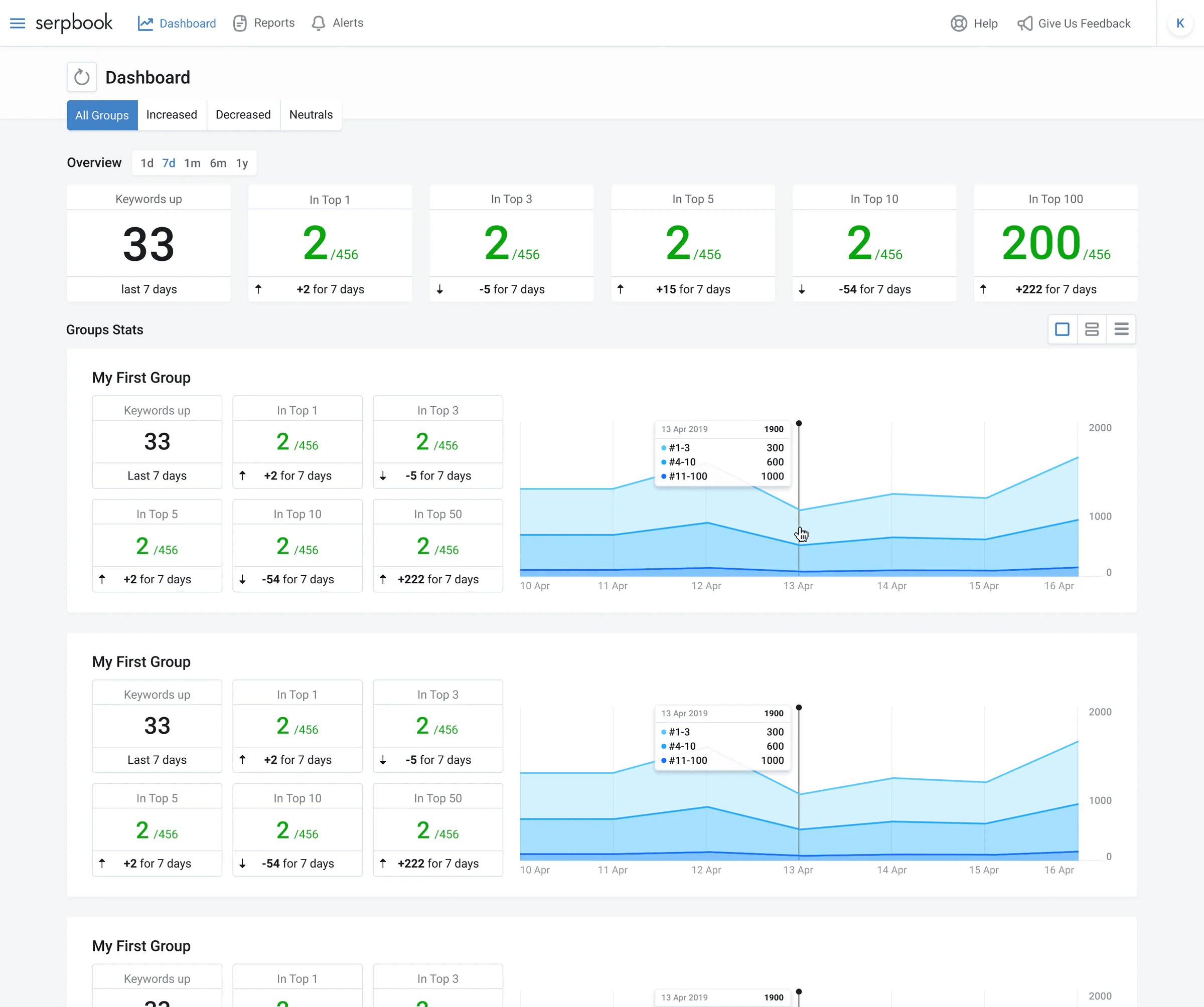
Keywords home — dashboard view
A configurable overview for teams tracking many sites at once, so the state of a whole portfolio reads at a glance rather than one project at a time.
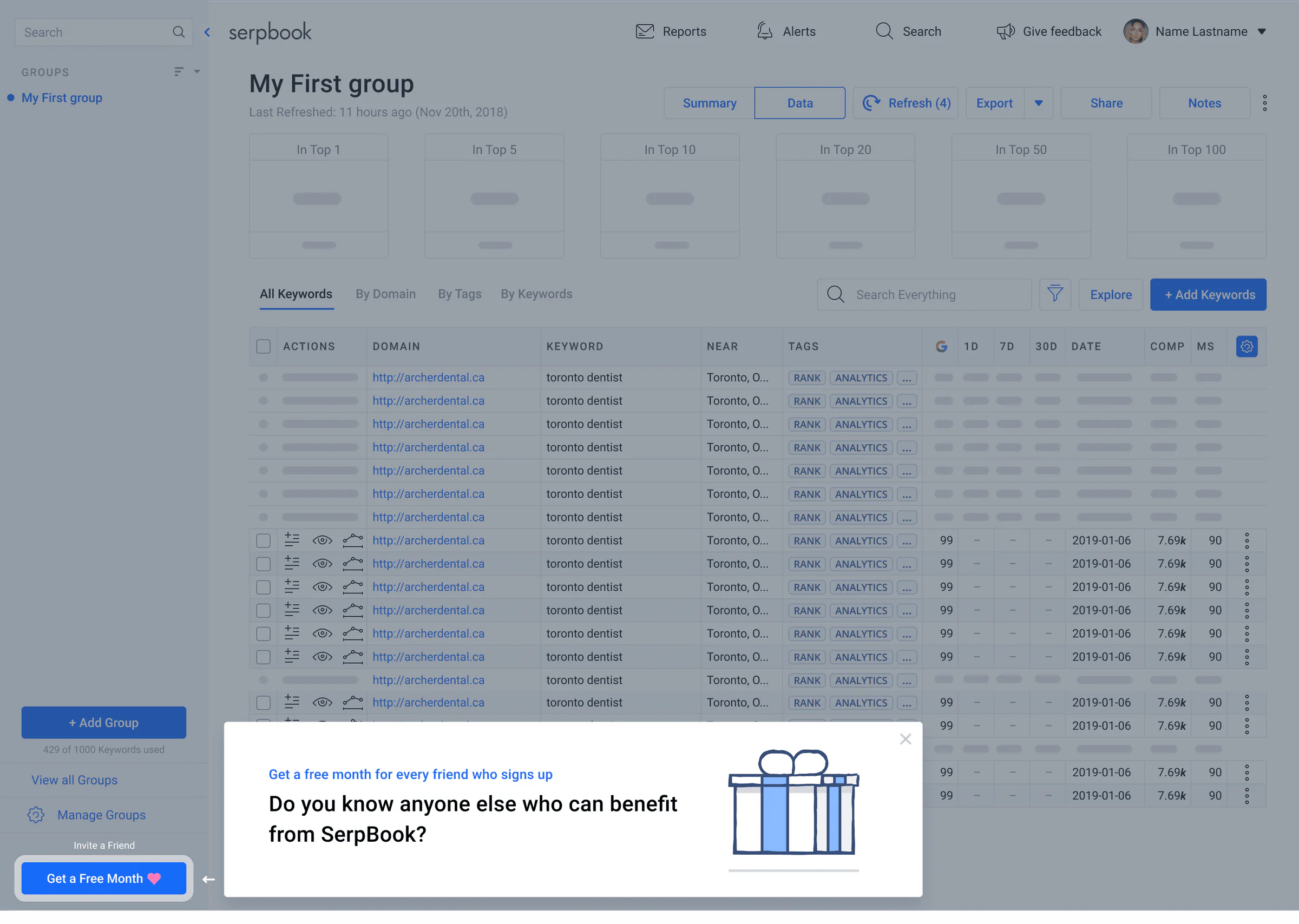
Onboarding flow
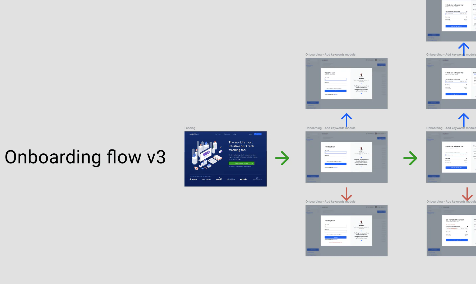
After several rounds of user testing, we refined the onboarding flow and achieved a 90% success rate. Users can now easily add keywords, view rankings, and create reports — getting value right from the start.
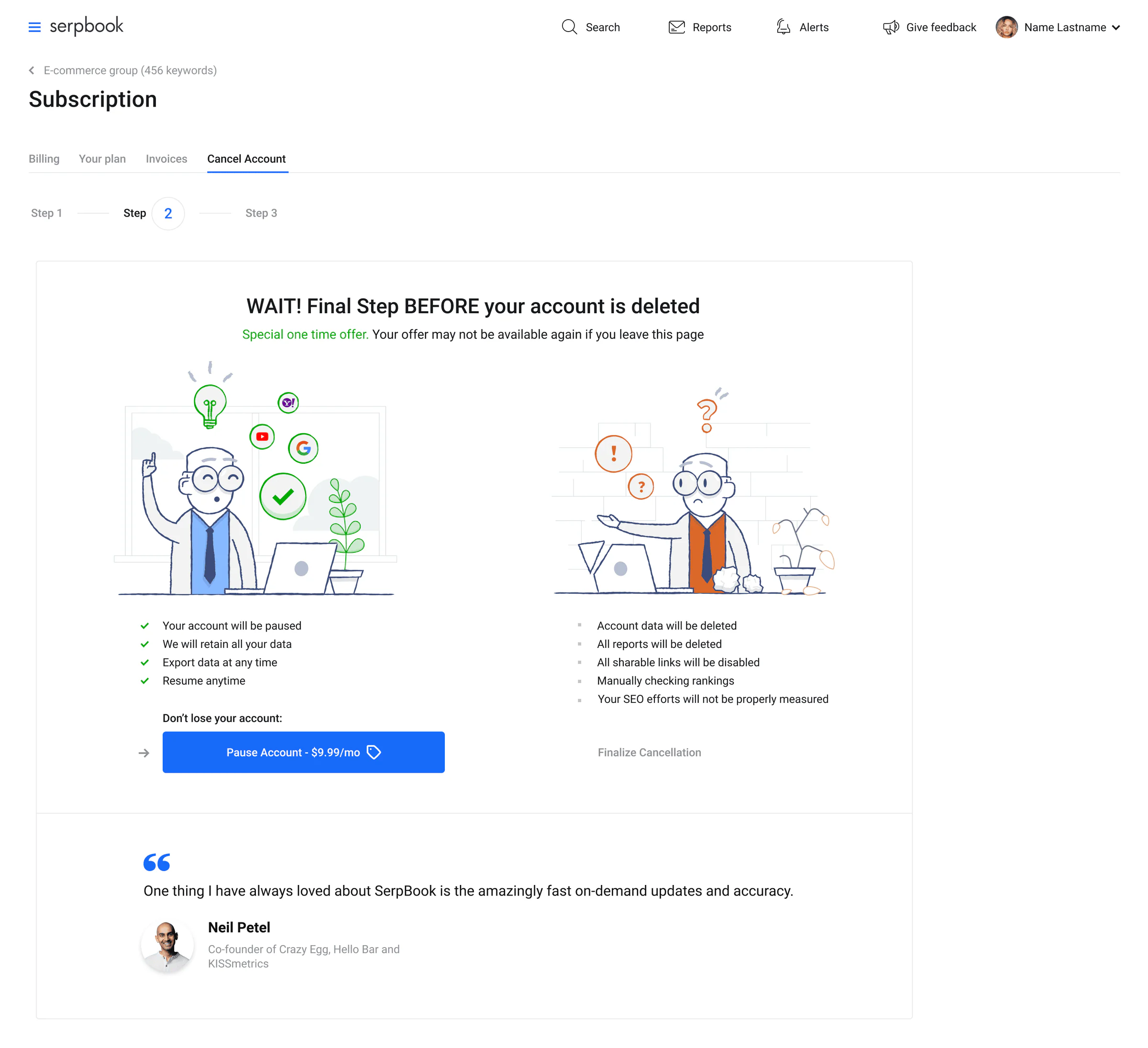
Subscription cancellation
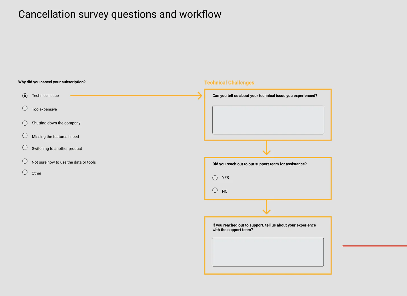
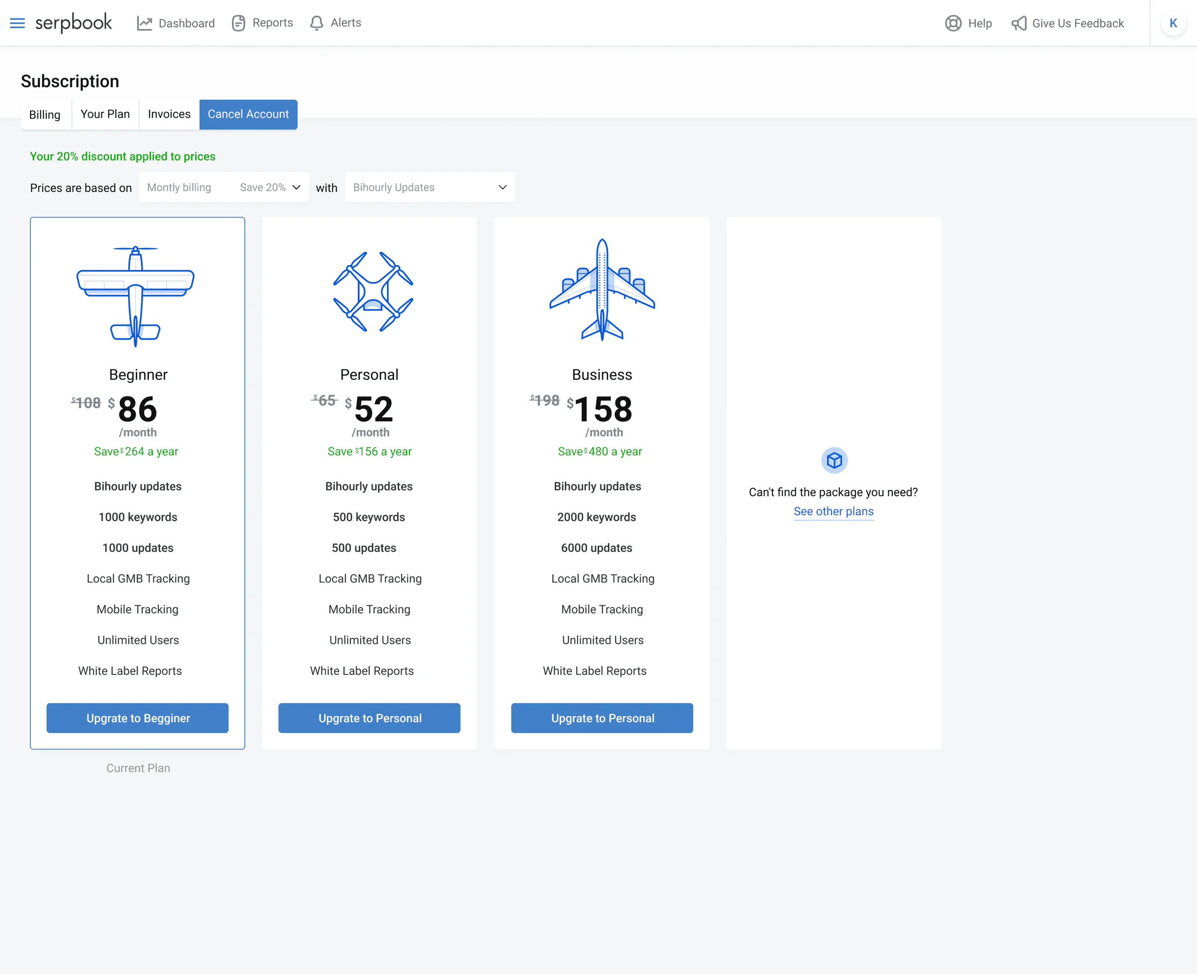
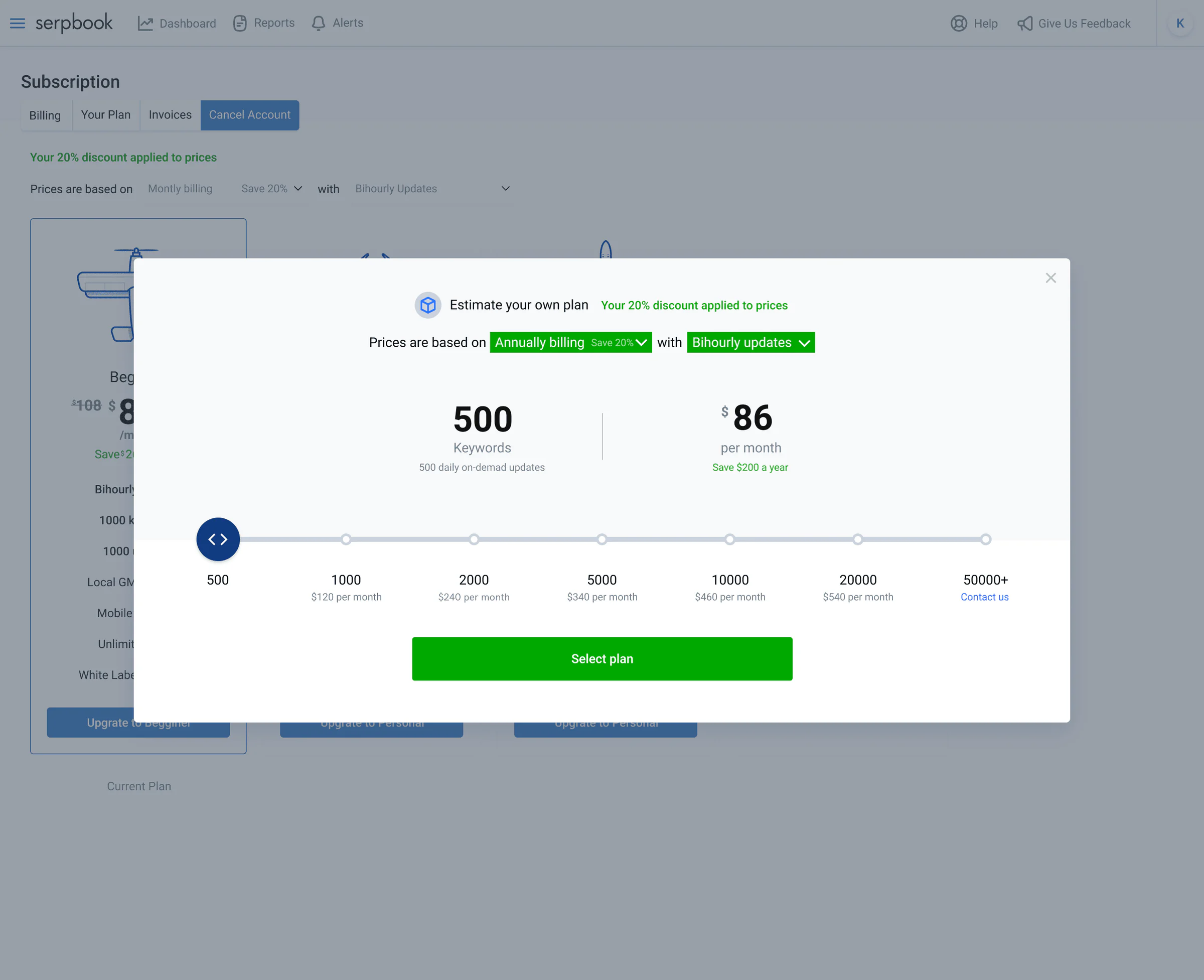
We redesigned the cancellation flow to reduce churn and support business goals. Users are offered a pause option and shown the impact of canceling, helping them make a clear, informed decision.
Impact
UX metrics
- Reduced onboarding time by 35% for new users
- Improved task completion rates for common workflows by 28%
- Decreased support tickets related to UI confusion by 42%
Business impact
- Increased trial-to-paid conversion by 18%
- Reduced churn rate by 12% in the six months following launch
- Contributed to a successful acquisition by saas.group in 2020
Challenges overcome
- Balancing power and simplicity: The biggest challenge was simplifying the interface without removing the power that advanced users relied on. I addressed this by using progressive disclosure patterns and ensuring that advanced features remained accessible but didn’t overwhelm the primary experience.
- Managing stakeholder expectations: Different stakeholders had varying priorities for the redesign. I navigated these by establishing clear success criteria early in the process and regularly communicating progress and trade-offs.
- Technical constraints: The existing codebase imposed limitations on what could be implemented. I worked closely with engineers to understand these constraints and find creative solutions that balanced ideal user experience with technical feasibility.
Lessons learned
- Developing clear, actionable visualizations for technical SEO data.
- Building a comprehensive system that balanced consistency with flexibility.
- Navigating competing priorities while maintaining focus on user needs.
- Working effectively with engineers on implementation details.
- Next time: incorporate more direct user testing in the wireframing phase.
- Next time: develop more comprehensive documentation for edge cases.